| Image |
Comment |
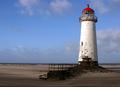
| 11/16/2003 12:04:04 AM |
To the Lighthouse by dan_pendletonComment: Gorgeous photo. Great simple colours. Sharpness is amazing and the composition is dead on. I love the soft appearance of the sand on the left side - it ads feeling of time to this photo. So very well done. |
 Photographer found comment helpful. Photographer found comment helpful. |
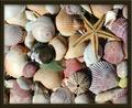
| 11/16/2003 12:01:19 AM |
Gift from the Sea (Anne Morrow Lindbergh)by GrandmomComment: The variety of the sea gifts makes this an interesting photo. The colours are nice and soft - realistically looking. You have some lovely textures. It needs tiny bit of sharpening, but my biggest suggestion is to really stay away from thick brown borders. This border totally kills your beautiful shot. I am not taking any points off for it, but IMO it doesn't add or help your image, it distracts from it. Perhaps thinner cream-coloured border would have been a better choice. |
| Photographer found comment helpful. |
| 11/15/2003 11:55:12 PM |
Old Possum's Book of Practical Cats - by, T.S. Elliotby joannadivaComment: This cat shot is well done. Love the way the cat tilted her head. Her eyes are like two liquid beads. The blue eyes nicely contrasts with the pinkish background. I like the way the parts that are supposed to be sharp are sharp and the rest is nicely soft. My only suggestion would be not to cut her top ear off (I mean in the photo of course). Lovely companion you have. |
| Photographer found comment helpful. |
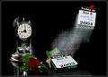
| 11/15/2003 11:49:46 PM |
"Same Time, Next Year" - a romantic comedyby jefalkComment: I bet this was fun to arrange. Love the whole composition. The simple background and colour scheme, the sharpness, the llighting, they all make it a very professional looking. Well done. |
| Photographer found comment helpful. |
| 11/15/2003 11:47:18 PM |
In A Lighter Veinby MWittComment: Beautiful macro. Great backlighting and simple background makes this a very striking photo. My only suggesion woud be the play more with the composition (maybe angle it to follow the leaves' lines...) |
| Photographer found comment helpful. |
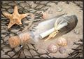
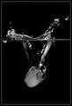
| 11/15/2003 11:45:26 PM |
Message in a Bottleby SharonSComment: This is one of my favs in this challenge. So well composed. I love the way you splashed a bit of sand on the bottle to make it look like it's been sitting there for a while. The net adds very nice touch to the whole image as it frames the bottle. My only suggesions would be to rotate the star tiny bit to make it less obvious that it was arranged, and make the border thinner (it should not compete with the fishnet lines). Otherwise beautiful photo. |
| Photographer found comment helpful. |
| 11/15/2003 11:42:23 PM |
|
| Photographer found comment helpful. |
| 11/15/2003 11:40:48 PM |
Preserving the Taste. The Secrets to Great Salsaby vrphotosComment: Very well shot. Love everything about it. The colours, the sharpness, the composition. The background and foreground were carefully chosen. This would have scored well in the still life challenge as well. Here is illustrates the title very well. The only tiny thing is that your border looks like it got chopped off. Still very good image. |
| Photographer found comment helpful. |
| 11/15/2003 11:38:15 PM |
The Electric Kool-aid Acid Testby grigrigirlComment: Superb piece of art. Just beautiful. The prism colours add life to this image. Her expression is nice and soft. My only suggesion would be to add a tiny bit of contrast to the black portions of the image - it kind of looks a bit greysh (but it could be a monitor calibration issue.) Among my top pics. |
| Photographer found comment helpful. |
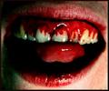
| 11/15/2003 11:32:12 PM |
The Rocky Horror Showby ArmMarteinsComment: You are dead on with this. I could have guessed it without your title - it's so good. It looks so real (I hope it's not). My only suggesion would be to somehow soften the light striking the gums and tongue to lessen the glare. |
Home -
Challenges -
Community -
League -
Photos -
Cameras -
Lenses -
Learn -
Help -
Terms of Use -
Privacy -
Top ^
DPChallenge, and website content and design, Copyright © 2001-2026 Challenging Technologies, LLC.
All digital photo copyrights belong to the photographers and may not be used without permission.
Current Server Time: 06/23/2026 05:52:34 AM EDT.