|
|
|
Showing 2651 - 2660 of ~3215 |
| Image |
Comment |
| 01/31/2003 09:28:00 AM | signs of sea dogsby andresComment: Critique Club Critique
(1) COMPOSITION (CONTENT) I find the layout of this photograph to be one of its great strengths. Both the horizon and the lighthouse are strategically placed to draw the viewers eye into the photograph.
I like your use of leading lines here, the way road and the line of clouds both draw the eye to the lighthouse is very powerful. Unfortunately, this makes the lighthouse the subject of your photograph rather than the sign.
(2) BACKGROUND The background of this photograph is the sky and the lighthouse. They are presented in such a way that they have overwhelmed the subject. This is almosst forgiveable because of the beauty, but I do believe the voters will not be able to over look this and you are likely to suffer for that in your score.
(3) CAMERA WORK ,TECHNICAL Exposure might have been more appropiate for a landscape rather than a "signs" challenge photo. I think the sign needs to be more the center of interest. Perhaps if it has a little more light suih as some fill flash. You might have also tried reflecting some of the beautiful sunset light onto it with a large reflector.
(4) DIGITAL PROCESSING ,TECHNICAL Your post processing is very good. You might have added to the strength of the composition by cropping it a little tighter and losing a little of the upper part of the sky.
(5)MEETING THE CHALLENGE This photo does a fair good job of meeting the challenge. When you have a background as beautiful as this one, its rather difficult to focus on the sign.
(6) MY OPINION ON THE PHOTO The scene here is beautiful. I think perhaps this is a photo that you might try to reshoot in many different lights and times of day and in different seasons. This is a great location to get some really neat shots. Well done!
|  Photographer found comment helpful. Photographer found comment helpful. |
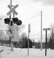
| 01/31/2003 09:14:37 AM | Advance to the nearest railroad...by RiderGalComment: Critique Club Critique
(1) COMPOSITION (CONTENT) I find the layout of this photograph to be interesting but not very strong. You have used the rule of thirds in several ways to the advantage of the photograph. (i.e. the horizon is along the lower line of thirds, two spearate sign poles are along the side lines). The repetition of the "railroad" and "railroad" in the signs is quite humorous.
I like your use of leading lines here, the way all of the power lines seem to be pointing to the railroad crossing sign. It is almost unforgivable to have power lines in a photograph, but you have used them here in a wise way. If you can not get rid of them, then at least use them appropriately.
(2) BACKGROUND The background here is rather cluttered. Unfortunately, I do not see any way around that. Did you try shooting from a lower angle to eliminate some of the distractions?
(3) CAMERA WORK ,TECHNICAL Exposure is very well done. Your exposure keeps the whites very crisp without losing any of the detail. Your blacks are deep and rich.
(4) DIGITAL PROCESSING ,TECHNICAL Your post processing is very good. Cropping this vertically makes for a more interesting photo than if it had been horizontal.
(5)MEETING THE CHALLENGE This photo does a very good job of meeting the challenge. Unfortunately the scene does little to invite the viewer to stay with it longer than a few seconds. It does not say "Wow".
(6) MY OPINION ON THE PHOTO The subject here is rather bland. There are few interesting details and it looks like just another railroad crossing. |
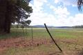
| 01/25/2003 06:05:18 PM | Northern Arizonaby raybanComment: Critique Club Critique
(1) COMPOSITION (CONTENT) I find the layout of this photograph to be strong and very interesting. The diagonal line of the fence, repeated by the diagonal line of the trees is a very powerful leading line and pulls the viewer right into the photograph.
(2) BACKGROUND The clouds are very nice, but I find the sky a little bit over exposed. I am not sure you could have exposed it properly and still have the foreground perfectly exposed. This is probably a good compromise.
The scenery leading away from the viewer is very nice as well, especially with the nice hills in the distance. This give the photo a real 3D effect.
(3) CAMERA WORK ,TECHNICAL Exposure is well done. Your exposure keeps the whites very crisp without losing any of the detail in the trees and grasses.
There are so many facinating details that one really must look this photograph for a long time. My eye keeps getting drawn to the tiny little pinecones the close front and the my eye just naturally follows the fence back to the trees. Beautiful capture.
(4) DIGITAL PROCESSING ,TECHNICAL Your post processing is very good. I might have cropped it a bit tighter getting rid of the branch in the upper right and placing the sagging fence post on the right most line of thirds.
(5)MEETING THE CHALLENGE This photo does a very good job of meeting the challenge. This is a very relaxing scene and filled with natural beauty.
(6) MY OPINION ON THE PHOTO I like this photograph very much. I think perhaps this is a photo that you might try to reshoot in many different lights and times of day. This is a great location to get some really neat shots. Well done! |
| 01/25/2003 10:42:32 AM | A little walk in the ol' countryby blind_as_a_batComment: Critique Club Critique
(1) COMPOSITION (CONTENT) I find the layout of this photograph to be interesting but lacking in strength. The old building to the left really draws my attention, but it is rather a small part of the entire photo. I want to see more details, and wonder if you could have gotten closer and made that more of the subject.
(2) BACKGROUND The background in this photograph is the sky which is a beautiful shade of pastel pink. It is a beautiful backdrop for the bare tree, almost turning into a filigree cutout. I am a little disturbed by the power lines and pole. They ruin what otherwise could have been a great and powerful image.
(3) CAMERA WORK ,TECHNICAL Exposure is very well done considering the time of day that this was taken. There are so many facinating details that one really must look this photograph for a long time. I keep going back to the old building and wishing I could see more details. If you had gotten closer, you could have cut out the power pole and made the tree and building the prominant subject of the photo. This would have added to the amount of details visible.
(4) DIGITAL PROCESSING ,TECHNICAL Did you try cropping this as a vertical (i.e. portrait style)? This would have cut out the disturbing aspects and brought the building and tree into closer view. I might suggest that you try this if you haven't, just as a little experiment.
(5)MEETING THE CHALLENGE This photo does a fair job of meeting the challenge. Normally man made objects are not considered "landscape" photography, but in this care I think one can look past that.
(6) MY OPINION ON THE PHOTO The subject here is nice. I would love to see what you could do with a few changes to the cropping. Good capture. | | Photographer found comment helpful. |
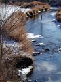
| 01/25/2003 10:27:57 AM | Icy Creekby DigipixerComment: Critique Club Critique
(1) COMPOSITION (CONTENT) I find the layout of this photograph to be very strong. The gentle curve of the creek is a very powerful leading line and pulls the viewer right into the photograph. This is repeated in the curve of the vegetation along the creek, and repetition is one of the things that makes this photograph so compelling.
(2) BACKGROUND There is not alot of background in this picture, but what little there is works well to keep the focus on the creek. The background is not distracting at all.
(3) CAMERA WORK ,TECHNICAL Exposure is very well done. Your exposure keeps the whites very crisp without losing any of the detail in the water or bushes.
There are so many facinating details that one really must look this photograph for a long time. My eye keeps getting drawn to the tiny little ripples in the close front and the way the light is reflected from them. I love the coldness from the snow and ice, yet the colors of the vegetation are on the warm end of the spectrum. This is a wonderful contrast. Beautiful capture.
There is only one little thing that bothers me about this photograph, and it is something that I doubt you had any control over. That would be the bare branches on the left side of the foreground. They seem to cut into the picture and are a little bit distracting.
(4) DIGITAL PROCESSING ,TECHNICAL Your post processing is very good. You have cropped this in such a way to add to the beauty of the scene.
(5)MEETING THE CHALLENGE This photo does a very good job of meeting the challenge. This is a very relaxing scene and filled with natural beauty.
(6) MY OPINION ON THE PHOTO When I requested a photo to critique, I was thrilled when I got this one. The subject here is wonderful. The way you executed it is wonderful. I think perhaps this is a photo that you might try to reshoot in many different lights and times of day and in different seasons. This is a great location to get some really neat shots. Well done! | | Photographer found comment helpful. |
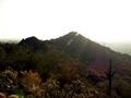
| 01/24/2003 04:29:23 PM | Morning Dewby rcrawfordComment: Critique Club Critique
(1) COMPOSITION (CONTENT) I find the layout of this photograph to be interesting but lacking in strength. The gentle sloping hills, the rows of hills that fade into the distance, the lone cactus all make for a strong composition. I wish there was a little less sky, that you had shown a little more of the details of the forground instead. By placing the horizon at 1/3 of the way down from the top, you would have accomplished this and also followed the rule of thirds.
(2) BACKGROUND The background in this photograph is the sky which unfortunately is very burnt out. I realize that this is because you are shooting into the sun, which gave you the interesting halos around all of the cactuses, and the wonderful lens flares....but it did nothing to the sky.
(3) CAMERA WORK ,TECHNICAL Exposure is very well done considering that you are shooting into the sun. The backlighting on the cactus and the plants in the foreground is wonderful, and I wish you could have made that a more prominent part of the photograph.
There are so many facinating details that one really must look this photograph for a long time. I keep going bakc to the hills that fade into the distance. Wonderful capture.
(4) DIGITAL PROCESSING ,TECHNICAL I wish you had cropped this a little differently. The photograph would have made a dynamic statement if there was not quite so much over bright sky.
(5)MEETING THE CHALLENGE This photo does a very good job of meeting the challenge. I love the way that you have taken a fairly normal scene and transformed it into a fairyland by the use of haloing effects and lens flare..
(6) MY OPINION ON THE PHOTO The subject here is wonderful. The way you executed it is wonderful. I think perhaps this is a photo that you might try to reshoot in many different lights and times of day. This is a great location to get some really neat shots. Well done! | | Photographer found comment helpful. |
| 01/24/2003 01:01:55 PM | jupiterby d95vetteComment: Critique Club Critique
(1) COMPOSITION (CONTENT) The composition of the photograph has followed all of the tried and true rules of composition - especially the rule of thirds. The colors are bright and vivid and give the photograph a life of its own.
(2) BACKGROUND I am thinking that the background here is the sky and the hill top. The sky is a very nice color that compliments the tourquoise water and the red of the lighthouse. Unfortunately the hilltop is rather cluttered with trees, and except for the lighthouse, has no place for the viewers eye to stop. Once the viewer has seen the lighthouse, his eye tends to wander through the photograph.
(3) CAMERA WORK ,TECHNICAL Exposure seems right on the mark. Composition is good but unimaginative.
(4) DIGITAL PROCESSING ,TECHNICAL I am thinking that a closer crop would have brought the lighthouse closer and made it more of the subject of the photograph rather than just another piece of it.
(5)MEETING THE CHALLENGE This photo does a very good job of meeting the challenge.
(6) MY OPINION ON THE PHOTO The subject here is very interesting. I think perhaps this is a photo that you might try to reshoot. This is a great location to get some really neat shots. I would try different times of the day and different angles as well. |
| 01/24/2003 12:42:53 PM | Beyondby ioComment: Critique Club Critique
(1) COMPOSITION (CONTENT) The composition of the photograph is one of the best things about it. The heavy tree on the right balances the many trees on the left. The branches of the big tree seem to just flow and reach through the misty atmosphere giving this photo a surreal quality.
Time of day made a big difference here and you choose wisely.
(2) BACKGROUND The background makes the photograph very special. I read some of the other comments you received and I have to agree with most of them, the background give this a Tolkein-like feel. The sky is a little bright, but works well here with the misty ground. Very nice, as it gives a brooding sort of hauntedness to the entire scene.
(3) CAMERA WORK ,TECHNICAL Exposure is very well done. The tree on the right is a little dark, but that contrasts well with the lighter sky and ground. I am wondering if seeing just a tiny little more detail in the tree trunk might have added one more level of interest to an already wonderful photograph. A little bit of fill flash might have opened the scene up a bit.
There are so many facinating details that one really must look this photograph for a long time... the texture of the grass in the foreground, the sunlit wall, the fence in the foggy background just to name a few
(4) DIGITAL PROCESSING ,TECHNICAL You accomplished something very interesting with the away you cropped this photograph. The first thing the viewers eye lands on is the heavy tree trunk, but then is pulled to the left along the sunlit wall top. This is emphasised with the long narrow crop, which works magnificently here.
(5)MEETING THE CHALLENGE This photo does a very good job of meeting the challenge. I love the way that you have taken a fairly normal scene and transformed it into a fairyland.
(6) MY OPINION ON THE PHOTO The subject here is wonderful. The way you executed it is wonderful. I think perhaps this is a photo that you might try to reshoot in many different lights and times of day. This is a great location to get some really neat shots. Well done! | | Photographer found comment helpful. |
| 01/23/2003 07:17:11 PM | Silly Boyby SonifoComment: Critique Club Critique
(1) COMPOSITION (CONTENT) The composition of the photograph is one of the best things about it. The diagonal placement of the young man is very interesting compositionally. The fact that you are looking down at him makes his face much larger than any other part of him and thus take on a prominence that it normally would not.
(2) BACKGROUND The background is rather plain, and because of this the photo has an uncluttered look to it. Nice selection for this partcular photo. I do not know what that little thing in the corner over his head is, but it is a little bit distracting. Maybe you could have cropped the photo just a little tighter and gotten rid of it.
(3) CAMERA WORK ,TECHNICAL Exposure seems a little bright on the left side of his face and hair. It looks as though this was taken in natural light. Some wonderful details are lost in the highlight areas. I am wondering if that light could have been muted a little with some tissue paper or muslin cloth.
(4) DIGITAL PROCESSING ,TECHNICAL Black and white was a good choice for this photograph. You have very good tonal range here, all the way from whitest white to blackest black.
(5)MEETING THE CHALLENGE This photo does a very good job of meeting the challenge. I love the look on his face, the way he is wrinkling up his nose and even the sparkle in his eye.
(6) MY OPINION ON THE PHOTO This is one of those photos that you will treasure when he is older. It does have a little "snapshot" feel to it, but that does not seem to take anything away from the photograph. | | Photographer found comment helpful. |
| 01/20/2003 10:50:50 AM | | | Photographer found comment helpful. |
|
Showing 2651 - 2660 of ~3215 |
Home -
Challenges -
Community -
League -
Photos -
Cameras -
Lenses -
Learn -
Help -
Terms of Use -
Privacy -
Top ^
DPChallenge, and website content and design, Copyright © 2001-2026 Challenging Technologies, LLC.
All digital photo copyrights belong to the photographers and may not be used without permission.
Current Server Time: 06/23/2026 11:26:12 AM EDT.
|