|
|
|
Showing 2631 - 2640 of ~3215 |
| Image |
Comment |
| 02/15/2003 10:09:10 AM | Grandma's favoriteby kenboComment: Critique Club Critique
(1) COMPOSITION (CONTENT) This is a very cute photograph. The glasses on the bear just give me a huge smile. The photograph has all the elements of a story, the bear dressed up and with glasses, the envelope and the letter.... all add up to a whimsical storybook feeling.
(2) BACKGROUND There are a couple of things in the background that are distracting to me. In the upper left there is a tag of some sort. I do not see how that fits into the picture. Behind the bears neck is also something that draws the eye away from the places it should be resting.
(3) CAMERA WORK ,TECHNICAL The DOF is very good, all of the important parts are in sharp focus. Your composition is very good as well. I love the lighting you have used, there are no harsh shadows. Everything is very evenly lit.
(4) DIGITAL PROCESSING ,TECHNICAL Your post processing is good. Saturation is good. Colors are vibrant and bright. Your cropping may be a bit tight. I feel as though something is missing because the top of the bears ears are cropped out. This gives the photograph a sort of "squashed" feeling"
(5)MEETING THE CHALLENGE This photograph does a very good job of meeting the challenge.
(6) MY OPINION ON THE PHOTO The subject here is very cute. I could see this framed nicely and hung in a childs room. Good luck on future challenges. |  Photographer found comment helpful. Photographer found comment helpful. |
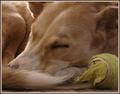
| 02/15/2003 09:57:46 AM | Let Sleeping Dogs Lieby mcraelComment: Critique Club Critique
(1) COMPOSITION (CONTENT) This is an adorable photograph. I know how difficult it can be to photograph pets, especially one with lots of energy. You have done well to wait until the dog was sleeping, and also including the ball for content. It looks as if he/she has worn themself out playing.
(2) BACKGROUND You have filled the frame nicely with just the subject, therefore, there is no distracting background.
(3) CAMERA WORK ,TECHNICAL The DOF is very good, all of the important parts are in sharp focus. I love the details visible in the dogs tail and also the eyes are very sharp. Your composition is excellent and the ball adds just the right touch.
(4) DIGITAL PROCESSING ,TECHNICAL Your post processing is good. Saturation is good. Your cropping may be a bit tight. I feel that something is missing where the dogs other ear should be.
(5)MEETING THE CHALLENGE This does an excellent job of meeting the challenge, not only in the subject, but aslo in the title.
(6) MY OPINION ON THE PHOTO The subject here is wonderful. The way you executed it is great. This is a photograph that you should be proud of. After all, aren't pets part of the family? Good luck on future challenges. | | Photographer found comment helpful. |
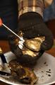
| 02/13/2003 04:36:47 PM | oyster shuckerby blickComment: Critique Club Critique
(1) COMPOSITION (CONTENT) This is going to be a very difficuot photograph for me to critique. I believe the content of your photograph is rather weak and the composition does nothing to draw the eye into the picture. If the viewer is not familiar with shucking oysters, he is not going to understand what is happening in this photograph.
(2) BACKGROUND The background is a little cluttered. There is not enough showing for someone to get a real feel of "place".
(3) CAMERA WORK ,TECHNICAL The DOF is very good, all of the important parts are in sharp focus. I feel a bit distracted by having only the tiniest bit of a finger on the left side. I believe it would have been better to include more of that hand. It might have conveyed the story in a stronger way. I also feel that a little more light on the glove would have brought out some details there. The glove is a bit "muddy" and it is difficult to see beyond the basic shape.
(4) DIGITAL PROCESSING ,TECHNICAL Your post processing is good. Saturation is good. Your cropping may be a bit tight. If you had included more of the hand on the left, and the entire plate, I would not feel so much like something is missing.
(5)MEETING THE CHALLENGE I am not sure how this is a cliche. I do not believe I have ever seen a picture of an oyster shucker before. I personally do not mark people down for not meeting the challenge, but there are many other photographers that do.
(6) MY OPINION ON THE PHOTO The subject here is alright. The way you executed it is alright. I think this is a photograph that you may wish to re-shoot under different lighting conditions. The potential here is better than the photo you have created. Good luck on future challenges. | | Photographer found comment helpful. |
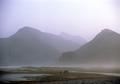
| 02/13/2003 07:34:43 AM | Mistby imagesloyolaComment: This is one of my favorites this week. Sorry I can not add anything to improve it. |
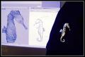
| 02/12/2003 09:07:54 AM | From Concept to Lapel Pinby lisaeComment: Critique Club Critique
(1) COMPOSITION (CONTENT) This is a very well done photograph. I have read your details and there is not much I can add that you do not already know. I very much like the repetition of the shapes of the seahorse. I also like the use of the "other" rule of thirds, using three like objects together. That is a very powerful tool.
(2) CAMERA WORK ,TECHNICAL I have read your comments and see that a few people have picked up on the soft focus. I can see that but to me it is just not that disturbing. Other than that, your camera work is good. The composition is extremely good.
(3) DIGITAL PROCESSING ,TECHNICAL Your post processing is very good. Saturation is good. The colors here are really quite wonderful. I can appreciate how hard it is to make your whites really crisp while keeping your blacks deep and rich. You have done that very well.
(4)MEETING THE CHALLENGE This photo a very good job of meeting the challenge. This is also an educational photo for most of us. Great job.
(5)MY OPINION ON THE PHOTO This is an interesting photograph that tells a story. I find that after a few moments though, it does not hold my interest. I think that maybe there is just not enough detail. | | Photographer found comment helpful. |
| 02/11/2003 09:30:51 AM | Past, Present and Futureby SharQComment: Critique Club Critique
(1) COMPOSITION (CONTENT) The composition here is alright but definately could be stronger. There does not seem to be a particular subject and the viewers eye tends to wander a bit instead of coming to rest somewhere. The bright "C" draws the eye at first, but does not have enough interest to hold for long.
(2) BACKGROUND The background is very dark, it does not distract from the subject, although the main objects tend to fad into the back ground a bit.
(3) CAMERA WORK ,TECHNICAL I wish there had been a bit more light so that more details of the cans could be seen. I would especially like to see more of the can on the left, the crumples and ridges wuld have added some interesting texture if they could be seen more clearly.
(4)MEETING THE CHALLENGE This photo a fair job of meeting the challenge. If you still have the can with the "C" cut out, you might try to play with it a bit more. I feel that this photo has greater potential than is seen from this particular shot. | | Photographer found comment helpful. |
| 02/11/2003 09:12:45 AM | Roseby sulamkComment: Critique Club Critique
(1) COMPOSITION (CONTENT) This is an incredibly powerful composition. The repetition in the curve of the petals works well to focus the attention on the center of the rose. Having the center of the rose off-center in the photograph is very effective. You have placed it in the proper position to take advantage of the rule of thirds.
(2) BACKGROUND The background is very light, just the proper background to show the rose off to its best advantage. This would not have worked as well with anything else. There is nothing to distract fron the rose itself.
(3) CAMERA WORK ,TECHNICAL The focus is crisp and sharp. By moving in close, you got wonderful texture on the petals. I can actually see the veins of the flower. This is incredible.
(4) DIGITAL PROCESSING ,TECHNICAL Your post processing is very good. I am wondering why you did this in black and white and I also wonder what it looked like in color. Obviously you did this for a reason, but since the colors of a rose are normally so beautiful, I do not see how you gained anything. Your tonal range is excellent for a black and white photograph though.
I read some of the comments you got about the edge of the petals being oversharpened. In my opinion, this works very well to separate it from the background. I personally like that element very much.
(5)MEETING THE CHALLENGE This photo a very good job of meeting the challenge. This may be one of the very best of the flower photos.
| | Photographer found comment helpful. |
| 02/10/2003 04:41:03 PM | | | Photographer found comment helpful. |
| 02/10/2003 04:27:04 PM | Stella Harmonyby goodtempoComment: Critique Club Critique
(1) COMPOSITION (CONTENT) This is one of the strongest compositions in the challenge this week. The balance between the straight line of the strings and the curve of the hole is powerful! The detail is wonderful, I almost feel that I could strumb the strings.
(2) BACKGROUND The background is very dark, just the proper background to show the strings off to their best advantage. This would not have worked as well with anything else.
(3) CAMERA WORK ,TECHNICAL I have read your comments and see that many people have picked up on the soft focus. I can see that but to me it is just not that disturbing. Other than that, your camera work is outstanding. The composition is extremely good.
(4) DIGITAL PROCESSING ,TECHNICAL Your post processing is very good. Saturation is good. The colors here are really quite wonderful.
(5)MEETING THE CHALLENGE This photo a very good job of meeting the challenge. This may be the very best of the guitar photos.
I know I critiqued your photo last week and I will understand if you would like someone elses viewpoint. Personally I think this is excellent!
| | Photographer found comment helpful. |
| 02/10/2003 04:02:23 PM | In the Shadow of Heroesby ClubJuggleComment: This photo is well done in many ways. The composition is dynamic. The exposure is so well done that you can read the inscription on the white tomb without blowing out your high lights in other places. The shadow and the foot are what makes this photograph in this particular challenge. I would like to see it without them just as a well done photograph. | | Photographer found comment helpful. |
|
Showing 2631 - 2640 of ~3215 |
Home -
Challenges -
Community -
League -
Photos -
Cameras -
Lenses -
Learn -
Help -
Terms of Use -
Privacy -
Top ^
DPChallenge, and website content and design, Copyright © 2001-2026 Challenging Technologies, LLC.
All digital photo copyrights belong to the photographers and may not be used without permission.
Current Server Time: 06/23/2026 12:57:20 PM EDT.
|