| Image |
Comment |
| 03/12/2003 12:59:22 PM |
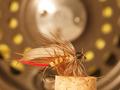
Fly Fishing - Yellow Elk Hair Caddisby justineComment: I really thought this might place higher! Very nice shot, Justine. I really like your props and set up. I love the contradictions in the reel issue. (sorry to laugh, but it just sounds sooo familiar!) |
 Photographer found comment helpful. Photographer found comment helpful. |
| 03/11/2003 07:51:33 PM |
Colorful Meringueby SwashbucklerComment: Oops I never saw the hair, honestly! Where's that cross and nails when you need it.
Nasty-gram backspaced!!!!
How about this - if you don't know a term, look it up! |
| 03/11/2003 07:48:09 PM |
Wrestling With Coffee Addictionby SwashbucklerComment: Normally, I send out thank you notes after each challenge. Taking the time to comment should always be rewarded. I just couldn't do it for this one. It was a silly picture, granted. An attempt to lighten what was certain to be a very depressing challenge subject.
I will continue to ask - Concentrate on the QUALITY of the photo and it's attempt to meet the challenge. Set up, props and studio type lighting are "nice", but the idea of the site is to improve photo quality. Is this a quality photo? Does it attempt to meet the challenge? nuf said! |
| 03/11/2003 07:31:33 PM |
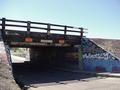
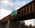
Needles, CA. Train Bridgeby ISivicComment: Sharp photo. Good color, too. Something about the rail just doesn't look quite right to me. Sorry, but I don't find a lot of interest (maybe the graffitti....) 5 Swash |
| 03/11/2003 07:29:18 PM |
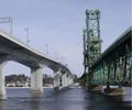
New and old Carlton Bridgeby kblmComment: Nice contrast between the two bridges. Challenge well met (two for the price of one!!) Color seems pretty good. Focus - the cement bridge seems to look much better than the steel one. 5 Swash |
| 03/11/2003 07:27:45 PM |
A Cold Peaceful Winter Afternoonby nathaliedooComment: While I do like the bare trees, it seems incongreous (sp) with the bridge and far background. You might want to revisit your frame again, too. The white to white edges just don't work well for me. 5 Swash |
| 03/11/2003 07:22:44 PM |
Can The Government Bridge This Gap?by LindaEComment: Very sharp photo! Color seems very good. Your title is a little difficult (but I think I eventually figured it out). The tree sticking out of the top of the sign might have been cool, but need more of it and maybe not quite so much coming out of the sign. Sorry, but the photo doesn't grab me, even with the political slam. 5 Swash |
| 03/11/2003 07:04:42 PM |
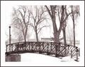
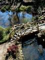
In The Gardenby boyte1Comment: Very pretty picture. It's a cool bridge (looks like a living bridge, except for the whiteness of the limbs). I esp. like the center 1/3 of this shot. The bridge and the pond beyond it are very cool! The "stream" and far bank..I could live without. Very sharp photo, color might be a tad muted. 8 Swash |
| Photographer found comment helpful. |
| 03/11/2003 07:01:39 PM |
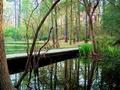
Small and Narrowby clues56Comment: Very cool picture. You might have saturated the green a tad heavily (see the cattails?), but I do that often myself. Very cool reflection. Very peaceful scene. Focus seems very nice. Not a spectacular bridge, but I like it! 9 Swash |
| Photographer found comment helpful. |
| 03/11/2003 06:59:35 PM |
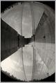
Brooklyn Bridgeby dimitriiComment: Very cool use of fisheye lens! The vigenetting at the corners is totally justifiable with this lens (I hope you aren't getting too many foolish comments on that!) Very nice job! 9 Swash |
| Photographer found comment helpful. |
Home -
Challenges -
Community -
League -
Photos -
Cameras -
Lenses -
Learn -
Help -
Terms of Use -
Privacy -
Top ^
DPChallenge, and website content and design, Copyright © 2001-2026 Challenging Technologies, LLC.
All digital photo copyrights belong to the photographers and may not be used without permission.
Current Server Time: 07/20/2026 12:50:16 AM EDT.