| Image |
Comment |
| 04/17/2003 01:40:22 PM |
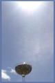
Catchin' the raysby BJComment: Cool idea! Very different/creative. To me, it seems like there's too much negative space between the candy and the sun. I am impressed with the nearly complete lack of solar flares (I find only one, my lens creates several if I get even close to the sun) I'd also like the candy bowl just a little larger in the frame. 7 Rob the Swash |
 Photographer found comment helpful. Photographer found comment helpful. |
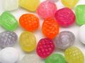
| 04/17/2003 01:37:35 PM |
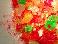
BowWowWowby akebonoComment: It's very bright and colorful! I honestly don't get the title at all. Focus seems just a bit off, the crystals lack detail. The color in the upper right area seems overly saturated (blends together), but that may just be an optical illusion created by the layers of the candy bits. Sorry, but I've talked myself into a bit lower score. From 7 to 6. Rob the Swash |
| 04/17/2003 01:31:41 PM |
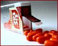
Tic-tacby pitsamanComment: This looks a bit like an advertisement. It's pretty well done, but you might want to try opposing lighting (so the lid isn't silhouetted) and a tad softer lighting (looks like the same window I used...) 7 Rob the Swash |
| Photographer found comment helpful. |
| 04/16/2003 07:51:14 PM |
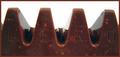
Lero, the chocolate candy mountains!by RobroComment: Very sharp photo. Good detail and color. May I assume "lero" is part of a larger name (that I have no idea what that would be). It doesn't move me or even make me hungry for chocolate (can't really say why, it just doesn't). Hugely minor nit: several fingerprints barely visible in the chocolate. 7 Rob the Swash |
| Photographer found comment helpful. |
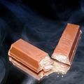
| 04/16/2003 07:47:43 PM |
kitkatby john22132Comment: Very well taken photo. Very clear and the color seems about right. I like the idea of breaking the bar (to show the insides), but (nit time!) the "shards" of candy bar don't help (imo) and the finger prints say "used" to me (don't touch). I like the smoke, but I don't understand why it's in this picture. 7 Rob the Swash |
| Photographer found comment helpful. |
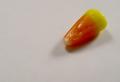
| 04/16/2003 07:44:34 PM |
Candy Cornby AnnidaComment: Huge amounts of negative space. Very clear photo with near perfect color. Glare on the candy is a tad sharp, but not horrible. Dual lighting does help to light up most of the subject (two shadows tells me this). Interest - near none, I get no sense of tie-in, no pattern, no deeper message, it's just there. 7 Rob the Swash |
| Photographer found comment helpful. |
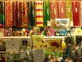
| 04/16/2003 01:06:30 PM |
Neighborhood Candy Storeby BAMartinComment: Very colorful! Focus seems very sharp, esp. on the back row. Foreground, to me, overwhelms the "busy", on the other hand, the tubes in the back row are catching quite a bit of glare (so I wouldn't suggest just centering on them, but I did consider this). The store's bulk bagging might have been good to avoid, too.
7 Rob the Swash |
| Photographer found comment helpful. |
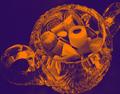
| 04/16/2003 01:03:15 PM |
This candy has been chromedby camelotnorthComment: Clear shot, interesting effect. Now, think about this...chromed candy? Takes away a bit of the yummy appeal, don't you think? Crop - too tight, if you're going to crop off parts of the jar, crop with a purpose, this just nicks the jar in several places. Maybe use "chrome effect" in a different challenge? 7 Rob the Swash |
| Photographer found comment helpful. |
| 04/16/2003 01:00:07 PM |
Grave of the Firefliesby AntithesisComment: Very bright shot! Lots of great color. Focus seems strong, but should be as the subjects are very parallel to each other and the camera. I'm not sure white would be the "best" background (esp. for the whiter candies). In general, pretty but unpatterned (maybe make a tic-tac-toe game of it?). 7 Rob the Swash |
| Photographer found comment helpful. |
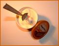
| 04/16/2003 12:56:51 PM |
HEAVENby howzaComment: Good, clear photo. Nice cross lighting. I'm sorry, but I don't quite think of ice cream as candy, yes, it's a sugary desert, but not quite candy (but I'm not going to chop off your points due to a difference of "opinion"). I like the idea of the spoon, but not really at this acute of an angle. I think I would have liked the stronger light on the side of the lid, rather than the opposite (makes for better "ad" copy).
7 Rob the Swash |
| Photographer found comment helpful. |
Home -
Challenges -
Community -
League -
Photos -
Cameras -
Lenses -
Learn -
Help -
Terms of Use -
Privacy -
Top ^
DPChallenge, and website content and design, Copyright © 2001-2026 Challenging Technologies, LLC.
All digital photo copyrights belong to the photographers and may not be used without permission.
Current Server Time: 07/22/2026 12:33:39 PM EDT.