|
|
|
Showing 2671 - 2680 of ~3862 |
| Image |
Comment |
| 07/29/2002 04:55:00 PM | Hear No Evil, See?by bobgaitherComment: This is a fine shot, but it seems (I don't know) too casual. Maybe it's the vast number of varied subjects that confuses this shot. I really can't tell what you are "looking at". 4 Swash |
| 07/30/2002 04:42:00 PM | |
| 07/30/2002 07:34:00 PM | Calling the brokerby rexharrisComment: Second photo I have commented along this line today! The other one was too jumbled (too many elements to really focus on), so in that respect, this is better. I think I figured out what would make me really happy with this shot. Circle in red the stocks you wanted to contact your broker about (add interest). It wouldn't matter if it were your stocks, you really can't see that level of detail anyway. Drink your drink down, you're upset, remember? 8 Swash |
| 07/30/2002 06:58:00 PM | Snap! Shotby deckyonComment: I have very mixed feelings about this shot. First, for computer geeks (like me), this does have a connection to the business world (not as much Corporate as business, there is a difference...) Next, parts of me likes the out of focus name (the artist side is kinda a small part of me), while the rest of me clamors to say FOCUS! (lame attempt at humor) This is a VERY good shot, please don't get me wrong. I started you out as a five (my "I don't know what I am going to do" starting score), but I going to take you up to 7. Swash I have done some additional thinking on this.....I believe more people could relate to the "output" generated from a business computer than the system itself. Most servers are locked up in a Server Room or equivelant, so a majority of USERS don't see them, non-users would most often be "clueless". I haven't given you a photo to go out and take, just some direction you might want to take. ;) Rob |
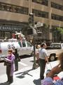
| 07/30/2002 07:16:00 PM | The Economic Rideby jimmspComment: This is more to the challenge subject than most, but it seems a bit overly jumbled to me, too many elements (I guess it's just me). Who are you going to call? (joke ans: GHOSTBUSTERS!) Clarity and lighting are top notch. Interest is at a good level, but see jumbled. Two pairs is your best liars poker hand. (get it?) Started as a 7, but have talked myself up to an 8. Swash |
| 07/29/2002 06:53:00 PM | Down The Drainby TomNTexasComment: Two toilet shots this week. It's a stretch, but I'm going along with the idea. Personally, I think the shot needs more to connect it to the corporate concept, maybe cr@p wrapped in $$ or a very red balance sheet, that sort of thing. The toilet alone just isn't enough and the title isn't supposed to "save" you. Since I already gave the other toilet a 4, but it was tweeked wierdly and your's isn't, I will give you one more point, so 5 it is. Swash |
| 07/29/2002 08:03:00 PM | corporate evilby shutterflyComment: The money looks REALLY old. The whole shot seems a little pixelated. My best guess is, you don't have a Macro mode, so you took a picture of a much larger group of subject and cropped too far down. If I'm wrong, I will gladly take it back. Also, unless you were aiming for a "dark mood", the shot is too dark. 6 Swash |
| 07/26/2002 03:25:00 PM | Weatheredby balynchComment: Besides the glare from the flash, this is a well taken photo. Texture is clearly portrayed, no problem. Eye pleasing, no, not mine. Rust is a great texture, widely used in this challenge, but lacks eye candy value. I am sorry, but I just can't give a top score for something that doesn't make me have happy eyes. 6 Swash |
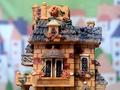
| 07/26/2002 01:53:00 PM | Brick Houseby quarxComment: My guess, you're not selling this on E-Bay. (lame joke) The shot is pretty good. Focus/framing/ composition are all nice. (well suited background, too) Texture is well demonstrated. Technically, your subject is somebody else's art. I have a hard time with this site restriction. (it's a good/bad thing) I guess your background adds "your art" to this composition, so I'll buy this. On the other hand, I'm not very crazy about this shot. (my bad, not yours) Let's just say, 6, and stop dwelling on it. Swash |
| 07/26/2002 02:17:00 PM | Revelationby welcherComment: This is such a great idea. Was the blur in the lower right corner intentional? I hope not, I don't like it. A wider depth of field, or backing away just a little might have helped. Are the letters colored? High angle attack shots create nice interest, but also create focal range problems. I think I would have been happy to see this more straight on. 6 Swash |
|
Showing 2671 - 2680 of ~3862 |
Home -
Challenges -
Community -
League -
Photos -
Cameras -
Lenses -
Learn -
Help -
Terms of Use -
Privacy -
Top ^
DPChallenge, and website content and design, Copyright © 2001-2026 Challenging Technologies, LLC.
All digital photo copyrights belong to the photographers and may not be used without permission.
Current Server Time: 06/20/2026 01:34:35 PM EDT.
|