|
|
|
Showing 2661 - 2670 of ~3862 |
| Image |
Comment |
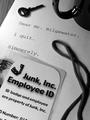
| 08/02/2002 04:32:00 PM | The Escapeby AmphianComment: Very cute idea! Seems like you took quite a bit of effort setting this up. I am impressed. ID card is poorly cut, no deduction, just thought you should know. I really don't see anything all that wrong with this shot, so GREAT JOB! I had originally scored this as a 7, but it is really much better than that. How about a 9? Did you say 10? Almost! Nice try! 9 Swash |
| 07/29/2002 05:21:00 PM | Wall Street Avalancheby amnonComment: A pretty good shot of building blocks, a distant connection to the challenge. Focus is on the rear of the shot, would rather it were on the middle or all of it. Interesting display angel, I like that part, and I like the strong colors used. Still, it's a 4, Swash |
| 07/29/2002 07:48:00 PM | Diogenes Searching for an Honest Corporationby spidermanComment: Cool, but wierd. Too long of title, but probably needed. Don't like the strong light in the lower left corner, but probably couldn't be helped. I would have loved to see the lamp lit, but you probably couldn't do that either. Focus is GREAT. Color is wonderful! I really like how the face came out. Personal nit issue: isn't this a photo of somebody else's art? I going for an 8, what do you say? Swash |
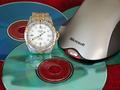
| 07/30/2002 06:42:00 PM | No Time & Fast Changing Technologyby spillerComment: Title? I think it resembles your photo, a bit jumbled. I would call this a little bit of a reach for this challenge. The photo is well taken. The focus is pretty good (the watch face seems "off" just a bit. Framing is too much of a personal choice to me, I prefer to not cut off subjects, but this is acceptable. I like the reflection of the watch in the CD. I'm not crazy about the carpet, but you make due with what you have on hand. As a just plain photo, it's about a 7, as a challenge photo, about the best I can go is 5. Swash |  Photographer found comment helpful. Photographer found comment helpful. |
| 07/29/2002 03:58:00 PM | Corporations Makin' a Killingby rdesaiComment: Very clear shot. (was any money "hurt" in this production?) I like the angle of the bill, nice interest. Good amount of negative space. (gotta learn that myself) The closest thing I have to a critical (bad) comment is the head of the nail.....pretty picky. Mine is a money shot, too, so I think the challenge was met. 9 Swash |
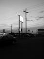
| 07/29/2002 05:01:00 PM | something has come over usby heartsdivideComment: Dark, dark, dark....I don't understand the part I can see. Is this supposed to be some reference to financial dark skies? The only contrast are the signs, but they are almost unreadable. 4 Swash |
| 07/29/2002 07:11:00 PM | We Got Burnedby timichelComment: This is GREAT! Makes me wish I had some stock to burn, too! Great timing! You must have only had one chance to "get this right". My only complaint is the WorldCom stock iis a bit blurry, but really.....10 (you may have a winner here) Swash |
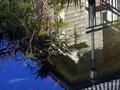
| 07/29/2002 05:05:00 PM | DrOWned Corporationby sulamkComment: Nice pond. I don't get the title or the connection to the challenge. I must be pretty dumb, I've only gotten about half the titles so far and found the challenge connection on a few more. This, I don't get. Sorry. A polarizing filter would have seen the coy better, but it would also toss your reflection (take your poison). 4 Swash | | Photographer found comment helpful. |
| 07/29/2002 05:46:00 PM | a cute hamburgerby censuraComment: Can't believe I ate one for lunch! Nice nose, well shot. A very, very loose connection to the challenge (in my view), but most are this week. Wow, I just figured out the numbers are in both ears, but I don't like them there. 5 Swash |
| 07/29/2002 07:44:00 PM | Make Mine Well Doneby daysezComment: Great idea and well executed. What's making the back of the doc look yellow? Clever title! There are some stray light patterns that are mildly distracting. Is the one in the lower right corner part of the burner? And the two in the upper left corner are part of the range? (add the red curved line in the middle left, too, originally thought that was a pan?) Spot edit those out, and you'd have a 10, except that you'd be DQ'd. How about an 8, Swash |
|
Showing 2661 - 2670 of ~3862 |
Home -
Challenges -
Community -
League -
Photos -
Cameras -
Lenses -
Learn -
Help -
Terms of Use -
Privacy -
Top ^
DPChallenge, and website content and design, Copyright © 2001-2026 Challenging Technologies, LLC.
All digital photo copyrights belong to the photographers and may not be used without permission.
Current Server Time: 06/20/2026 09:19:40 AM EDT.
|