|
|
|
Showing 4201 - 4210 of ~5149 |
| Image |
Comment |
| 09/01/2009 05:05:27 PM | Go Daddy-Oby acoppolaComment: OK, I'm going through the Free Study submissions, purposefully finding those images I think are shot with a less conventional eye - this is one of those images! Thanks for offering something that isn't just DPC friendly eye-candy (though of course there's nothing wrong with eye-candy):
Positives: Just a flat-out superb composition. The juxtaposition of the hyper-sharp mic and the guy in the background, separate but linked and coherent is quite excellent. I like the lighting and colours too - bright but still communicative of an enclosed space. You have demonstrated a great eye for a photo here.
Critical stuff: I do think the crop of the chin is slightly problematic but not disastrously so. Thinking about some of the software I have, I imagine using Viveza with a control point on the guy's cheek and taking down the luminosity of that whole area and lifting the contrast a little. Just choices though and it would certainly offer a less authentic image. I think such an approach might have address the slightly flat lighting though.
Overall: A really great capture - good job! |  Photographer found comment helpful. Photographer found comment helpful. |
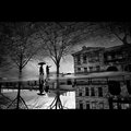
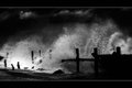
| 09/01/2009 04:56:19 PM | forecast by nixterComment: OK, I'm going through the Free Study submissions, purposefully finding those images I think are shot with a less conventional eye - this is one of those images! Thanks for offering something that isn't just DPC friendly eye-candy (though of course there's nothing wrong with eye-candy):
Positives: Some of the images I find myself commenting on this comment series are ones which have much wider appeal - this is one of those. The quality here is so high, how could anybody not love it! I wonder whether you stood over the reflection and waited for the right people to come along or whether you were really, really fortunate - I'd put money on the former; this is too 'crafted' to be accidental. I love 'crafted' images - for me, that's what photography is about.
Everything is right about this image - the focus, the camera angle, the exposure, the composition...even the border (and I hate those things!!). A 10 from me.
Critical stuff: Nothing really.
Overall: Stunning, I hope it ribbons. | | Photographer found comment helpful. |
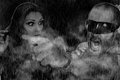
| 09/01/2009 04:49:43 PM | Get that Camera Out of My Face!by pete0121Comment: OK, I'm going through the Free Study submissions, purposefully finding those images I think are shot with a less conventional eye - this is one of those images! Thanks for offering something that isn't just DPC friendly eye-candy (though of course there's nothing wrong with eye-candy):
Positives: I'm not sure I've ever seen anything like this - it's very original. The haloing around the figures gives a composite effect; I'll assume it isn't but the overall effect is one that results in this image looking like a cell from a comic book. The woman's eye expression contributes to this feel. I'm not sure what else I'm seeing - rain? I think so, steam? smoke? mist? something else - but I can't discern what it is.
Critical stuff: This soo says comic book to me that I would've liked to have seen a much more contrasty post-process and possibly even a highly saturated or false colour version.
Overall: All credit to you for bringing such an original image to the table and actually I kinda like it! | | Photographer found comment helpful. |
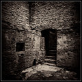
| 09/01/2009 04:43:44 PM | I n A b a n d o n e d P l a c e sby rooumComment: OK, I'm going through the Free Study submissions, purposefully finding those images I think are shot with a less conventional eye - this is one of those images! Thanks for offering something that isn't just DPC friendly eye-candy (though of course there's nothing wrong with eye-candy):
Positives: I like how you have fully committed to your vision for this image; you haven't shied away from the grain, the high contrast or the deep shadows. It all works together very well. Is it the most exciting scene? No; but your post processing has served the image well - you have augmented it and elevated it to something of beauty. There is art in that act.
Critical stuff: Not much really, I really like it - I can't really make any suggestions, I think this is one of those images where even small changes would affect the overall impression greatly, so it is just fine the way it is. | | Photographer found comment helpful. |
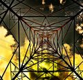
| 09/01/2009 04:39:44 PM | Deep Space (?) Star Birth Observation Postby ineedauniquenameComment: OK, I'm going through the Free Study submissions, purposefully finding those images I think are shot with a less conventional eye - this is one of those images! Thanks for offering something that isn't just DPC friendly eye-candy (though of course there's nothing wrong with eye-candy):
Positives: Great communication of strong geometry and an unusual POV. I also like the lighting on the inside of the pylon, for me that makes the image. I also appreciate the boldness of this image - you clearly have had a vision for this image and have committed to it.
Critical stuff: You've probably guessed by my absence of superlatives above that I'm not a fan of this image. I should explain why. The haloing around the pylon and the blown highlights in the clouds - I think such things are quite difficult for an image to accommodate successfully here. I feel the straight lines of the pylon should remain crisp but the haloing effect pulls these elements out of the image and the overall image loses coherence as a result. Then there is the colour choice - I can respect it as a choice but I don't think it works too well.
Overall: A picture with potential but one that, in my view, is not well served by your post-processing choices. | | Photographer found comment helpful. |
| 09/01/2009 04:29:55 PM | Brokenby juliejoldComment: OK, I'm going through the Free Study submissions, purposefully finding those images I think are shot with a less conventional eye - this is one of those images! Thanks for offering something that isn't just DPC friendly eye-candy (though of course there's nothing wrong with eye-candy):
Positives: Great colours and texture and a very interesting orientation of the subject. I find it rather disorientating (I mean that in a good way) - not only am I not sure how the chair is lying or the orientation of the surface, I feel that my POV is ambiguous. This makes for quite an unsettling but engaging image. This disorientation draws me in, makes it more real for me.
Critical stuff: The close crop to the top of the chair at the bottom of the image seems too close - clearly this has been your choice but I'm not sure it works for me.
Overall: an interesting image which benefits greatly from the colours and textures you have managed to capture so effectively. | | Photographer found comment helpful. |
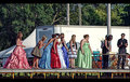
| 09/01/2009 04:16:36 PM | ...and the winner is...by HipychikComment: OK, I'm going through the Free Study submissions, purposefully finding those images I think are shot with a less conventional eye - this is one of those images! Thanks for offering something that isn't just DPC friendly eye-candy (though of course there's nothing wrong with eye-candy):
Positives: What a slice of life this is! The Topaz (or Topaz-like) effect gives it an other-worldly look which invites a particular interpretation...... as a viewer, with my own perspective, this looks like satire to me - don't get me wrong, I do think this is a non-contrived scene but I feel you are asking us take a particular stance. I'm going to go out on a limb here and hope that the girl in the green dress isn't a loved one but I can't help noticing that the girl in black is cutting a cake and the lady in green is first in line! I really love the way the girls in the centre are crowding together and perhaps I've watched to many Lindsey Lohan movies but they seem to be in their own clique - making me wonder about all of their relationships with each other. Perhaps I have read too much into this image but as the viewer I have felt invited into this scene to draw my own conclusions. That's something quite significant you've done there - pull me in, make me feel as if I'm there.... I feel involved, part of it.
Critical stuff: This image makes me worry a little - perhaps it is a sincere rendition of a scene of importance to you and what I've said above is a little inappropriate in that context for I have certainly entertained stereotypes in my interpretation. However, that in itself offers a social commentary - not of the photo but of me, the viewer, and my socio-culturally moulded view of the world; if that's the case then I do apologise - but nonetheless I thank you for the image.
Overall: A very interesting image which is very, very involving. | | Photographer found comment helpful. |
| 09/01/2009 03:57:40 PM | Hedy Melvinby hazeComment: OK, I'm going through the Free Study submissions, purposefully finding those images I think are shot with a less conventional eye - this is one of those images! Thanks for offering something that isn't just DPC friendly eye-candy (though of course there's nothing wrong with eye-candy):
Positives: What an interesting perspective - just how wide was your lens? It works really well and your composition of elements within the scene is well matched to your lens choice. There is plenty to look at here and I find my eye is pulled easily to each of the elements - there really is something to look at in every part of the image. I particularly like the guitar case. I also like the long shadows which emphasise the already pronounced perspective.
Critical stuff: Not much really, I do wish that the shadow of the guitar case wasn't cropped and wonder whether you might have increased the saturation of green a little to bring the wall out a little more but I can see how that might have messed with the authenticity of the image.
Overall: I like this image, it is interesting and well executed. I'm glad you submitted it. | | Photographer found comment helpful. |
| 09/01/2009 03:44:35 PM | run!by Ecce_SignumComment: OK, I'm going through the Free Study submissions, purposefully finding those images I think are shot with a less conventional eye - this is one of those images! Thanks for offering something that isn't just DPC friendly eye-candy (though of course there's nothing wrong with eye-candy):
Positives: I think the use of a Lensbaby qualifies this image for a comment in this series but I feel this marvellous image is just as likely to receive great scores from those who reject the unconventional as those who embrace it. This is just flat-out fantastic, one of those pictures I know I'm just not skilled enough to pull-off.
I'll try and explain why I like it so much - the image is dynamic but frozen, sharp but blurry, contrasty but not lacking in tones, dark and light, scary and playful. Just fabulous. I could go on some more, but I don't want to bore you. It suffices to say I've given it a 10.
Critical stuff: The border, I've tried obscuring it on my screen and I think it looks better for it, but that's just a personal thing.
Overall - I really hope this gets the score it deserves and ribbons. I'm soooo glad to have had the opportunity to view this image. | | Photographer found comment helpful. |
| 09/01/2009 03:35:43 PM | The Bluff: Jacks Rule the Realmby android3000Comment: OK, I'm going through the Free Study submissions, purposefully finding those images I think are shot with a less conventional eye - this is one of those images! Thanks for offering something that isn't just DPC friendly eye-candy (though of course there's nothing wrong with eye-candy):
Positives: Very interesting lighting and intriguing subject. I feel there are references here I don't understand but then I'm not a poker player. Back to the lighting - it has a setting sun feel about it yet the context of the image is such that I imagine we are inside here, I like the ambiguity of that. The deep shadow on the face is very effective and helps to keep the smile enigmatic.
Critical stuff: Despite being intrigued by it, this isn't an image I particularly like; I feel a story is being withheld rather than communicated and that frustrates me. The focus is clearly on the face but the composition thrusts the less than sharp cards in the viewers face - I feel this puts the image somewhat in conflict with my senses.
Overall: This is a competent image and I feel sure that you have served up something which is very close to your original intent - that in itself is noteworthy. |
|
Showing 4201 - 4210 of ~5149 |
Home -
Challenges -
Community -
League -
Photos -
Cameras -
Lenses -
Learn -
Help -
Terms of Use -
Privacy -
Top ^
DPChallenge, and website content and design, Copyright © 2001-2026 Challenging Technologies, LLC.
All digital photo copyrights belong to the photographers and may not be used without permission.
Current Server Time: 06/22/2026 02:57:18 PM EDT.
|