| Image |
Comment |
| 01/06/2011 05:46:53 PM |
|
 Photographer found comment helpful. Photographer found comment helpful. |
| 01/05/2011 07:48:53 AM |
|
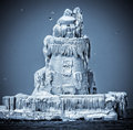
| 01/05/2011 06:24:06 AM |
the lighthouse by tateComment: Glad to see this take the blue. Excellent image with a nice back story. |
| Photographer found comment helpful. |
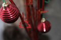
| 01/04/2011 07:57:51 PM |
Santa Clausby dbortoComment: OK - I'm going out on a limb here and letting you know that I initially scored this a '1'. Only fair to let you know why.
First of all I should say that I use the full scale and that I am but one voter with my own expectations and 'luggage'.
I should say that I have a (fairly extreme) prejudice for images of ornaments - particularly figurines, so this was always going to be a hard sell to me.
As you may know, this is my second go at trying to offer a comment on this image. my first comment was over harsh and deserved to be consigned to the bin, so here goes again:
Although I don't have much love for the figurine, the bokeh is particularly well done - it creates a degree of ambiguity in terms of the scale of the figurine. That in itself is worth a bump up the scoring ladder. |
| 01/04/2011 07:53:30 PM |
Shell Vortex!by grgkopanasComment: OK - I'm going out on a limb here and letting you know that I scored this a '1'. Only fair to let you know why.
First of all I should say that I use the full scale and that I am but one voter with my own expectations and 'luggage'.
I should begin by admitting my prejudices - I'm not a fan of image of objects; I can be persuaded if they are exquisitely executed like much of  h2 h2's work but otherwise it is always going to be a hard sell to me.
Here although, the object is pretty - it is really difficult to bring something to the table as a photographer. Macro technique limits the choices you have with the depth of field and with the flat lighting and vanilla processing, it doesn't communicate a sense of you having made any artistic choices.
For me, as a viewer, I like to see some photographic intent, some artistic license - I think that it what is lacking with this image. I hope that makes sense and offers some rationale for a '1' score.
Coming back to add to this. I should've also said that this is of course technically competent; the fact that it is a mismatch for my expectations shouldn't be enough of a reason for me to dish out a 1. Bumping it a bit. |
| Photographer found comment helpful. |
| 01/04/2011 07:50:13 PM |
I See REDby kerirabComment: OK - I'm going out on a limb here and letting you know that I scored this a '1'. Only fair to let you know why.
You may already know that this is my second go at commenting here. My first attempt came across much more harshly than it should.
First of all I should say that I use the full scale and that I am but one voter with my own expectations and 'luggage', consequently my comments are an honest reaction to this image rather than a direct commentary on your work.
Although I do this the narrow depth of field and the POV add a good degree of interest to the image, I find the light coloured background detects from you subject a little and the lack of sharpness and the clipped crop of the foreground ball doesn't give the eye an easy place to settle. Of course this may well be deliberate but for me it is a bit of a mismatch. |
| 01/04/2011 03:05:19 PM |
Girlby zeuszenComment: I would never have tagged this as one of yours. I like its subtlety though. |
| Photographer found comment helpful. |
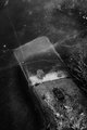
| 01/04/2011 03:04:00 PM |
tentative transformationby posthumousComment: I'm going through the entries, stopping at those images I feel have had the benefit of an unconventional eye and dwelling a little longer to try to see and appreciate what you saw. This is one of those images.
Positives: There are many interesting textures here, but what fascinates is trying to working out how each of the interfaces relate to one another in three dimensions. I suspect we are looking at a object (a sleeper?) that is partially submerged in water; that the water has frozen and now carries some textures (scratches and cracks) of its own. It is difficult to tell though. Your contrast handling and choice of a monochrome presentation ensures that we don't get as much visual information as we might like to work it all out. In that sense the photographic choices you have made have a profound effect on the viewing experience.
I think your choice of aspect ratio works really well and I like how my eye is drawn up to the upper left corner where is meets emptiness and darkness. That seems fitting given the fate of the sleeper. I feel I should comment on the leaf, but it feels irrelevant - I think that is a good thing.
Critical stuff: Not much to say here - perhaps the contrast has made the bottom right corner a bit 'crunchy' for my taste, I much prefer the upper 2/3 of the image.
Overall: A well put together, thoughtful image. |
| Photographer found comment helpful. |
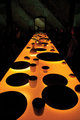
| 01/04/2011 12:49:52 PM |
inner sanctumby oldbimmercoupeComment: I'm going through the entries, stopping at those images I feel have had the benefit of an unconventional eye and dwelling a little longer to try to see and appreciate what you saw. This is one of those images.
Positives : Fascinating scene - difficult to tell whether this is an art exhibit or people sitting down to dinner! I really like the coloration and the lighting glows under the large disks. The back wall texture and coloration is also very interesting as is the arched structure - mirror or opening? Difficult to say. I also like how we can only just discern the faces of the people in the room. Your choice or aspect ratio is bang on the money for this scene too.
Critical stuff: Perhaps I wish the red in the faces was toned down a little?
Overall: A most intriguing image. Bumping from a 6 to a 7. |
| Photographer found comment helpful. |
| 01/04/2011 12:45:01 PM |
|
| Photographer found comment helpful. |
Home -
Challenges -
Community -
League -
Photos -
Cameras -
Lenses -
Learn -
Help -
Terms of Use -
Privacy -
Top ^
DPChallenge, and website content and design, Copyright © 2001-2026 Challenging Technologies, LLC.
All digital photo copyrights belong to the photographers and may not be used without permission.
Current Server Time: 07/23/2026 12:44:15 PM EDT.