|
|
|
Showing 2071 - 2080 of ~5151 |
| Image |
Comment |
| 04/20/2011 12:55:42 PM | Window Flowersby rneurenComment: Greetings from the Critique Club:
First entry eh? Well there's a lot that you've got right here and some stuff that could be a lot better.
The good stuff: your colour picks here are bang on, those reds, oranges and yellows are a perfect match for the challenge. You also used the light really well, it make the flowers glow. Your exposure too is pretty good I think.
The stuff that could be better. Unedited..... never going to cut it challenge-wise unless it is a minimal editing challenge, then it's straight out of the camera for all of us. Here the off verticals cry out to be straightened and your flowers are undersold against a fairly dull backdrop - straighten and crop as a minimum; find the area of optimal interest and crop to that. Also, try to think how this looks on the screen... we only get 800 X 800 pixels to play with so every move from a square crop diminishes what you can show. Now, I definitely not advocating you always enter square cropped images but you should always ask yourself what parts of the image outside of a square crop contribute positively to the impact of the image. Try straightening and then cropping this image to the bottom right corner so that you bottom edge intersects where the shadow meets the edge of the shelf, then the left edge of the image along the line of the edge of the frame just outside the petals of the left flower and then across the top just above the upper flower. I imagine that will make more of what you've got. Or, if you want to keep the context of the window (and I can see how you might, crop it half way between the flower and the top of the image. As you lose height, you'll gain width making the flowers more prominent.
I can think of other stuff I'd do in the edit, but for the most part they require dedicated software - if you don't have any you'll need to get some if you want to approach the quality of the images you see on the front page.
I'll leave it at that for now - good luck with future challenges
Paul |
| 04/20/2011 04:05:20 AM | Miss Daisy and Mr. Beeby allanyComment: Greetings from the Critique Club:
This image scored pretty well in the challenge, largely down to your colours and a most excellent title.
I'm going to be a little harsh in my critique here, so hold onto your hat! I feel it is important to do so because you have nailed the overall composition and some different technical choices would have turned what I think is a poor macro shot into a really good one - you've already done the hard stuff; you deserve a better outcome!
First of all, I don't know how much macro experience you have so I apologise if I'm about to tell you stuff you already know. I've spent hours using my specialist macro equipment and know how hard it is. Technical considerations are so important.
First off, look at your aperture, f/5.6 gives you way too small a depth of field to have any hope of catching the bee, you've given yourself about 5mm of depth of field, anything outside that will be blurred. Nice bee, lovely flowers and what do we get? The bees butt! Something like f/16 on the same shot and I suspect you'd have given us a lot more. I wouldn't advise a much slower shutter speed for this shot, so you may have needed to push the ISO a bit to make this work.
In terms of processing, the highlights on the petals seem to be robbed of detail, I don't know what software you have access to but recovering the highlights would have got you something back here. Also, various filters that enhance tonal contrast would have pulled out extra detail in these areas.
Overall, this is a shot that benefits from very fine composition and colouring but one that could have been a whole lot better with a different set up.
Best regards
Paul Message edited by author 2011-04-20 04:06:48. |  Photographer found comment helpful. Photographer found comment helpful. |
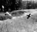
| 04/20/2011 03:48:45 AM | Is there anybody out there?by CrazyDiamondComment: Greetings from the Critique Club:
You came in pretty low in this challenge, I didn't vote in it or even look until now but the quality of the high finishers was very high indeed. With the bar set up there, less special shots were always going to get relegated. Looking up through the field (just above you), there are a number of blurry flowers and objects that are less well executed than your shot, though there are some astonishingly good abstracts down here too.
Let me try to give some feedback on your composition and lighting as requested.
Full length portraits are really difficult, it's human nature to look at the face so placement of the face is tricky - doing it with a tightish crop is never really going to work without great clothes, dramatic (and planned) lighting and a controlled background - none of those elements are here. There was a full length model portrait challenge last summer, look that up and check out the high finishers - you'll see the difference. Abandon full length, crop this below your right elbow and the image instantly gets better, without even trying, your face and hand fall into 'rule of thirds' positions. This alone wouldn't have been enough for you to do well though because of the stuff below.
In terms of lighting, it's well balanced in terms of giving enough light to you, on your face whilst not creating excessively bright highlights elsewhere, but doing this shot in broad daylight like this give you little opportunity to create something effective. Go and have a look at the outdoor daylight portraits in the portfolios of  lovethelight lovethelight and  njsabs njsabs and see how they use the light. Lower sun equals warmer colours right away and if you are skilled in your choices you can use a contre jour technique to add some high interest.
The overall scene does, as one of your commenters suggests, look snap-shot like - the bush adds nothing and it looks like the only reason it is there is because you regarded it as a cool colour to include. Never let the challenge brief dictate the aesthetics of a shot - a beautiful DNMC will always score more that a dull, boring or poorly executed challenge meeting image.
The title adds little, you are clearly looking into a bush, so it doesn't make a lot of sense. Posting an image in a DPC competition is a communication act, it comes with a viewer expectation of story - many (but not all) voters will not tolerate confusion.
I've looked at your portfolio and you macro with bugs or flowers is nicely made and would have done well in this challenge and your photographing photographers entry is quirkily engaging.
Overall, as a capture of a scene it is competent, more so than some of the others in the challenge but as a set of artistic choices that should be more than the sum of the whole, then I think this is much less successful.
I'd love to see you have a go at more self portraits though, perhaps use one of the current challenges to see how you can emulate the work in the portfolios I signposted above?
Paul | | Photographer found comment helpful. |
| 04/19/2011 01:12:02 PM | | | Photographer found comment helpful. |
| 04/18/2011 04:33:55 AM | Inlineby stantheman1313Comment: Greetings from the Critique Club:
This is strong work and for my money the lighting is perfect. Great isolation of subject with due inclusion of that tilted reference plane too - that, by the way is sublimely lit.
Overall composition is very effective and Of course the 1/160 flash sync speed masks a much quicker light source, this has frozen the movement fantastically. The timing of the shot too is highly effective with plenty of air.
Overall, you've left me with little to critique. I'm not sure I'd change a thing.
Paul Message edited by author 2011-04-18 04:52:01. | | Photographer found comment helpful. |
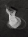
| 04/18/2011 02:54:42 AM | o canadaby posthumousComment: Greetings from the Critique Club:
Another comment from me I'm afraid.
I didn't even cast an eye over this challenge during voting - I knew this was yours as soon as it opened up in the window. As I said in another comment, I think that's a good thing.
What an amazing histogram, even with a peak at 4, you have a second peak at 1! Impressive.
I have to say, I'm at the other end. I love this! Full of whirling life and energy. Your title was just enough to facilitate instant lock on to the image and get a handle on it. That doesn't mean that other images were repressed though. I instantly got echoes of the ocean, the swathes of grass like rolling waves, the tree line becoming the horizon itself while we, on our boat, are tipped at the mercy of the waves.
As a viewer I experienced a similar sensation to that I first received on viewing that painting of Turner's where he had strapped himself to a mast to experience the scene - Snow storm / steam boat??
Disorientation, abstraction, clarity.
Then there's the kit you've used, the way LBs offer up elliptical frothy circles of confusion; here they add to the feeling of water - like sea spray.
As you can see, I like it well enough. I'm sure you don't mind the 1s at all. There may have been a 1 in my score had I voted. Message edited by author 2011-04-18 02:57:38. | | Photographer found comment helpful. |
| 04/18/2011 02:33:08 AM | The Eternal Nonconformistby picjunkieComment: Greetings from the Critique Club:
Seeing this for the first time here - unusually for me I never took a look at this challenge in voting.
I find I like this image, it's more than the sum of it's parts - the high contrast, the degree of tilt, the subject matter,the depth of field, the title all fit together really well and communicate intent.
There is much information lost in the shadows, but it is a testament to your choices that we don't miss it, those swathes of background black communicate enough of the form of the trees behind to set the scene and define the wider environment without robbing any attention from the gravestones.
I look at the tilt and wonder if the eccentric stone should be vertical, I can see that if you rotated the image, you clip some of the bottom of your image and mess up the relationship between the stones, we do need to see it going past the one beyond. I also think a straightened shot would lose some of it's power, the slight off kilter would be an insult to the nonconformist.
Nicely made.
Paul | | Photographer found comment helpful. |
| 04/18/2011 02:22:13 AM | Playby tinkie2010Comment: Greetings from the Critique Club:
I didn't cast an eye over this challenge, so I look here with fresh eyes. If I'd have voted, I'd have been between 5 and 6 and settled on a 6. From your histogram I can see my response would be fairly typical of the way your image was received by the wider voting audience.
You picked up a couple of 1s, I suspect they came from members of the DNMC police who would have looked for a 'proper' horizon and not found one.
For me, I like the simplicity of the shot, it works on that level but in any photographic competition you get judged on your stand-out-from-the-crowdness and pairing a simple shot with quite a flat feel in the post processing is likely to have the opposite outcome. Here the dynamic range of the mid tones and highlights seems quite restricted, we do have deep shadows, but even these are robbed of a little detail.
Given that you did this with Silver Efex (first version), I think using a less tinted tone (the first coffee one- number 7??), moving up the highlight slider, increasing the strength of the vignette (slider down) and then removing it from her with control points and then adding some structure into her eyes, tip of nose, mouth and hands would have helped to draw the eye to her.
At the moment the higher contrast grass just ahead of her catches and pulls the eye.
I don't know if you smoothed the skin or decreased structure in the skin (or even if you used the smooth skin preset) but I always take care to preserve those areas I mention above. Dropping control points on each, brightening them and adding structure with a very small effect radius is almost a default in my work flow. With portrait work, I tend to emphasise the eyes just as much as I can without them looking like they've been processed. I don't always get in right but I'm getting better.
Overall this is a nice picture, the tilt as used makes a great contribution to the overall composition but I think your processing has placed the emphasis slightly away from where you need it to be.
Paul | | Photographer found comment helpful. |
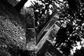
| 04/17/2011 02:24:10 PM | Thou Art the Potter.... I Am the Clayby pmichaudComment: Greetings from the Critique Club:
I should say up front, I did vote on this image and my vote is one of your lower ones. My views are therefore not representative of the wider audience and I note that you received many positive comments and three 10s.
For me, though this is certainly an interesting find with great textures and interesting colours, I don't find it 'created' enough for this challenge; I don't see much of the photographer here. I think that's less of a problem for pure abstracts that communicate the intent of the photographer through constructed form and colour; but this shot falls short of pure abstract and instead we see enough to discern its true form. This creates an impression of reliance, even dependence on the form of the tree for your impact rather than crafting your own impact from the choices you have made.
Is the scene well-captured? Certainly. Is it an interesting piece of wood? Of course. Is it an interesting photograph? Not to me I'm afraid - but as I said, I'm definitely non-typical of this image's voting audience. An outlier.
Overall, is it a successful image - yes it is, just look at that average vote from those who commented: 7.6667. All we can ask with our images is that we connect with others - and you certainly did that. Well done.
Paul
| | Photographer found comment helpful. |
| 04/17/2011 01:10:59 PM | Something beautifulby candyyamComment: Greetings from the Critique Club:
I think this may be the same model from your recent Librodo entry so you already know I'm a fan and of course she looks lovely here. This images doesn't have the power your 'Woman' image though and doesn't seem to be finished to the same standard. I can see how the shelf is horizontal but your POV has introduced some geometric distortion of the frame which does detract from the image.
Personally, I do like the bright light and feel it could have been emphasised even more. I'm not a fan of your crop though - your model is too good to make her this small on the screen to include some cushions...!
The critical question for this image is whether it fits the 'Fine Art' genre - for me, I'm not sure it did; it may have been effective within a wider Free Study brief but for me lacks the imagination that underpins much of the Fine Art work.
However, there's no denying that this is an effective image in a less loaded context.
Paul |
|
Showing 2071 - 2080 of ~5151 |
Home -
Challenges -
Community -
League -
Photos -
Cameras -
Lenses -
Learn -
Help -
Terms of Use -
Privacy -
Top ^
DPChallenge, and website content and design, Copyright © 2001-2026 Challenging Technologies, LLC.
All digital photo copyrights belong to the photographers and may not be used without permission.
Current Server Time: 07/21/2026 04:17:59 PM EDT.
|