|
|
|
Showing 2061 - 2070 of ~5151 |
| Image |
Comment |
| 04/25/2011 01:18:51 PM | Warmthby equanimityComment: Greetings from the Critique Club:
Well done for entering your first image in a DPC challenge. I like idea of this image, your notes explain your intention well. The idea is a third of the job with the other two thirds being execution and presentation.
Execution: Focus-wise, this image struggles - I'm not sure what's caused this lack of focus but you've missed it by quite some margin. Working with an aperture of f/5.6 doesn't give you a huge depth of field at short object to camera distances so the tolerance for missing the focus is small.
I'm not sure why you are set to 1600ISO, although I can't see any evidence of noise, with a shutter speed of 1/2500, you have plenty of margin there to bring both down.
Compositionally, the basics are there but as you commenters have said either include all of the flower or go closer; here it just looks like a petal has been carelessly clipped. I suspect that you might have been inside your lens's minimum focussing distance so pulling back a bit would help with composition and focus.
Exposure wise it's tricky high contrast lighting and although it isn't optimal on the screen, I don't think you're so far away that you couldn't pull it back in software.
Presentation: (Post processing): Not sure what tools you have access to here but doing some highlight recovery and adding some tonal contrast to the petals would help the overall quality of the image. Having said that, with an image this unsharp this alone wouldn't make much difference - you need to raw material first.
Good luck with your next entry.
Paul |
| 04/25/2011 12:47:57 PM | Palm trees at sunsetby topdogComment: Greetings from the Critique Club:
Well, you certainly made an impact with this one and actually I think the overall scene you shot was a good choice for this challenge. I can even buy the centred composition with the trees eclipsing the setting sunlight.
However, your processing is a different matter entirely - sure it's obvious that this must've been the look you were going for but that doesn't explain the choice - the end result is ugly and more than slightly ruinous of your nice scene. I think people have little tolerance for seeing good shots ruined.
Your other comments are right, halos and fringing are pretty much pathognomonic of badly applied HDR. Having made that choice, you're living with the results.
Of course, if you like the look then carry on but if you want higher scores you'll need to accept that your images have an audience other than yourself and unlike you they do get to vote on your images.
Now, there is a whole subculture on DPC of supporting alternative and disruptive images and playing to that crowd can be fun but even there, with this shot - you'll struggle to win admirers.
However, as I said before - if you're just shooting for yourself then carry on, that's admirable in itself and after all, it is your image.
Paul |
| 04/25/2011 09:53:08 AM | embroideryby mitalapoComment: One of my highest scoring entries - thanks for offering up such a lovely image. |  Photographer found comment helpful. Photographer found comment helpful. |
| 04/25/2011 09:52:16 AM | Wonderby UrfaKComment: I'm not a fan of the subject but I suppose such things go on.
However, I think this is one of the stronger entries. Nicely done. | | Photographer found comment helpful. |
| 04/25/2011 09:50:50 AM | | | Photographer found comment helpful. |
| 04/25/2011 04:34:17 AM | The Netby MArteSiComment: Greetings from the Critique Club:
Congratulations on your strong (and well deserved) finish. There area number of elements in this photograph that conspire to make it highly successful. The colours obviously hit the mark for this challenge but I think the strong contrast also contributes a great deal to the overall image; throw in the great DOF / focus and the leading lines and we have a winner (well 4th place anyway!).
My favourite part of the image is the play of shadows on the main column but I also like how purposefully placed the confluence of structures is in your frame, right on a ROF intersection. Communicates intent; I like that.
Overall there isn't much that I can suggest to improve this - I think it's pretty much an optimal edit for this scene. | | Photographer found comment helpful. |
| 04/22/2011 03:29:22 AM | Three in a basketby galatia_nComment: Greetings from the Critique Club:
Sure, there are some warm colour here but beyond that baseline appeal, there is quite a bit that is problematical with this image.
Firstly the unsharpness; outside of the challenges and styles of execution that embrace blur, DPC is fairly intolerant of unsharpness images. Camera movement unsharpness like this is the worst received and most easily fixed, especially when I see you shot this at f/11 and ISO 400 - you have plenty of room for change in those settings not to have to live with 1/5 sec exposure times.
Additionally, I think your composition is not well suited to the subject; the crop sides of the basket constrict the image and have the effect of funnelling the viewers gaze upward, like squeezing toothpaste - our eyes end up looking at the dull background of out of focus plate and chopsticks.
Much better I think to have opened your aperture wide open, use a landscape orientation and offer a lower depth of field of the food and basket. I would have pulled back a little too and included the sides of the basket.
Having said all of that, although this would have addressed the technical short comings of the image, the overall subject matter of food seldom does well outside of food-focussed challenges; pictures that create stories tend to do better. Some users like  h2 h2 can manage to make things and objects very interesting but do so with careful planned lighting and extraordinarily well executed pre and post technicals.
Overall, I can see what you were going for but the image is let down by technical choices and given the type of image, it needed all the help it could get to be successful in this challenge.
Paul | | Photographer found comment helpful. |
| 04/22/2011 03:10:59 AM | Golden Hourby hstegComment: Greetings from the Critique Club:
Technically, this is a well executed image that reflects good photographic choices; you've shot wide open and looking at your ISO and shutter speed I'm guessing you were out at 200mm with your zoom. This has allowed you to limit your depth of field and isolate your subject from the background (as much as possible). I like how the focus is nailed on the eyes and the front paws. I'm less keen on the highlight on the back leg, I don't mind blown highlights but this one stands in over-stark contrast to the rest of the image. Perhaps you could have used a highlight recovery tool or even used a partial opacity clone brush sourced from the adjacent fur to take it down a little.
Artistically, I like your coloration but I think the overall composition is a little problematical, like many full length portraits (including people), having the face in the top centre position doesn't offer the best visual balance, though I've tried cropping this in various ways and losing the whole dog doesn't seem to yield a better picture, so given the shot you got, this is probably an optimal composition.
Overall this is competent work but in a challenge with some very high quality at the top end, the overall relatively low visual interest in this image and led it to be placed rather lower than it's absolute quality might deserve.
Paul | | Photographer found comment helpful. |
| 04/21/2011 12:23:32 PM | Aussie Wash Downby dazza17Comment: Greetings from the Critique Club:
This is a superb shot - it communicates warmth very effectively, the deep blues don't detract from that effect at all. I think the figure brings a lot of life to the image and the city on the horizon makes this pretty special. The time of day you shot this is just perfect, the long shadows work really well.
I do wonder if including the sun and making this a contre jour shot may have worked too, though of course you may have just lost all of your contrast.
I think your overall composition, sharpness, coloration are all spot on - leaves me with very little to critique.
With your eye for an image, your first ribbon can't be too far away.
Paul |
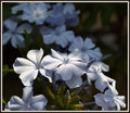
| 04/20/2011 02:10:22 PM | Beauties in Blueby mrjssimsComment: Greetings from the Critique Club:
This looks like your first entry. Welcome.
There's a lot right with this image, the overall composition and the interesting-enough light with the right exposure to give your shadows a bit of punch.
I think I disagree that you've nailed the focus, it seems a little soft to me - I think optimal sharpness should fall at the centre of the centre right flower.
I think the suggestion to boost the blue a little might be a good idea, though I wonder if the delicacy of your image would be lost.
Like many, I don't really care for borders, but you've picked an effective one here.
Overall this is a nicely composed delicate image.
| | Photographer found comment helpful. |
|
Showing 2061 - 2070 of ~5151 |
Home -
Challenges -
Community -
League -
Photos -
Cameras -
Lenses -
Learn -
Help -
Terms of Use -
Privacy -
Top ^
DPChallenge, and website content and design, Copyright © 2001-2026 Challenging Technologies, LLC.
All digital photo copyrights belong to the photographers and may not be used without permission.
Current Server Time: 07/21/2026 06:29:08 PM EDT.
|