| Image |
Comment |
| 04/07/2013 07:47:21 AM |
Sunday morningby odriewComment: This is an amazingly tender and poignant shot. My only 10 of the challenge.
Bold and full of life.
Brilliant. |
 Photographer found comment helpful. Photographer found comment helpful. |
| 04/07/2013 05:33:36 AM |
Autum Sunflowerby ArnaMarieComment: I think that if you shoot flowers 'wide open' to get a narrow depth of field, it is critical to get a pleasing contrast profile in the image. Here I think your subject doesn't help you too much in this regard.
(I'm offering some critique based on your implicit request for it in the welcome centre) |
| Photographer found comment helpful. |
| 04/07/2013 05:29:44 AM |
|
| Photographer found comment helpful. |
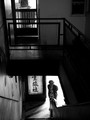
| 04/07/2013 04:01:36 AM |
afternoon teaby instepsComment: 
Awarded for the March 2013 Free Study, for the reasons identified below.
This image has caused me to stop and pay attention. That means it is in my 7-10 voting band. (Voted earlier)
Additionally, it is highly interesting/eclectic meaning it keeps me here long enough to offer a longer comment and a vote of 8 or more.
This is one of my 10s - I like it very much. Furthermore I think it enriches the DPC collective portfolio. Put simply, I wish we saw more stuff like this. Let me tell you why it pushes all the right buttons for me:
1. My word, what a composition - the structural elements of the photograph, the interplay of shadow and highlight is just perfect.
2. The environmental contextualisation is fantastic. As a viewer, we get a real sense of where we are in the building, it's structure - how the room beyond the upper door feels, how it is lit - like we know it. You've communicated a familiarity of the space despite it being strange to us. It's like we're piggy-backing on someone else's cognition - someone who feels at home here.
3. The woman downstairs, she is interacting with us but remains apart as an observer. But, again there is a degree of familiarity communicated through the scene. A palpable sense of belonging of each and every facet of the image - including our own viewpoint.
Overall, this is one of the best photos I've ever seen. Takes my all time favourite spot on DPC - or at least ties with  nixter nixter's headless swimmers. |
| Photographer found comment helpful. |
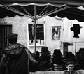
| 04/06/2013 05:46:29 PM |
chapeau basby jagarComment: This image has caused me to stop and pay attention. That means it is in my 7-10 voting band. (Voted earlier)
Additionally, it is highly interesting/eclectic meaning it keeps me here long enough to offer a longer comment and a vote of 8 or more.
This is one of my 10s - I like it very much. Furthermore I think it enriches the DPC collective portfolio. Put simply, I wish we saw more stuff like this. Let me tell you why it pushes all the right buttons for me:
1. A seemingly everyday scene but with an 'aha' moment. The boy bottom right is fabulous.
2. The bold contrast and deep blacks - many (including me) would have been tempted to bring out some shadow detail. You were right not to - the inky blacks add drama.
3. The head silhouette on the right is almost surreal juxtaposed against the white of the van.
4. The poster of the model adds a touch of whimsy and grounds the image with a modern context.
5. I really like the glow too.
French title aside, the glowing monochrome has a jagaresque quality about it.
Great stuff. |
| Photographer found comment helpful. |
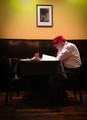
| 04/06/2013 01:07:58 PM |
Dinner for Oneby YandrosxxComment: This image has caused me to stop and pay attention. That means it is in my 7-10 voting band. (Voted earlier)
Additionally, it is highly interesting/eclectic meaning it keeps me here long enough to offer a longer comment and a vote of 8 or more.
This is one of my 9s - I like it a lot. Furthermore I think it enriches the DPC collective portfolio. Put simply, I wish we saw more stuff like this. Let me tell you why it pushes all the right buttons for me:
1. Gorgeous colours - that red of the hat and the yellow paint were made for each other - especially in the warm light you have captured it.
2. The guy himself - what an interesting chap.
3. The strong contrast - I like the blocky blacks and the white of the menu(?)
4. The precise composition - this looks optimally framed to me.
Overall, a fine shot that is more than the sum of its parts. |
| Photographer found comment helpful. |
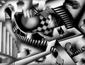
| 04/06/2013 07:48:16 AM |
moving the floorby cutoutComment: This image has caused me to stop and pay attention. That means it is in my 7-10 voting band. (Voted earlier)
Additionally, it is highly interesting/eclectic meaning it keeps me here long enough to offer a longer comment and a vote of 8 or more.
This is one of my 8s - I like it. Furthermore I think it enriches the DPC collective portfolio. Put simply, I wish we saw more stuff like this. Let me tell you why it pushes all the right buttons for me:
1. Normally a photo of somebody else's art wouldn't do it for me - but here, your contribution is additive and inspired. The positioning of the hands and the associated blur is confounding and fascinating.
2. If I'm right about how you've done this - you've had a very small area to control and influence - a micro-frame within a frame. You 'work it' wonderfully.
3. The juxtaposition between the edge to edge sharpness and the aberrant blurry hands offers surprising dynamism.
Overall: Clever. |
| Photographer found comment helpful. |
| 04/06/2013 07:43:18 AM |
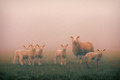
Looking at eweby P-A-U-LComment: This image has caused me to stop and pay attention. That means it is in my 7-10 voting band. (Voted earlier)
Additionally, it is highly interesting/eclectic meaning it keeps me here long enough to offer a longer comment and a vote of 8 or more.
This is one of my 8s - I like it. Furthermore I think it enriches the DPC collective portfolio. Put simply, I wish we saw more stuff like this. Let me tell you why it pushes all the right buttons for me:
1. Wonderful pink and green hues - like those movies that are stylistically graded.
2. Engaging subjects - cute but not sugary.
3. Lovely composition - I particularly like where the horizon is in relation to the frame.
4. The grain/noise. Masterful.
5. The slight glow - a good processing match to the fog.
A photo that is more than the sum of its parts. Well played. |
| Photographer found comment helpful. |
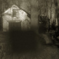
| 04/06/2013 07:40:49 AM |
timeby jmritzComment: This image has caused me to stop and pay attention. That means it is in my 7-10 voting band. (Voted earlier)
Additionally, it is highly interesting/eclectic meaning it keeps me here long enough to offer a longer comment and a vote of 8 or more.
This is one of my 8s - I like it. Furthermore I think it enriches the DPC collective portfolio. Put simply, I wish we saw more stuff like this. Let me tell you why it pushes all the right buttons for me:
1. The gloomy light and complementary blur and glow really go together to offer up a very particular mood.
2. The greenish brown tones are perfectly matched to the scene.
3. Despite the gloom, there is great light here.
4. The intriguing foreground block of shadow - like a dark apparition or a malevolent artefact appearing in the photographs of a 1970s horror movie.
Really nice work. |
| Photographer found comment helpful. |
| 04/06/2013 06:03:16 AM |
oh, spare meby mariucaComment: This image has caused me to stop and pay attention. That means it is in my 7-10 voting band. (Voted earlier)
Additionally, it is highly interesting/eclectic meaning it keeps me here long enough to offer a longer comment and a vote of 8 or more.
This is one of my 8s - I like it. Furthermore I think it enriches the DPC collective portfolio. Put simply, I wish we saw more stuff like this. Let me tell you why it pushes all the right buttons for me:
1. Great capture of the bleakness of the snow - before it is pretty.
2. The dainty window display almost mocking the passers-by.
3. The weirdness of the police trestles.
4. The blurry person going about their business.
Very effective. |
| Photographer found comment helpful. |
Home -
Challenges -
Community -
League -
Photos -
Cameras -
Lenses -
Learn -
Help -
Terms of Use -
Privacy -
Top ^
DPChallenge, and website content and design, Copyright © 2001-2026 Challenging Technologies, LLC.
All digital photo copyrights belong to the photographers and may not be used without permission.
Current Server Time: 06/23/2026 11:28:13 AM EDT.