| Image |
Comment |
| 08/07/2006 06:18:46 PM |
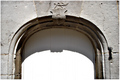
Royal entranceby nordicgirlComment: From the Critique Club:
This looks like a very interesting building and I would love to see it. I love architectural photography! You have a nice composition here. I like the curve of the door frame contrasted with the straight lines in the wall.
There are a couple of things that jump out at me that would improve this shot dramaticaly. The first thing that I noticed is the lighting is VERY harsh. It looks like you took the shot when the sun was very high in the sky. If this was taken earlier or later when the sun was at a lower angle you would have more 'depth' in the shot. The detail work of the door and above the door would look more dimensional. The way it is shot here looks very flat. You are also overexposed on the door. This results in a loss of the detail. It also looks like your focus is a touch off. This will almost always result in a lower score.
If you can go back to this scene at a more photo friendly time of day, this could end up being a very nice shot to redo!
Yours
TC |
 Photographer found comment helpful. Photographer found comment helpful. |
| 08/07/2006 12:15:24 AM |
|
| Photographer found comment helpful. |
| 08/06/2006 10:13:03 PM |
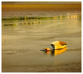
Cedar Strips Gold Viewby ColeyComment: From the Critique Club:
I'm gonna be using my what I like/don't like format for this shot so here goes!
What I like: I really like the overall compostition of this. You have some great lines (the boat) leading you into the shot. I really like the contrast of the gold boat and the blues and greens of the background. I really like all the parallel lines you have also. These are in the boat and extend to the shoreline in the bg. Even the shadow in the front of the boat adds to the feeling of the shot! I can almost hear the waves hiting the sides of the boat.
What I don't like: You have very cool lines that lead into the shot, however when you follow them out into the background, there really isn't anything there to land upon. It's kinda like a diving board over an empty pool to make up an expression on the spot... Your horizon also looks a tad crooked but making it straight would ruin the symetry of the boat at the corners.
To summarize, if there were something in the distance to see when you followed the lines of the boat then this shot would be the bomb!
Hope you find something usefull here.
yours
TC |
| Photographer found comment helpful. |
| 08/06/2006 04:38:19 PM |
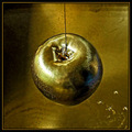
The touch of Midaby Rino63Comment: From the Critique Club:
This shot begs for the what I like/don't like treatment so here goes.
What I like: This shot has a very earthy feel to it because of the subdued green color scheme. The lighting is very nice. You have all the important parts lit in a very interesting way which helps to give depth to the shot and draw the focus to the intent of the shot. The background though cluttered a little adds to the earthy feeling of the shot without being really distracting. You have a shot that tells a story and that is not always easy to do!
What I don't like: Your models finger is not the most attractive for the shot. A little hand lotion would help to smooth out the cracks in the finger. I would really like to see just a touch more of the leaf in focus but that is kind of a nit picky thing. I personally would probably have lightened it up just a touch also.
All in all a very nice shot. I'm surprised that it finished at only a 5.2.
Yours
TC |
| Photographer found comment helpful. |
| 08/04/2006 06:19:14 PM |
Once upon a time... by Jaded_HousewifeComment: Originally posted by drewmedia:
Wow -- great shot. This image terrifies me =) |
LOL I'll second this and put it on my wallpaper just to keep me honest! Congrats.
TC |
| Photographer found comment helpful. |
| 07/30/2006 11:24:56 PM |
Sunburstby levyj413Comment: From the Critique Club:
I need to preface these comments with the fact that I'm not a huge fan of abstracts. I more of a traditionalist as a photographer. I do get the appeal of this form, it just ain't my cup of tea so to speak. That said...
What I like: I like the repetition of shapes that you have in this image. The overlapping squares and circles give this a neat appearance. I like how you have the wholes in the cheese almost overlapping so that you have different shadings showing through. I like the dark circle in the center of the cheese. I would never have guessed that you added a tomato to give it this effect. I also like the tones that you have achieved.
What I don't like: You said it yourself, it's an abstract, but it isn't all that attractive. This looks more like a study shot to me. You know, the kind of shot that you play around with taking many different snaps just to see what you end up with. As a study it is very interesting. As an abstract, not so much. You have a lot of noise in this. This is probably a limitation of your camera at such a slow shutter speed. In some shots it would help. In this one, I'm not sure that it adds anything. I'm not sure I like the tones that you have achieved. I know this sounds contradictory, but at first I really liked the red's, but after looking at it longer and knowing that it is cheese...
Hope something here is useful.
Yours
TC |
| Photographer found comment helpful. |
| 07/30/2006 10:18:32 PM |
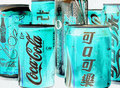
Multicultural City of Cokeby LERtasticComment: From the Critique Club:
First of all, let me preface by saying that I'm not a big fan of abstracts. I understand their appeal, they're just not my cup of tea. That said...
This shot, though kinda cool, just doesn't look like an abstract to this viewer. I love the tones that you achieved by inverting the shot but inverting doesn't equal abstract. I think that and the fact that Coke really ain't a food is what took away from your score for this challenge. Now if this was a beverage challenge or a blue (green? I have some color issues) challenge, this would be the bomb!
Yours
TC |
| Photographer found comment helpful. |
| 07/30/2006 04:19:58 PM |
|
| Photographer found comment helpful. |
| 07/30/2006 03:47:11 PM |
|
| Photographer found comment helpful. |
| 07/30/2006 03:46:09 PM |
Golden Girlby PhilosComment: This may work nicely at 8x10, but at this resolution, you need more girl and less field...
TC |
| Photographer found comment helpful. |
Home -
Challenges -
Community -
League -
Photos -
Cameras -
Lenses -
Learn -
Help -
Terms of Use -
Privacy -
Top ^
DPChallenge, and website content and design, Copyright © 2001-2025 Challenging Technologies, LLC.
All digital photo copyrights belong to the photographers and may not be used without permission.
Current Server Time: 08/25/2025 12:23:37 AM EDT.