| Image |
Comment |
| 12/05/2003 08:46:47 AM |
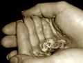
... to drinkable water whenever I want it... by kosmikkreeperComment: On a personal level, I think that this is a little deep for the current challenge, but I don't know where you are from or what your culture does for this holiday if anything... I can't fault the image too much though. You have a couple of spots in the bakground above the right hand thumb. You managed to light it up nicely without getting hardly any overexposure (KUDOS for that alone. I'm trying to get through my lighting issues.) Cropping is a little tight (is this straight out of camera?) Your focus is damn near perfect without being over sharp and I LOVE your choice of a sepia style here. Nice! Gotta be top 5.
TC |
 Photographer found comment helpful. Photographer found comment helpful. |
| 12/04/2003 10:18:47 PM |
Have and Have Notby dehalanComment: Great expression! Nice lighting, but you could use a touch of fill on his left shoulder. The kid looks like the 'not', but the 'have' ain't got enough to make this shot. Also I don't comment often on borders, but the triple one here IS distracting.
TC |
| Photographer found comment helpful. |
| 12/04/2003 10:15:48 PM |
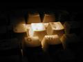
Rebusby jvanderauComment: Funny! And tricky. Unfortunately you don't have anywhere near enough light. You are soft on focus, dull on color and flat. All can be fixed with LIGHT!
TC |
| Photographer found comment helpful. |
| 12/04/2003 10:12:26 PM |
|
| Photographer found comment helpful. |
| 12/04/2003 10:10:51 PM |
75 cents unopened, 5 cents opened.by faidoiComment: Nice shot. Good colors. The DOF is a touch shallow for my taste for this type of shot. Also the multiple shadows detracts. Oh and I'm a coke drinker! :-P
TC |
| Photographer found comment helpful. |
| 12/04/2003 10:09:20 PM |
|
| Photographer found comment helpful. |
| 12/03/2003 11:15:02 PM |
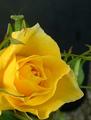
Peek-a-Boo!by trainComment: From the Critique Club
I don't know what I can say about this shot that the score and placing don't already say!
The colors here are nice and vivid. Lovely yellows and complimentary greens! A nice amount of negative space in the upper right corner.
At first I didn't like the crop. I thought at first that the insect (the real subject of the shot) should be more prominent, but the more I look at it the more I wouldn't want it changed even the slightest. I would even go as far as to say that the cropping is brilliant!
Now that challenge is over the only things that I would change is to get rid of the dull green behind the mantis and the dull grey in the bottom right corner. Both are slightly distracting, but looking at your score I would have to say that neither are too distracting...
This shot does prove my point that there is at least a small element of chance in great photography. One awesome shot!!!
Yours
TC |
| Photographer found comment helpful. |
| 12/03/2003 10:10:14 PM |
|
| Photographer found comment helpful. |
| 12/03/2003 10:08:21 PM |
Temptationby KINGComment: I can handle the person in the shot (though I like the building better by itself), but the branch on the right is way distracting. It looks unreal. Did you use an on board flash? Also the church is a touch tilted in frame. Otherwise a very nice shot!
TC |
| Photographer found comment helpful. |
| 12/03/2003 06:14:58 PM |
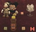
Money Makes the World Go Roundby GPComment: I don't know what you're trying to say with this image. I can't seem to make the title fit it. It's a nice composition though. You do have some exposure issues and it's a little grainy.
TC |
| Photographer found comment helpful. |
Home -
Challenges -
Community -
League -
Photos -
Cameras -
Lenses -
Learn -
Help -
Terms of Use -
Privacy -
Top ^
DPChallenge, and website content and design, Copyright © 2001-2025 Challenging Technologies, LLC.
All digital photo copyrights belong to the photographers and may not be used without permission.
Current Server Time: 08/07/2025 01:02:59 AM EDT.