| Image |
Comment |
| 06/28/2006 09:49:38 PM |
|
 Photographer found comment helpful. Photographer found comment helpful. |
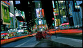
| 06/26/2006 07:17:33 PM |
Color wheelby jaxedComment: I don't know why I like this one so much. I'm not a fan of abstract type images but this one works very well at least for this voter...
TC
Edit to add... Just as I clicked post, I noticed that your border is not even... |
| Photographer found comment helpful. |
| 06/26/2006 07:15:40 PM |
Break 'em!by jdannelsComment: Sweet! I just wish more of the model were in focus then this would be perfect!
TC |
| Photographer found comment helpful. |
| 06/26/2006 07:13:56 PM |
|
| Photographer found comment helpful. |
| 06/25/2006 11:23:13 PM |
And the Light Emerged from His Handby palmeroComment: From the Critique Club:
What I like: I love how you have combined breaking the rules with following the rules. You have a great third line with your model (youself) on the rightmost vertical third. You broke the rules by putting your horizon right on the center horizontal line. This works very well! Good tones in the sunset.
What I don't like: This shot is extremely contrasty! I would love to be able to see more detail in the horizon line instead of the almost solid black. You're highlites are almost blown out while your shadows are almost completely black. I wanna see what is there but it ain't there. Nothing here seems to really be in focus. It might be, but it don't look like it is. This is part of the downfall of such a harsh backlighting. It also (the backlighting) makes it look oversharpened.
Why didn't it score better? This challenge was about shadows. You have shadows, but they are overwhelmed by the darkness of the silhoutte of the background. The first thing I thought when I saw this shot wasn't shadow but glowing silhouette of the subject. If you look at the higher scoring shots in this and the other shadow challenges, you will see that the shadow plays a much more prominent role in the shot.
Hope this helps,
TC |
| Photographer found comment helpful. |
| 06/25/2006 10:21:43 AM |
A shadow of meby sarsonukComment: From the Critique Club:
Though this shot fits the challenge perfectly well, I believe that it suffers from a lack of an interesting subject. There is nothing in the shot that can hold your eye and keep you interested. There are no compositional elements that can take the place of an interesting subject. All there is is some harshly lit sand and the shadow. There are some features in the sand that could help the shot in different lighting. The smooth rolling textures at the top or the roughed up textures at the bottom. However they need the nice lighting that comes from early morn or late evening light. Another thing that may have helped this shot would have been to make the shadow more interesting. Not just you standing there taking the picture. Perhaps you sitting on the beach or in a running pose. Something to take the shot to the next level.
I have many shots in my port from challenges that even though they met the challenge perfectly scored pretty low. Sometimes we have to be able to look through the challenge description and ask ourselves does this photo stand on it's own...
Yours
TC |
| Photographer found comment helpful. |
| 06/21/2006 04:56:28 PM |
|
| Photographer found comment helpful. |
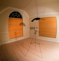
| 06/11/2006 07:58:30 PM |
"L" Ghostby srdanzComment: This is an interesting effect. The wide lens that you used makes the image look bowed. This makes the crop look like it bulges at the top and sides! Great optical illusion.
TC |
| Photographer found comment helpful. |
| 06/11/2006 07:56:38 PM |
|
| Photographer found comment helpful. |
| 06/11/2006 07:56:19 PM |
|
| Photographer found comment helpful. |
Home -
Challenges -
Community -
League -
Photos -
Cameras -
Lenses -
Learn -
Help -
Terms of Use -
Privacy -
Top ^
DPChallenge, and website content and design, Copyright © 2001-2025 Challenging Technologies, LLC.
All digital photo copyrights belong to the photographers and may not be used without permission.
Current Server Time: 08/25/2025 08:30:29 PM EDT.