| Image |
Comment |
| 01/01/2009 10:12:34 AM |
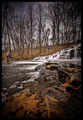
Fall's Catchby NeilComment: I would have composed the shot more to the right if possible because I can't really tell what the person in the shot is doing, and I find the leaves in the foreground far more interesting. |
 Photographer found comment helpful. Photographer found comment helpful. |
| 01/01/2009 10:05:46 AM |
|
| Photographer found comment helpful. |
| 01/01/2009 10:04:06 AM |
|
| Photographer found comment helpful. |
| 01/01/2009 09:59:12 AM |
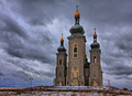
Sanctuaryby PhotologistComment: I like the position of the building against the sky. The blue band on the bottom of the sky is a little off for me though. |
| Photographer found comment helpful. |
| 01/01/2009 09:56:24 AM |
|
| Photographer found comment helpful. |
| 01/01/2009 09:55:06 AM |
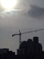
Building Progressby binsurfComment: I didn't score this very highly because: 1) The sun is overexposed. I would have cropped it off. 2)The edge of the crane is cropped off. I would have framed with more space on the right. 3) The building looks like it may have some interesting lines but it's too dark to see them. On the other hand, I think the building might make a good silhouette, but you might have to take the shot when the sun was lower in the sky. |
| Photographer found comment helpful. |
| 01/01/2009 09:42:37 AM |
She Sells Sea Shellsby fldaveComment: This is the kind of shot that I would take, but they don't seem to do too well on DPC. I think I know what you were trying to accomplish. I would be more engaged with the shot if one of the shells in the foreground was in focus and well lit. Good luck. |
| Photographer found comment helpful. |
| 01/01/2009 09:35:20 AM |
|
| Photographer found comment helpful. |
| 01/01/2009 09:32:37 AM |
gone fishin'by MichaelCComment: Did you do the colours like this on purpose? I would have tried it in black and white or sepia or duotone. Love the sky, btw. |
| Photographer found comment helpful. |
| 01/01/2009 09:25:52 AM |
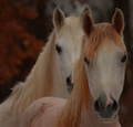
Mother and Daughterby sfmorrisComment: I'm not usually a fan of photos of horses, but the way their heads are positioned make this interesting for me. |
| Photographer found comment helpful. |
Home -
Challenges -
Community -
League -
Photos -
Cameras -
Lenses -
Learn -
Help -
Terms of Use -
Privacy -
Top ^
DPChallenge, and website content and design, Copyright © 2001-2025 Challenging Technologies, LLC.
All digital photo copyrights belong to the photographers and may not be used without permission.
Current Server Time: 08/04/2025 06:58:40 PM EDT.