| Image |
Comment |
| 01/22/2009 08:54:19 PM |
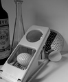
Still life, San Fransicoby hajekaComment: While I give you credit for replicating his still life image, the challenge called for a photo "in the style of Ansel". I cannot think very highly of a "copycat" image, when there were so many other options for the challenge. Maybe if you had adjusted the darkness/contrast, the image would be a bit more powerful. |
 Photographer found comment helpful. Photographer found comment helpful. |
| 01/22/2009 08:50:06 PM |
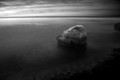
Lonely Islandby jumboshrimpComment: Great overall story here, the mood really works for me. I like your perspective. The contrast/lighting is perfect. |
| Photographer found comment helpful. |
| 01/22/2009 08:45:42 PM |
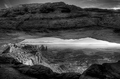
Mesa Arch Morning by rjksteschComment: The only image I gave a 10 in this challenge. Awesome perspective, just an overall amazing photo. |
| Photographer found comment helpful. |
| 01/21/2009 08:58:58 AM |
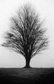
hello dpc friendsby cmtcComment: Definitely wish you had not centered the tree. Otherwise, the tones/mood is great. |
| Photographer found comment helpful. |
| 01/20/2009 04:20:46 PM |
|
| Photographer found comment helpful. |
| 01/20/2009 03:04:46 PM |
Keswick Illustrated: Physical Appealby jessy_pesceComment: Did you notice the penis on the wall in the back? Honestly, I see the "contrast" that you may have been going for here: pretty, clean cut girl in a grungy atmosphere. IMO, its too much contrast. I feel you would have done her more justice with a plain black background, a bed, etc... |
| Photographer found comment helpful. |
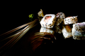
| 01/14/2009 08:29:46 PM |
Simply Simpleby JulietNNComment: The lighting is slightly too much here. I feel like I am not seeing enough of the sushi to really gauge the image. The setup is awesome, and the lighting is nice, but I want to get a better look at the food. |
| Photographer found comment helpful. |
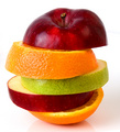
| 01/14/2009 06:13:06 PM |
Fruitby alanfreedComment: Great setup, great lighting, very creative idea. Good job =) |
| Photographer found comment helpful. |
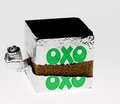
| 01/14/2009 06:12:23 PM |
Stock (Cube) Photo!by PaulComment: Very original idea. The lighting is a tad to bright for my taste, but barely. Im just nitpicking at a great image. I love how you tore the wrapper ever so slightly, while still leaving the "OXO" label. Excellent job. |
| Photographer found comment helpful. |
| 01/14/2009 06:10:09 PM |
Well Seasonedby giosv5Comment: I really like this image. The colors really make the picture, and it's simple, yet good. 7 |
| Photographer found comment helpful. |
Home -
Challenges -
Community -
League -
Photos -
Cameras -
Lenses -
Learn -
Help -
Terms of Use -
Privacy -
Top ^
DPChallenge, and website content and design, Copyright © 2001-2025 Challenging Technologies, LLC.
All digital photo copyrights belong to the photographers and may not be used without permission.
Current Server Time: 08/05/2025 04:53:04 AM EDT.