| Image |
Comment |
| 03/02/2009 11:05:28 AM |
Minimalism.by GenrOneComment: I think this could be a lot sharper, it feels grainy to me. I also find the shadow distracting. |
 Photographer found comment helpful. Photographer found comment helpful. |
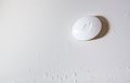
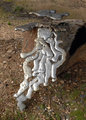
| 03/02/2009 11:01:40 AM |
Vegetative Stateby mitalapoComment: Overall, I think that if the exposure would have been higher, I think this would have scored better. I also don't think it's that appealing of a subject by itself. But, I think it would be more appealing, at least for this challenge, if it were higher key. |
| Photographer found comment helpful. |
| 03/02/2009 10:59:56 AM |
The white dragon's nestby GlanniComment: This is interesting, something about it feels off, ... I think without as many shadows (behind the egg, behind the cubes) and with different composition (try putting the egg somewhere other than the center of the pic) it would have done better. |
| Photographer found comment helpful. |
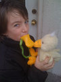
| 03/02/2009 10:58:23 AM |
Delightby BudComment: I think if this were slightly overexposed it would do better in this challenge. Having their skin look more like porcelin and less sun-familiar just would have made it fit better with the challenge description, imho. |
| Photographer found comment helpful. |
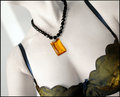
| 03/02/2009 10:56:58 AM |
White Shouldersby tangueraComment: The dark clothing and necklace make this dnmc to me... "Take a photo in which the background is white and the subject is predominately a lighter color." I suppose that the skin is technically a predominately lighter color, but I think the darkness of the other colors take away from the idea of the challenge. |
| Photographer found comment helpful. |
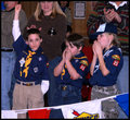
| 03/01/2009 12:09:48 PM |
Victoryby phiggins24Comment: Too much of a snapshot for me. If the pic didn't include any of the adults' faces I think it would be stronger. |
| Photographer found comment helpful. |
| 03/01/2009 12:08:47 PM |
Dessertby dtremainComment: This feels very snapshot-ish. The lighting feels harsh/flahsy. The glass is distracting at the top, the other plate is distracting in the bottom right corner. I think this would be better with fewer elements. |
| Photographer found comment helpful. |
| 03/01/2009 12:04:01 PM |
|
| Photographer found comment helpful. |
| 03/01/2009 12:03:12 PM |
|
| Photographer found comment helpful. |
| 03/01/2009 10:36:06 AM |
Puzzling Natural Art by RasaiComment: To me, everything here blends together. All the colors are so neutral and the dof doesn't make the subject stand out from the background. |
| Photographer found comment helpful. |
Home -
Challenges -
Community -
League -
Photos -
Cameras -
Lenses -
Learn -
Help -
Terms of Use -
Privacy -
Top ^
DPChallenge, and website content and design, Copyright © 2001-2025 Challenging Technologies, LLC.
All digital photo copyrights belong to the photographers and may not be used without permission.
Current Server Time: 08/20/2025 10:50:33 PM EDT.