| Image |
Comment |
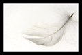
| 03/02/2009 11:44:34 AM |
LightWeightby michaelmonnComment: I like this but I really don't care for the thick black border around a pic in a light on white challenge. I think it takes away from the pic a lot. |
 Photographer found comment helpful. Photographer found comment helpful. |
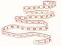
| 03/02/2009 11:43:52 AM |
60"by Carlo21Comment: This is a cool pick. I like the composition and the way the red pops but it doesn't take over the pic. I think it would have an even stronger effect if it didn't have shadows. More even lighting from both sides might change that. |
| Photographer found comment helpful. |
| 03/02/2009 11:41:03 AM |
Light on Whiteby vawendyComment: Hahaha, I get it. Neat idea. It feels like it might be compression, but I find this a little blotchy... |
| Photographer found comment helpful. |
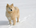
| 03/02/2009 11:39:18 AM |
On The Lakeby tooterComment: Beautiful dog! I think that if the dof were less inclusive and the impuities on the snow behind it weren't so visible the effect here would be stronger. |
| Photographer found comment helpful. |
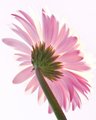
| 03/02/2009 11:38:09 AM |
Tribute to Charleneby WalesPComment: Lovely. Great details and texture in the petals and stem. I think the green pops and that the colors and teh exposure fit the challenge nicely. |
| Photographer found comment helpful. |
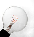
| 03/02/2009 11:37:29 AM |
Pipeby choltmeierComment: If there wasn't such a strong shadow in the background I think this would do better in this challenge. I think that well-lit subjects are going to do better, and that shadow definitely makes the background feel un-white. |
| Photographer found comment helpful. |
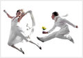
| 03/02/2009 11:36:21 AM |
Young Loveby limerickComment: This is cute, but it feels like cut and paste to me. I feel like it's another picture of people jumping that was cut and paste onto a background of white. I don't know why that matters, but for some reason it makes the pic feel fake to me. |
| Photographer found comment helpful. |
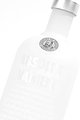
| 03/02/2009 11:34:38 AM |
Absolut Whiteby DiScComment: I love that at first glance, this just seems to be the label and the cap floating in air. Then, as I let it sit there the bottle and words started to appear. It's like a Magic Eye game or something. I think the exposure is spot-on. |
| Photographer found comment helpful. |
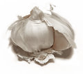
| 03/02/2009 11:27:29 AM |
take off your clovesby posthumousComment: Haha, I love the title and I think this works really well for the challenge. Normally I'm not a fan of shadows like that, but I think it helps to define the shape of the subject here. |
| Photographer found comment helpful. |
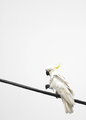
| 03/02/2009 11:25:56 AM |
Sulphur Crested Cockatooby vladoComment: I really like the composition for this. It feels like it could be a lot sharper, and I think if it were it would really stand out. |
| Photographer found comment helpful. |
Home -
Challenges -
Community -
League -
Photos -
Cameras -
Lenses -
Learn -
Help -
Terms of Use -
Privacy -
Top ^
DPChallenge, and website content and design, Copyright © 2001-2025 Challenging Technologies, LLC.
All digital photo copyrights belong to the photographers and may not be used without permission.
Current Server Time: 08/20/2025 07:06:50 PM EDT.