| Image |
Comment |
| 03/04/2009 01:27:43 PM |
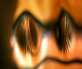
i confuse myselfby skewsmeComment: I like this, but I can't really figure out why. At first it reminded me of frog eyes, then of a pig snout. The more I look at it though the more I'm distracted by the flecks that seem like smudges of dirt or something. |
 Photographer found comment helpful. Photographer found comment helpful. |
| 03/04/2009 01:23:01 PM |
Me without myselfby hajekaComment: I suppose that you have a hard time seeing and that you live somewhere cold, so this does tell us a little about you... but I don'f think this feels like it captures any personality. |
| Photographer found comment helpful. |
| 03/04/2009 01:21:33 PM |
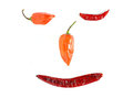
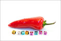
Hot and Happyby sekarmalathyComment: I like the simplicity of it an dI like the white vs. color, but I feel like there is something missing... perhaps a noticeable border (which I'm usually not a fan of) might make the pic seem less indefinite to me? |
| Photographer found comment helpful. |
| 03/04/2009 01:04:46 PM |
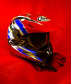
Favored Hatby C_Steve_GComment: The red is a great colorhere, but the backdrop is strangely shiny, like it's a tarp or something, and I think a less noticable material would be better. |
| Photographer found comment helpful. |
| 03/04/2009 11:45:33 AM |
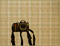
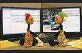
Photographerby jhomrighausComment: I feel like this camera is floating in space... I think a less busy background would be good. |
| Photographer found comment helpful. |
| 03/04/2009 11:44:54 AM |
|
| Photographer found comment helpful. |
| 03/04/2009 11:44:19 AM |
Red Hotby BalkoComment: I like the simplicity of this and the metallic letters against the natural red. |
| Photographer found comment helpful. |
| 03/04/2009 11:43:34 AM |
MY LAST WORKPLACEby remboComment: I think there's too much going on here and not in a well-composed kind of way. There's so much stuff and so much is getting cut off by the edges and then there's all this blank, white space in between. I think if the empty spaces were filled with little knick knacks it might have a more coherent, pattern feel to it. |
| Photographer found comment helpful. |
| 03/04/2009 11:40:30 AM |
Crazy Geekby dtremainComment: This is cute, and I like the composition of it. I think that either the lighting could be different or maybe the contrast could go up a bit, but it doesn't feel like it pops as much as it could, as far as colors and such go. |
| Photographer found comment helpful. |
| 03/04/2009 11:39:36 AM |
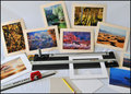
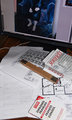
Desktopby raishComment: Too much stuff is getting cut off here - I think the ruler is the only thing in the frame that doesn't get chopped off along an edge. I think that a more inclusive shot of a larger, messier destop would be better. Also, the white wire is bright and distracting, I'd move that. |
| Photographer found comment helpful. |
Home -
Challenges -
Community -
League -
Photos -
Cameras -
Lenses -
Learn -
Help -
Terms of Use -
Privacy -
Top ^
DPChallenge, and website content and design, Copyright © 2001-2025 Challenging Technologies, LLC.
All digital photo copyrights belong to the photographers and may not be used without permission.
Current Server Time: 08/20/2025 02:37:01 PM EDT.