| Image |
Comment |
| 07/21/2004 05:12:55 PM |
Chocolate Dreamby asijComment: The color and lighting are very nice. The crop is way too tight though... |
 Photographer found comment helpful. Photographer found comment helpful. |
| 07/21/2004 05:11:08 PM |
Chocoholic's delightby kirtiebuComment: Yummy, but sadly, the photo is blurry in many outer areas. The blue background doesn't quite enhance the photo entough. The overall feel of the image isn't too exciting for me, but you certainly meet the challenge! |
| Photographer found comment helpful. |
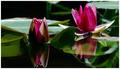
| 07/12/2004 03:10:41 PM |
The Purple One Today?by KylieComment: great, fun shot! I love the colors and the feel. Very crisp and great lighting & composition. great job! The ONLY thing i might change would be to try to get the dock to be 100% flat on the horizon line (180 degrees). Other than that, it's great! I didn't vote in this challenge actually. I wish I had. My shot didn't do very well, shows me for getting creative with my lighting haha! |
| Photographer found comment helpful. |
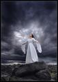
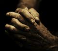
| 07/08/2004 11:40:55 AM |
Angel by heidaComment: Please do a burning tutorial for us! It would really help us understand what you do and what we can do to become better digitial darkroom experts like you!
Amazng photo! |
| Photographer found comment helpful. |
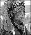
| 07/07/2004 04:08:28 PM |
Extraordinary Lifeby qmdiComment: Haha, great job!!!! I am so glad you did so well! It's funny how many people said your should be in color when it did so much better in B/W! :) I love it in B/W, nice work! |
| Photographer found comment helpful. |
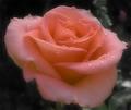
| 07/01/2004 01:53:02 PM |
After the rainby BlueDragonComment: Beautiful color and softness. Nice composition and feel. Very engaging. I wish the background wasn't so dark on the upper left. It'd be nice if that section matched the upper right for color, blur and light. |
| Photographer found comment helpful. |
| 07/01/2004 01:51:42 PM |
|
| Photographer found comment helpful. |
| 07/01/2004 01:51:10 PM |
|
| Photographer found comment helpful. |
| 07/01/2004 01:50:39 PM |
|
| Photographer found comment helpful. |
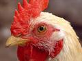
| 07/01/2004 01:47:59 PM |
A Rooster's Stareby kim100878Comment: Contrast is a little high on the rooster's feathers and above his eye. I like the color and composition. |
| Photographer found comment helpful. |
Home -
Challenges -
Community -
League -
Photos -
Cameras -
Lenses -
Learn -
Help -
Terms of Use -
Privacy -
Top ^
DPChallenge, and website content and design, Copyright © 2001-2025 Challenging Technologies, LLC.
All digital photo copyrights belong to the photographers and may not be used without permission.
Current Server Time: 08/04/2025 02:57:24 PM EDT.