| Image |
Comment |
| 12/01/2004 02:23:28 PM |
|
 Photographer found comment helpful. Photographer found comment helpful. |
| 11/22/2004 12:52:29 PM |
Where once there was laughter, rain erodes rockby markmulkerinComment: I LOVE this feel! This looks a lot like Bobster's work. I love cemeteries and this soft, fantasy look with super high saturation! Excellent job! The only thing I would try to change is the very dark upper right corner, but I am really not sure how you could get that lighter without lamps pointing in that direction.. would take a lot of work and money. Great job though... I really love this. |
| Photographer found comment helpful. |
| 11/22/2004 12:48:48 PM |
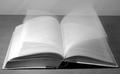
Reading to pass the timeby GBServisComment: I love the idea, but the edge of the desk gets into the photo subject too much, and it's not 180 degrees on the horizon line. You may need to rotate the photo CC a little to get the horizon line perfect. The book is great!!!!. I also think you need a little more contrast. I like this overall :) |
| Photographer found comment helpful. |
| 11/22/2004 12:44:11 PM |
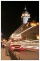
Looking At The Time Go Byby DiscraftComment: Your photo is so close to perfect!!! I just wish the top wasn't so close to the frame edge. If you matched it to the left side (blackness around the clock edge) it would be a perfect 10. I LOVE this photo! Excellent! |
| Photographer found comment helpful. |
| 11/22/2004 12:42:43 PM |
Since I Was Lovedby riotspyneComment: Great animal photo! Is this a real dog? It sure looks like it with that wet nose! Poor thing!!!! Excellent composition! Lighting in upper right is a bit harsh but doesn't really take away from the photo. I like it! |
| Photographer found comment helpful. |
| 11/22/2004 12:40:45 PM |
Beach Erosionby Mark of SRQComment: I don't really see your title, as I am used to beaches like this that aren't in danger of erosion, but perhaps your area is not this shallow... i'll give you that. :) I like the sepia, but I would prefer more dark tones and contrast. I also think the buildings are a little to tight to the edge (top left) and could use more sky above them. I like the detail in the water. |
| Photographer found comment helpful. |
| 11/22/2004 12:38:38 PM |
Melting Momentsby BeetleComment: This looks like it took a lot of work! I love the perfection in the angle of the lights, great job! are you an architect? :) The lighting is not overblown, which is very nice, but it is a bit dark in the lower left of the frame of this photo. I like the photo a lot, but I think I'd like to see the background more gold/yellow or green even. Good job! |
| Photographer found comment helpful. |
| 11/22/2004 12:36:46 PM |
The 17.20 .... Late againby agwrightComment: Excellent composition! Lighting is a bit bright, but quite appropriate. The speed is awesome. Your tilt is a little off though. Try rotating Counter Clockwise just a hair to get the garbage can/pillar and the building tower perfectly straight. nice choice of border too! |
| Photographer found comment helpful. |
| 11/22/2004 12:34:47 PM |
Free Timeby techtraumComment: Great photo! The lighting is a tad dark, but not bad. The soft focus on the lower right is a bit eye-catching, which you may not want people to notice, but it's not bad. i love the composition, tone, and lighting! Great job overall! |
| Photographer found comment helpful. |
| 11/22/2004 12:33:34 PM |
Mother and Daughterby admart01Comment: The tones are nice, the composition would probably be better if the hands were centered though (in this case). I like the ring standing out, but not sure it shows the point of the theme. The lighting is nice too! |
| Photographer found comment helpful. |
Home -
Challenges -
Community -
League -
Photos -
Cameras -
Lenses -
Learn -
Help -
Terms of Use -
Privacy -
Top ^
DPChallenge, and website content and design, Copyright © 2001-2025 Challenging Technologies, LLC.
All digital photo copyrights belong to the photographers and may not be used without permission.
Current Server Time: 08/01/2025 01:20:09 PM EDT.