| Image |
Comment |
| 08/15/2008 09:18:40 PM |
Raise awareness and fundraise for animalsby suemackComment: I imagine the fencing is there purposefully, but for my money, I'd have liked to have seen you frame it so that both eyes were free of being blocked by it. Just a little bit of a jump-over, and you'd have a stronger shot. |
 Photographer found comment helpful. Photographer found comment helpful. |
| 08/15/2008 09:16:15 PM |
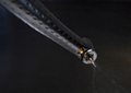
Dentistryby GolferDDSComment: Hands down the best photo of a dentist's tool I've ever seen. The color play with the gold/brass and the silver/pewter metal is gorgeous. The only dock I have is the fact that the background has been rendered a bit blocky because of whatever smoothing/blurring you've done, I would guess to combat noise? It looks like similar things I've done with neat-image like programs...
Still, that's a minor quibble really, as the main subject jumps out too much to really dock too much for the background. (although I'd be more inclined to give a 9 if it was smoother) |
| Photographer found comment helpful. |
| 08/15/2008 09:13:53 PM |
Wedding Photographerby jtf6agentComment: The soft focus effect is what puts this photo up above others like it that I've seen. It's done very well, subtle, yet plays a vital role. I don't know if you used a filter, or if you used something like a soft-focus lens (or pantyhose stretched over the lens), but I do know that I like it.
Actually, on a deeper look, I'm going to say filter, as the ring has been brought back into very sharp focus, which would be impossible to do if it was a hardware filter/device/method.
Anyway, nicely composed, well lit, and a nice showcase of her bling. |
| Photographer found comment helpful. |
| 08/14/2008 12:55:19 AM |
Just Meby JudiComment: It looks like you lost detail in this shoot, and then tried to recover by either pushing the exposure, or using a little too much "fill light" or shadow/highlight adjustments. The end result is that the black in the clothing is noisy and splotchy, and detail is next to non-existent in the hair and face.
While I like the idea of the background, it falls off by being too cluttered in the lower corner.
I want to like this effort, but it feels rushed and lacking in self-respect, to a point. It also loses points because you've chosen this to represent photography as your profession, which says to me, "I rush things and don't care too much about polish and finish." |
| Photographer found comment helpful. |
| 08/14/2008 12:45:38 AM |
|
| Photographer found comment helpful. |
| 08/13/2008 12:31:18 AM |
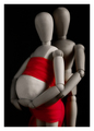
A Great Expectation by rinacComment: My favorite of the challenge, nicely done. Puts forth a good amount of emotion, yet gives us a new take on a classic shot. |
| Photographer found comment helpful. |
| 08/13/2008 12:29:46 AM |
One of many by tjmuellerComment: Another clever idea that just wasn't executed as nicely as it could have been. |
| Photographer found comment helpful. |
| 08/13/2008 12:27:20 AM |
|
| Photographer found comment helpful. |
Home -
Challenges -
Community -
League -
Photos -
Cameras -
Lenses -
Learn -
Help -
Terms of Use -
Privacy -
Top ^
DPChallenge, and website content and design, Copyright © 2001-2025 Challenging Technologies, LLC.
All digital photo copyrights belong to the photographers and may not be used without permission.
Current Server Time: 07/31/2025 01:33:41 PM EDT.