|
|
|
Showing 1151 - 1160 of ~1198 |
| Image |
Comment |
| 08/23/2008 01:58:37 PM | Where's Purple?by rarmermannComment: Hello, I have made it a point for this challenge to comment on every photo that I scored under a 4.
I scored this photo a 3 for the following reason(s):
1. The image is too small. Always try and use the maximum pixel dimensions that DPC allows. There are tutorials on DPC that can help you achieve this while keeping the file size the allowable limit.
2. Over-sharpened. From my experience, sharpening like this happens because the initial photo was either not fully in focus, or there was some camera-shake. Fixes for this include using a higher ISO or faster shutter speed. If not possible due to camera or lighting conditions, move the subject into better lighting.
It could be over-sharpened due to an over-use of sharpening tools as well, in which case it never hurts to play around with various sharpening tools to find a good balance, and don't be afraid to ask for opinions on it as well.
3. Lack of the color demanded by the Challenge. Where's the purple? The minute amount visible in her hair-tie is just not enough to solidify this entry to the challenge for me. |  Photographer found comment helpful. Photographer found comment helpful. |
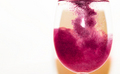
| 08/23/2008 01:54:01 PM | Study #243by EyesupComment: Hello, I have made it a point for this challenge to comment on every photo that I scored under a 4.
I scored this photo a 3 for the following reason(s):
1. Focus. Your focus is soft here throughout the photo. Nothing has any real clarity, and it's hard on my eyes to view it.
2. lighting is harsh, and the shadow play behind the glass is distracting to the subject.
3. The color is approaching pinks, instead of purples, but this isn't a strong negative, as I do give leeway for monitor differences.
A little more work getting this subject in focus, and perhaps minimalizing the amount of chaos going on inside the glass would have pulled a higher score from this image from me. | | Photographer found comment helpful. |
| 08/23/2008 01:48:32 PM | Makeup Addiction: Cocaine of the Beauty Worldby LindseyJeanComment: Hello, I have made it a point for this challenge to comment on every photo that I scored under a 4.
I scored this photo a 3 for the following reason(s):
1. The use of purple is muted to the point where it's almost chromatic. Lacks the color needed for me to give it a higher score as relating to the challenge.
2. Choice of subject, while certainly unique, isn't used very flatteringly. I don't really like the random-seeming placement and the lack of a tie-in to your title. It's powder, certainly, but it could be any powder. The relation to cocaine isn't evident.
3. Overall appeal is simply just very low for me. It's one of those photos that I just looked at, shrugged, and moved on. Just not a strong choice of photo for the challenge IMO.
Things I do like about it, however, are the choice of a shallow DOF, which stands the powder out, and the color play that is in the powder itself, albeit very muted. | | Photographer found comment helpful. |
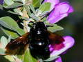
| 08/21/2008 09:21:44 PM | Buzzby gunsmith6Comment: Hello, I have made it a point for this challenge to comment on every photo that I scored under a 4.
I socred this photo a 2 for the follwoing reasons:
1. Your connection to the challenge is tentative, the main color of this shot is green, with black and then a magenta/pink with a slim leaning into lavender in the flowers. With the challenge called "Purple", you would need the photo to have much more of a connection to that main color for me.
2. You've missed focus on your main subject, leaving it out of focus in a very glaring way, especially since it comes across as the main focal point to the viewer.
Technically, and challenge wise, this isn't a very strong entry for my eyes. | | Photographer found comment helpful. |
| 08/21/2008 09:18:25 PM | Shamuby yjoshiComment: Hello, I have made it a point for this challenge to comment on every photo that I scored under a 4.
I gave this photo a 2 for a few different reasons:
1. There is no purple in this photo whatsoever. Even with a generous adjustment for monitor differences, all I see is blue. In a challenge named "Purple" well, I think it speaks for itself.
2. The photo itself isn't pleasing to me in any way. You have reflections from the glass, there is no point of interest beyond the static subject, focus is off, and just about every other technical aspect to the photo (in DPC terms) simply isn't there.
I won't presume to know or guess on why you entered this photo into this challenge, but because of what I mentioned, it is a 2 from me. | | Photographer found comment helpful. |
| 08/21/2008 09:05:29 PM | | | Photographer found comment helpful. |
| 08/20/2008 08:28:24 PM | One of many by tjmuellerComment: Follow up to my comment:
I'm sorry that I didn't get the time to come back and be a little more clear on what I meant with my one-liner.
I've seen this type of shot done before, so I was comparing it to the ones I've seen. What I see here is that you've not allowed the viewer to really see what is in those droplets by leaving the shot too far out. I understand that sometimes equipment can be a real roadblock to this sort of thing, but for a shot like this, you really want the viewer to be able to recognize what it is you're reflecting without squinching up to the screen.
Focus is also a little off, which some commenters pointed to.
| | Photographer found comment helpful. |
| 08/20/2008 08:23:42 PM | The Star Wars scene that George Lucas did NOT want you to seeby JaimeVinasComment: Follow up on my comment:
I was being a little super-picky on my original commenting and voting of this image. It's to my own loss that I didn't spend the time to really feel the image then, but I do now. The posing of the woody here is, at the expense of sounding like a kiss-ass, ingeniously done. To the point where I don't even see a woody now, I see C-3P0.
While I gave you a respectable 6, I believe had I come back to actually spend some time with this image, I'd have bumped you to an 8. Consider my adding this photograph as a favorite to be my way of repentance.
No, it still isn't the most perfectly technical shot, but to hell with that. | | Photographer found comment helpful. |
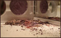
| 08/20/2008 08:08:39 PM | Techo's Breakfast Spreadby TonyTComment: Clever idea, but the execution of the photo leaves a little to be desired for me to give this anything higher than a 6. | | Photographer found comment helpful. |
| 08/20/2008 08:06:37 PM | Amethystby Tap10Comment: Get a little more strength in the color of the amethyst, and you're looking at a half point more in your score, or more, I think. | | Photographer found comment helpful. |
|
Showing 1151 - 1160 of ~1198 |
Home -
Challenges -
Community -
League -
Photos -
Cameras -
Lenses -
Learn -
Help -
Terms of Use -
Privacy -
Top ^
DPChallenge, and website content and design, Copyright © 2001-2025 Challenging Technologies, LLC.
All digital photo copyrights belong to the photographers and may not be used without permission.
Current Server Time: 08/01/2025 11:06:55 AM EDT.
|