| Image |
Comment |
| 11/20/2008 11:09:55 PM |
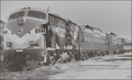
Art is: Riding The Railsby fldaveComment: The overall grey look does not work for me. There is noise from the post processing obvious which detracts from the photo. The crop I think is too close on the left, more room was needed. There also doesn't appear to be any true white or black. Adjusting the levels such that both black and white were int he photo may have improved the look of this photo.
Also, even with the title, its a stretch on the topic for this shot. |
 Photographer found comment helpful. Photographer found comment helpful. |
| 11/20/2008 11:05:57 PM |
The United States of...?by bigjComment: I wonder what type of President Art would make, not to get into a political debate here (seeing I'm an aussie)
Something different, well thought out and well executed. I like the composition of the shot, and the way it ties in with the challenge. Not sure the white border adds to your photo though.
Next time you should spend longer than 11 days in Australia...... |
| Photographer found comment helpful. |
| 11/20/2008 11:02:53 PM |
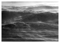
Frozen solid ???by anferhComment: Interesting photo. Nice effect you have acheived here. However the black and white gives a very bleak look, and makes it somehow less interesting.....
Also, even with the Title, not really fitting in with the Challenge for me |
| Photographer found comment helpful. |
| 11/19/2008 02:12:26 AM |
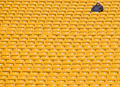
Alone With His Thoughtsby alanfreedComment: A very interesting picture of Yellow Seats. What should have been a boring shot has turned out well due to the patterns thaat appear in the seats. A great angle on the photo. Exposure is good, and the person in the photo is able to be tied to the topic well. |
| Photographer found comment helpful. |
| 11/19/2008 02:10:41 AM |
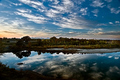
Art is in a world of color and beautyby cogeroxComment: A good landscape photo, really like the colours theough the sky and the reflections which you have through the still water. The flatness of the land though means it is less appealing than it could have been, as there is little subject other than the sky in this photo.
Also, the lack of anything really tied to the topic affects the score. |
| Photographer found comment helpful. |
| 11/19/2008 02:08:10 AM |
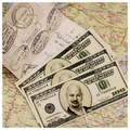
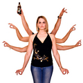
I heard he had been hanging out with the Indian Goddess Durga.by aKiwiComment: Interesting photo you have here Even with the title, for me it struggles to meet the challenge, but ignoring that....
The overexposed areas of skin on the first person are distracting. The light needed to be less intense from the front, or, as this was Advaned Editing rules, this could have been selectively fixed during PP. The lack of expression also does not appeal. |
| Photographer found comment helpful. |
| 11/13/2008 08:58:32 PM |
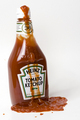
red bottleby soerenComment: Noise is a problem here that detracts from the image. Also, some fill light to light the rest of the bottle would have helped |
| Photographer found comment helpful. |
| 11/13/2008 08:56:14 PM |
|
| Photographer found comment helpful. |
| 11/13/2008 08:55:33 PM |
|
| Photographer found comment helpful. |
| 11/13/2008 08:52:01 PM |
Red red wine.... (Actually it was rosé) by aKiwiComment: Firstly, would not have added the extra (actually it was rose) to the title, it detracts from anything your title is trying to achieve.
Ignoring that (as I don't vote on titles anyway)
I like what you are trying to achieve here The top of the bottle needed a litte more light from the front/right so it didn't get lost. I like to composition and simple border. |
| Photographer found comment helpful. |
Home -
Challenges -
Community -
League -
Photos -
Cameras -
Lenses -
Learn -
Help -
Terms of Use -
Privacy -
Top ^
DPChallenge, and website content and design, Copyright © 2001-2025 Challenging Technologies, LLC.
All digital photo copyrights belong to the photographers and may not be used without permission.
Current Server Time: 08/05/2025 12:42:59 AM EDT.