| Image |
Comment |
| 11/23/2008 09:10:33 PM |
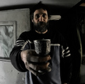
Art who?by OdedComment: I think some fill in light was needed for this. The overall darkness, with the Man blending into the background in places (Hair, left shoulder and arm) mean the effect is lost. |
 Photographer found comment helpful. Photographer found comment helpful. |
| 11/23/2008 09:08:55 PM |
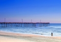
Lostby tjmuellerComment: The location is nice, however I feel I want to see what is to the right. I feel that more water and land to the right may have added to the photo. It may not have been as DPC friendly though, but I am a fan of panoramic photos. The colours are alright without really being brilliant. SOme extra PP work may improve the impact of this photo. |
| Photographer found comment helpful. |
| 11/23/2008 09:05:59 PM |
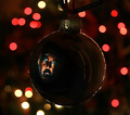
Yes, I've Scene Artby lynnesiteComment: A completely different take that meets the challenge well. The colours of the Neaon make this interesting. The added clutter of surrounding things is something you could do little about. Cropping out the partly obstructed Scene at the bottom of the frame may have helped though..... |
| Photographer found comment helpful. |
| 11/23/2008 09:02:54 PM |
|
| Photographer found comment helpful. |
| 11/23/2008 09:02:02 PM |
Gone Fishin'by aerogurlComment: Nice......Soem of the highlights appear a little blown out (on my computer at least) Some good colours here and a good idea for the challenge |
| Photographer found comment helpful. |
| 11/20/2008 11:51:38 PM |
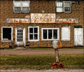
At the Officeby HipychikComment: The out of focus letterbox is a distraction for me. The building is pretty uninteresting. Even with the title, it is a stretch to make the topic as well |
| Photographer found comment helpful. |
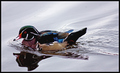
| 11/20/2008 11:26:56 PM |
On The Lakeby sepvComment: Struggling to see the connention to the challenge here. The colours here are a little uninspiring to me. Maybe the duck is a little dark which doesn't help
Note that you have some significant sensor dust spots. They could have been cloned out anyway...... |
| Photographer found comment helpful. |
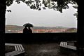
| 11/20/2008 11:20:19 PM |
Art Roflmao is in loveby onarComment: Due to the backlighting causing the Silloutte (i can't spell), it makes this photo quite dark. I like the idea of the framing between the two trees, and the branches above. The foreground though with the seats adds nothing except dark areas. If you had of cropped the seasts out, it would of then had the dark silloutte at the bottom, the couple then in the foreground more, and removed those seats out. The photo then would not have seems as dark as well. Then the photo I think would have scored much better.
I like the idea you had. With the changed crop (and ideally a blue sky) this could then have been stunning..... |
| Photographer found comment helpful. |
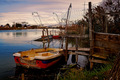
| 11/20/2008 11:15:45 PM |
His boat waitby Rino63Comment: Nice Photo, prehaps a little too closely cropped. Some extra space to the left, and some extra sky may have made this even better.
However, its a stretch to consider this as meeting the topic. |
| Photographer found comment helpful. |
| 11/20/2008 11:13:35 PM |
|
| Photographer found comment helpful. |
Home -
Challenges -
Community -
League -
Photos -
Cameras -
Lenses -
Learn -
Help -
Terms of Use -
Privacy -
Top ^
DPChallenge, and website content and design, Copyright © 2001-2025 Challenging Technologies, LLC.
All digital photo copyrights belong to the photographers and may not be used without permission.
Current Server Time: 08/05/2025 12:42:36 AM EDT.