| Image |
Comment |
| 12/04/2008 11:36:36 PM |
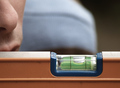
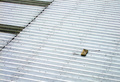
Straightedgeby gunsmith6Comment: Different. Looking forward to seeing the description. I assume this is metal you heated and then put on a black backdrop/
I think the colours you go tout of this are good, the angle and crop are good s well |
 Photographer found comment helpful. Photographer found comment helpful. |
| 12/04/2008 09:47:21 PM |
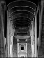
Under the Bridgeby davidwComment: Details: Capture an image that includes only straight lines.
Nice idea, but the challenge details were pretty clear on only straight lines
Thsi photo doesn't jump out at me. I think a lack of contrasting elements means it all merges too much into each other here |
| Photographer found comment helpful. |
| 12/04/2008 09:45:50 PM |
Good Enough?by balancedfoxComment: Details: Capture an image that includes only straight lines.
Nice idea, but the challenge details were pretty clear on only straight lines
The large light thing in the background (a head???) is clutter that is a distraction and not needed. having a plainish brown background caused by the shallow DOF would have been better. |
| Photographer found comment helpful. |
| 12/04/2008 09:42:46 PM |
Pipesby BrinComment: Nice Idea, however the cropping of the pipes at the ends, while it may have been unavoidable, reduces the effect. Having these in the photo, and the crop running straight int he dark patch beside them would be better, however maybe not possible.
And the curves on the pipes are going to hurt you, with the challenge description saying "only straight lines" |
| Photographer found comment helpful. |
| 12/04/2008 09:40:21 PM |
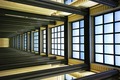
Caught in a Matrix by fmalanComment: Simple, elegant, sharp, composed of only straight lines, while not being boring. This is what this challenge should be all about. We have colour, contrast, shaddows, highlights, dark patches.......Everything.......
Great Submission. Best I have see so far......Well Done |
| Photographer found comment helpful. |
| 12/04/2008 09:37:37 PM |
Where Shadows Bendby Hot KarlComment: The reflections off the glass are distracting, and take away from the effect you are after. Cropping out the stairs etc in the bottom also would have been better, as they add nothing to the overall effect |
| Photographer found comment helpful. |
| 12/04/2008 09:31:13 PM |
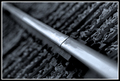
The Jointby cryanComment: Its a joint. The lines behind from the sleepers though help this photo, as they run the opposite direction. Shallow DOF does work here, as does the B&W and the border |
| Photographer found comment helpful. |
| 12/04/2008 09:30:11 PM |
Tech Supportby pdxstocktonsComment: The simplicity of many phoitos here works, however I am not sure you have acheieved it here. The keyboard location I think needed to be lower and further right, more towards the corner to really make the statement here |
| Photographer found comment helpful. |
| 12/04/2008 09:27:23 PM |
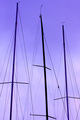
Harbor Linesby mindbottlingComment: Nice clean lines here. I like the symatry you have going here. I like that the middle mast is black, the other two are purple. There is a hint of pink in the clouds, which could maybe have been brought out a little more. |
| Photographer found comment helpful. |
| 12/04/2008 06:14:30 PM |
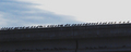
Birds in a line on a bridgeby emoonsComment: For some reason, panoramic crops do not usually do well here (a shame really)
Next time, use the maximum available pixels (640 wide) as smaller pictures get hurt as they are harder to see the detail in them.
The colours are a bit uninspiring. Some PP could have got a more vivid shade of blue in the sky |
| Photographer found comment helpful. |
Home -
Challenges -
Community -
League -
Photos -
Cameras -
Lenses -
Learn -
Help -
Terms of Use -
Privacy -
Top ^
DPChallenge, and website content and design, Copyright © 2001-2025 Challenging Technologies, LLC.
All digital photo copyrights belong to the photographers and may not be used without permission.
Current Server Time: 08/05/2025 10:57:56 AM EDT.