| Image |
Comment |
| 02/26/2009 11:51:47 PM |
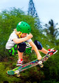
My kind of funby MaggyeComment: I love saturaation in photos, but I think you overdid it a little with this one.
I would have been tempted to isolate the kid, and desaturate the rest of the photo (the background) to black and white, which would have made this photo really work. A great capture but I think many will mark you down for the oversat...... |
 Photographer found comment helpful. Photographer found comment helpful. |
| 02/26/2009 11:49:55 PM |
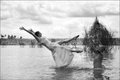
Throw Away Bride by BarbBComment: I feel she is blending in too much with the background. The black and white, while good, means she does not stand out enough against the surroundings for me. The sky has blown out elements, while the dress probably should have been whiter. Selective editing of these areas seperate would have helped, as we are under advanced editing rules |
| Photographer found comment helpful. |
| 02/26/2009 11:39:25 PM |
Caution - Friendly surfer crossing by tjmuellerComment: Nice capture here. I think the crop on the sides is a little close, making a narrow picture. a little extra room showing the foam water on each side would have helped this and just given it more space, without effecting how large he appears on teh screen |
| Photographer found comment helpful. |
| 02/26/2009 11:36:56 PM |
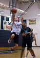
Taking it to the basketby NobodyComment: I like the idea, and the shutter speed is spot on, giving the slightest blur ont he feet and hands. However, he blends in too much to the surroundings. The other players int eh shot don't help. With advanced editing, it would have been great if you could have made him stand out more from everything else, whether that was blurring some parts or something else. A shallower depth of field in camera would have also helped as I can see too much detail int he wall etc. |
| Photographer found comment helpful. |
| 02/26/2009 11:34:55 PM |
The Airborne Fourby canonnicaComment: Great Action shot here. Teh next couple if they fall out also would have been great. the colours of this are great. The red and yellow add to this photo. The blurred background works really well to remove any distracting elements also |
| Photographer found comment helpful. |
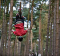
| 02/26/2009 11:33:24 PM |
Tachi-dori Kokyu-nageby millsaComment: Tell Wal that his posture sucks. Straighten up.
Still like this with teh feet above Wals head (nice jump Tony)
Not Voting as I know the image |
| Photographer found comment helpful. |
| 02/26/2009 11:31:30 PM |
Defying Gravityby MAKComment: Nice idea, but the back of the biker is not that interesting. Would have been great to photograph from the other side, so that we see his face instead. Depth of field is pretty good. |
| Photographer found comment helpful. |
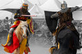
| 02/26/2009 11:30:24 PM |
Joustby spidermonkeyComment: Nice shot and like the colouors that go with jousting. The crop is a little restrictive on the right and top for me. I may have been tempted to just crop on the red horse, as he has much more interesting colours, and have portait orientation on this. This would have removed the dark ares on the right Selective desat on the crowd is a great way to get rid of the distracting elements from them and works really well.
But great submission for the challenge |
| Photographer found comment helpful. |
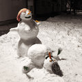
| 02/26/2009 11:25:25 PM |
|
| Photographer found comment helpful. |
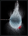
| 02/26/2009 11:24:02 PM |
High Impact by artvetComment: Love the effect of this as always. Must of made quite a mess trying to get the exact right shot. I think the crop maybe is a little close on top and bottom as we lose the extremes of the splash |
| Photographer found comment helpful. |
Home -
Challenges -
Community -
League -
Photos -
Cameras -
Lenses -
Learn -
Help -
Terms of Use -
Privacy -
Top ^
DPChallenge, and website content and design, Copyright © 2001-2025 Challenging Technologies, LLC.
All digital photo copyrights belong to the photographers and may not be used without permission.
Current Server Time: 08/06/2025 03:25:02 PM EDT.