| Image |
Comment |
| 03/25/2009 11:12:49 PM |
|
 Photographer found comment helpful. Photographer found comment helpful. |
| 03/25/2009 11:11:27 PM |
Please, Mister Postman........by CJinCAComment: Is post a language? Even a letter is not really Language, but I will allow it anyway, as I see a strong connection to communication, and the use of language
I presume you in Processing went for the blown out sky, especially seeing the effect that this processing had on the tree. The stark look is one that can work effectively, but the loss of detail on the tree etc I think hurts it here.. The range of shades through the photo is good (ignoring the sky) with everything from black through white present. |
| Photographer found comment helpful. |
| 03/25/2009 09:48:42 PM |
Lingua Francaby GeneralEComment: have come back to this photo a number of times, and still it does nothing for me. Nothing of this makes me understand the point, or message you are trying to put forward with this photo............sorry |
| Photographer found comment helpful. |
| 03/25/2009 09:47:24 PM |
Double Entendreby CraigDComment: A shallower depth of field could have blurred the rubbish bin and shelter in teh background, therefore removing the distracting elements as well |
| Photographer found comment helpful. |
| 03/25/2009 09:46:30 PM |
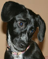
Mommy...can I please leave time out?by irish_princess87Comment: Well, it is about the only way, save for barking, that a dog can communicate, but not sure it really is language, but we will ignore that.
Nice Portrait, but I find myself looking into the bottom right corner, following the dogs gaze, and finding nothing there. |
| Photographer found comment helpful. |
| 03/25/2009 09:24:08 PM |
|
| Photographer found comment helpful. |
| 03/25/2009 09:23:20 PM |
Love Languageby ErinKirstenComment: Would have loved to see the expression on the kid, with the dirt smeared al over his face, rather than it being cropped off. I think you lost half the message of the photo with this crop. Also, i don't think the border is adding anything to this shot |
| Photographer found comment helpful. |
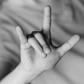
| 03/25/2009 09:22:11 PM |
I <3 Youby CindyGComment: A different coloured shirt, so that the hand does not merge into it may have been better, and I can see noise in the shirt as well, which detracts from the really good composition |
| Photographer found comment helpful. |
| 03/25/2009 09:19:10 PM |
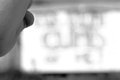
Freedom, The Basis of America by Be-realComment: hmmmmmm, you have taken a photo and turned it into a political statement..............I will now ignore the title
The light is a problem. The gradiant of light means the F is quite dark, and all attention is drawn to the E at the end. Having more space int eh photo may have helped draw attention to the word, rather than to the individial letters. To me it also appears to read backwards. With the E being both larger and brighter, I seem to read right to left, EERF instead. With the light like this, maybe shooting fromt eh other end, having the F larger (but darker) may have then emphasised the word, instead of all attention going to the letter E |
| Photographer found comment helpful. |
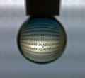
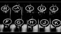
| 03/25/2009 09:14:43 PM |
The key to communicationby LutchenkoComment: Is there a reaason the T is so far off aligned. Everytime I look at this image, that is what draws my attention. The U is the only other letter that is not lined up...........
The border works to frame this well, the highlights on the keys do work for the most part |
| Photographer found comment helpful. |
Home -
Challenges -
Community -
League -
Photos -
Cameras -
Lenses -
Learn -
Help -
Terms of Use -
Privacy -
Top ^
DPChallenge, and website content and design, Copyright © 2001-2025 Challenging Technologies, LLC.
All digital photo copyrights belong to the photographers and may not be used without permission.
Current Server Time: 08/09/2025 06:28:28 PM EDT.