| Image |
Comment |
| 03/27/2009 12:25:21 AM |
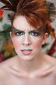
Angerby JaimeVinasComment: Yes, an attempt to show an emotion, but doesn;t give me that strong Language feel. The expression I don;t think is strong enough to stand up by itself without the title here. |
 Photographer found comment helpful. Photographer found comment helpful. |
| 03/26/2009 09:38:56 PM |
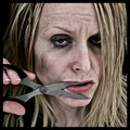
Speak No Evilby kingskingdomComment: A disturbing photo. really does not appeal to me. It is reasonably well executed, the makeup works well and the lighting is good, but not for me....... |
| Photographer found comment helpful. |
| 03/26/2009 08:54:27 PM |
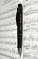
Writing Connects Peopleby ikopanasComment: Don't understand why you gave that title. Writing Musioc Connects People I feel makes a better connection with the photo.
Interestiong use of depth of field. it does make the pen really stand out as the subject. However it also emphasises the very centred composition. Having the pen on the forward third may have worked a little better, with the foreground music in more focus, and the background fading out...... |
| Photographer found comment helpful. |
| 03/26/2009 08:51:59 PM |
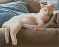
Kitty Slang: "DON'T bug me!!!"by NikonJebComment: hmmmm, doesn't really say language to me, even with the title, it is a photo of a cat. Just my opinion........
The border does nothing for me with this either. The overall phoot is reasonably well lit, but just doesn't appeal to me. |
| Photographer found comment helpful. |
| 03/26/2009 08:50:35 PM |
The Stopologistby nutzitoComment: Good idea. Maybe this would have been better in colour, as I feel his head and hand don't jump out of the photo enough. There is a lot of grey here, so that the skin tone grey merges with the background a little too much.
Other than that, a well composed image for the challenge |
| Photographer found comment helpful. |
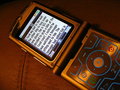
| 03/26/2009 08:21:00 PM |
My Thumbs Hurt by gunsmith6Comment: The angle of this is awkward. I find myself tilting my head to read what is on the screen, and the message really does not make a heap on sense in the scheme of the photo. The colours seem quite a bit off here as well...... |
| Photographer found comment helpful. |
| 03/26/2009 08:18:09 PM |
The (sign) language of loveby BackpackRComment: A number of people have gone this way. The dirty fingers distract. Part oif the hand is overexposed. The crop makes the photo feel incomplete. However the depth of field for this was spot on..... |
| Photographer found comment helpful. |
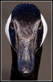
| 03/26/2009 08:12:12 PM |
The Look Says It Allby scottiehamComment: Hmmmmm, a photo of a bird. Not really saying Language to me, even with your title.....Sorry
Apart from that, it is a good photo, just not really to my liking. Its sharp, its well exposed. Has both true black and white elements. The water is a bit distracting thought..... |
| Photographer found comment helpful. |
| 03/25/2009 11:15:53 PM |
Universalby soupComment: Have seen this done before, and the effect here, while good, is not outstanding. The red is a nice touch for this, but the uneveness doesn't help. Also not sure this book is the best. I would like to see the cover cropped out, and a book where the pages sit a bit flatter to make the effect work better |
| Photographer found comment helpful. |
| 03/25/2009 11:14:04 PM |
Mutual Understandingby karmatComment: An undertsnading, maybe. Language, a bit of a stretch though.
The minimalist ground can work on occassion, I just don't think it has here though. it results in feet cut off, and the interest of the photo being in the very bottom of the shot, which I don't think works |
| Photographer found comment helpful. |
Home -
Challenges -
Community -
League -
Photos -
Cameras -
Lenses -
Learn -
Help -
Terms of Use -
Privacy -
Top ^
DPChallenge, and website content and design, Copyright © 2001-2025 Challenging Technologies, LLC.
All digital photo copyrights belong to the photographers and may not be used without permission.
Current Server Time: 12/21/2025 03:11:44 PM EST.