|
|
|
Showing 441 - 450 of ~1024 |
| Image |
Comment |
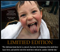
| 05/17/2009 11:33:03 PM | Limited Editionby helgiComment: This photo appears like a snapshot, all the way down to the feet int he background, whicha lso emphasised the rotation of the photo. Distracting elements int he background, I don't like the writing on the photo, I don't understand why the title colour was chosen, and struggle to see the real relevance of this photo to the challenge |  Photographer found comment helpful. Photographer found comment helpful. |
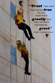
| 05/17/2009 11:30:58 PM | Trust men and they will be true to you...by horsinaround97Comment: Interesting photo, and an interesting phrase. I feel the colours in this shot could have benifited from some attention in Post processing,. The photo appears to lack contrast, and some saturation adjustment could have made this stronger. Not sure about the presentation. I feel this would have been much more suited to the traditional motivational poster with black border, title (Trust) and the phrase underneath..... | | Photographer found comment helpful. |
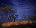
| 05/17/2009 11:28:44 PM | Make Evey Day Memorableby ButterflyGirlComment: On first galnce, I really like the photo, but as I look into it more, there are a number of things that catch my eye. The tree on the left is blown to the left, making me tilt my head, and you have cropped off the very edge of it. More space to the left was needed to balance this photo. it is currently too far to the left in the frame to be the subject, yet is the most dominating part. it needs to sit ont eh third line, prefeably the right third due to the lean. Trees are cropped off on the right, which also makes it look unfinished. Further to that, the writing just seems to blend in a little too much, rather than making the bold statement it should make...... | | Photographer found comment helpful. |
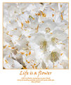
| 05/17/2009 11:24:34 PM | Life is a flowerby hajekaComment: A really good submission. Very professional presentation and the choice of both the background colour and text/border is spot on. That helps make this as one of the best overall submissions int hsi shallenge.
Phrase/Title/Photo combination is great, and all compliment each other. Photo is really good, simple, yet well executed, interesting without being overlly dominating, so perfect for this type of poster.
Smallest thing.........offset the Quote author to the right more, and remove the brackets.......this is the only thing that makes me think this isn't already for sale in shops...........excellent submission | | Photographer found comment helpful. |
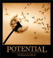
| 05/17/2009 11:18:15 PM | Potential by TallPaulComment: Excellent photo composition for this, i like the overall placement, the diagonal composition, the scattered parts. it all works for me in that sense.
You chose the text and border colour from the photo, which normally is exactly the right thing to do. However, in this case, maybe is makes everything a little too brown. Would have to experiment with the colours to see if something worked better........
The phrase is great, matches the photo, however the text size is too small, and I don't think it should be capitalised. Maybe script in a larger font would have worked so much better. A great photo for this, but the overall presentation of this is not quite as good. | | Photographer found comment helpful. |
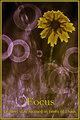
| 05/17/2009 11:09:44 PM | Leaders stay focused in times of chaosby bobccComment: A very interesting submission. A great idea, but the execution of the photo maybe didn't quite do ity justice. The flower looks way too fake for me, and I feel you lose a lot of the overall impact as a result of that. The yellow I feel needed to be a strong, bold, bright yellow, and not the colour you have in this. A vibrant colour would ahve made it stand out, and make a statement, above everything else. | | Photographer found comment helpful. |
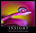
| 05/17/2009 11:07:28 PM | Insight by KarenNfldComment: An exceptional submission. This looks professional, and something I could image seeing on peoples walls. The photo matches the title and phrase very well. I feel that the white for the border and writing in this case was the correct choice, as any other colour in the photo would have merged in somewhere in the border. The photo has a lot of interesting elements, with the right depth of field and very interesting colours throughout. A top class submission for this challenge, and one of my highest rated photos. | | Photographer found comment helpful. |
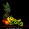
| 05/17/2009 11:05:01 PM | Eat healthilyby ReinerComment: Different to many of the others, but a well executed poster. I feel the subject and message are suited to the different presentation, and the overall submission looks very finished and professional. The presentation of this is exceptionally good.
Lighting of the fruit has been done very well. A few reflections on the apple and orange that maybe are a little distracting, but I like the lighting of the grapes and Banana's, which I feel you got spot on. The range of colours gives the poster an interesting look and the arrangement works very well. | | Photographer found comment helpful. |
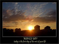
| 05/17/2009 11:02:34 PM | Wake up!by fitz3000Comment: nice photo, and nice overall combination. The phrase and title match the photo and compliment each part well.
The photo is good, but perhaps the sun being centred maybe isn't the strongest thing. Having it to one side, on the third line, may have helped against this, and given an even more broad range of colours. Further to that, a little extra dark foreground would also have balanced this photo much more.
Don't know why you opted for the text colour being different from the border. Having both of these in the blue would have kept the entire poster together more and given a more finished and professional look. | | Photographer found comment helpful. |
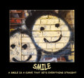
| 05/15/2009 03:03:58 AM | a SMILE is a curve that sets everything straightby wildirisComment: I like the saying, an interesting idea with the title, but maybe the crop could be improved, so that the lower face is in the picture a little more, rather than being cropped out, especailly cropping out the lower part of the smile. Including this area below would have made this look more complete than it does at the moment. | | Photographer found comment helpful. |
|
Showing 441 - 450 of ~1024 |
Home -
Challenges -
Community -
League -
Photos -
Cameras -
Lenses -
Learn -
Help -
Terms of Use -
Privacy -
Top ^
DPChallenge, and website content and design, Copyright © 2001-2025 Challenging Technologies, LLC.
All digital photo copyrights belong to the photographers and may not be used without permission.
Current Server Time: 08/14/2025 11:57:34 AM EDT.
|