| Image |
Comment |
| 05/18/2009 11:25:15 PM |
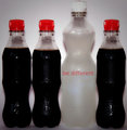
Be Different !!by abbi2bComment: Why should I be different. Where is the motivation to be different. This same statement has been made by others, yet it lacks the motivational phrase to make this work, which is a large part of all motivational posters........
I feel this would have worked more strongly if the bottle was still a coke bottle, and just the fluid inside was different, rather than being a different shape as well..... |
 Photographer found comment helpful. Photographer found comment helpful. |
| 05/18/2009 11:23:09 PM |
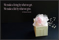
What We Giveby admart01Comment: Simple, elegant and realy well presented. The overall construction of this wrks exceptionally well, and nothing really to add. the most minor thing is the line in the background on the right hand side that is visible....... |
| Photographer found comment helpful. |
| 05/18/2009 11:21:51 PM |
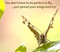
You don't have to be perfect to fly, just spread your wings and try!by PaulComment: I would have really preferred the wings of this to also be in focus. I don't find the body that interesting, but had all of the bug been in focus, i think this could have been a much stronger photo, especially when your phrase refers directly to the wings.
Nice colours in this image, although the green to the left is a distraction and adds nothing to the overall omage. |
| Photographer found comment helpful. |
| 05/18/2009 11:20:07 PM |
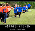
S p o r t s m a n s h i pby glad2badadComment: A statement, but not really of the motivational aspect. An interesting photo and angle, that probably could have been improved. Having all the kids on the line rather than curved around could have menat a really interesting shot of all the hands could have been achieved......... |
| Photographer found comment helpful. |
| 05/18/2009 11:18:18 PM |
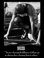
“Success is focusing the full power of all you are on what you have a burning desire to achieve.”by SuttonNComment: The lighting conditions mean that while you have some areas on the very edge of being blown out, much fo the photo is too under-exposed and dark. it appears that this photo was taken in the middle fo the day on harsh lighting conditions, and that hurts the overall image. This is even more obvious when you have this in Black and white.
Its a great idea, a shame you couldn't get this athlete to pose for you, without the others around, later on in better light. this would have removed the distracting elements (other hand, person standing on the left) and enabled you to include the rest of his right hand. therfore, your crop could have been driven by your choice of what works, and not by what you want to cut out.
The presentation is good, the title and phrase work well with the photo. |
| Photographer found comment helpful. |
| 05/18/2009 11:13:08 PM |
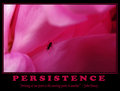
Persistenceby obscurityComment: I like the idea for this, however the photo appears a little soft, which hurts the overall submission. I am also not sure about the choice of colour for the words, as it gives this a very, very pink feel to the entire poster as well. The title and phrase are a great match for the photo..... |
| Photographer found comment helpful. |
| 05/18/2009 11:11:44 PM |
Green Futureby Haukur JoComment: A nice statement, a great, yet simple image, where the subject is able to speak for itself without clutter and distractions, while not being boring. The pink fading to blue is great and gives the colour I feel these type of posters need, the clouds add a little interest as well. A well constructed poster. |
| Photographer found comment helpful. |
| 05/18/2009 11:10:03 PM |
Be Yourselfby kicadiumComment: This photo is an interesting choice, and its biggest problem is that the overall poster lacks the motivational phrase that really ties it to the challenge and makes the entire poster come together. As it is, you have a different lamp and a title, but nothing to inspire........... |
| Photographer found comment helpful. |
| 05/18/2009 11:08:43 PM |
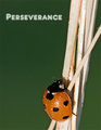
Perseveranceby rrdjservComment: The light reflection is instantly noticable. The plain green of the background doesn't appeal to me. Its just a boring and uninspiring colour which takes up much of the photo. I would have used a deeper depth of field and kept the sticks in focus for the entire photo as well. |
| Photographer found comment helpful. |
| 05/18/2009 11:04:59 PM |
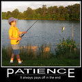
Patienceby jcarComment: I feel some space to the left of this image, just to move the boy closer to the third line, would have helped balance this out a bit more. At the moment, he is very close to the side of the image. The shaddow accross his leg is annoying, and this follows through the foreground.
The colours in this also seem like they could have been improved during Post Processing |
| Photographer found comment helpful. |
Home -
Challenges -
Community -
League -
Photos -
Cameras -
Lenses -
Learn -
Help -
Terms of Use -
Privacy -
Top ^
DPChallenge, and website content and design, Copyright © 2001-2025 Challenging Technologies, LLC.
All digital photo copyrights belong to the photographers and may not be used without permission.
Current Server Time: 08/13/2025 06:41:20 PM EDT.