|
|
|
Showing 381 - 390 of ~1024 |
| Image |
Comment |
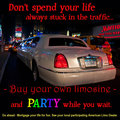
| 05/25/2009 10:44:42 PM | Buy A Limoby tvsometimeComment: Way too much bright words for me. The words overpower the image, the image is not great of the Limo, a bad angle and bad lighting, with plenty of distracting elements as well. The car needed to be more evenly lit to make it the subject |  Photographer found comment helpful. Photographer found comment helpful. |
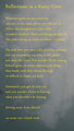
| 05/25/2009 10:40:10 PM | Reflections in a Rainy Civicby posthumousComment: Really do not see this as meeting the Challenge. This is a Photography Contest for Automobile Ads. This is no way makes me want to buy a car.............DNMC | | Photographer found comment helpful. |
| 05/25/2009 04:19:21 AM | Americanus automobilius - Endangeredby VitaminBComment: A very different take. SOme will claim that you took the photo and shoehorned, but I will give you the benifit of the doubt here, as I think it all works really well, and sells a message that you guys need to sell to save the industry.
The photo is stunning, a brilliant capture. I like how the bird is looking into the distance, into the negative space, and away from us. In many ways it is like he is contemplating the future of the industry. A typically sure thing, looking into the uncertain future.
The text, brilliant, great font, great placement, works really well. The overall composition of this is exceptionally good.
Only critisism. If this were an add, the title wouldn't be shown, and therefore it would lose the overall effectiveness, as we wouldn't know what you were selling. It could be a generic phrase. Integrating the title in, somewhere, would have completely made this as an add. Don't know where you would put it, but I feel, for this to stand alone, in a Magazine, it needs to be in there. Other than that, I expect to see this advertising the industry next week. Exceptionally professional, well executed, great idea and a stunning photo........ | | Photographer found comment helpful. |
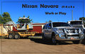
| 05/25/2009 04:14:03 AM | Nissian Navaraby CraftyComment: Like the idea. Love the blue sky. Hitching the trailor is good.
However, the crop is too tight. You are on the edge of losing the front bumper, and the border goes through it. Also, the trailor is partially cropped off. The car needed to be more towards the centre, on the line of third, as the main subject, with the trailor behind as a secondary element
Also, there are too many distracting elements in this. The truck is a major problem, it doesn't add to the message, neither does the garage either, but both just grab the attention. | | Photographer found comment helpful. |
| 05/25/2009 04:10:42 AM | Cadillacby dtremainComment: Classic. Whereas most others went and photographed a car, and advertised a car, you instead went the brand. What you have acheived is a very clean, crisp image, that is simple in its composition, and yet extremely effective in its message. Of those I have gone through, this is the best at selling the car......
A few very (very) minor things prehaps.
Maybe the crop is just a little tight around the image. Just a little extra negative space would have helped, so that the symbol wasn't as constrained.
The text I feel is a little light. A darker silver I think would have been better. Avoiding black though was a good choice.
An excelent image, and overall composition for this challenge. | | Photographer found comment helpful. |
| 05/19/2009 11:28:20 PM | let it beby skewsmeComment: I like the image, I like the phrase, I like the overall concept and message you are trying to portray, but don't find it really to be that motivational. A little extyra room around the sides and top of this image, just to clearly define that nothing is cropped off, would have helped this slightly as well. it feels a little contrained by the current crop | | Photographer found comment helpful. |
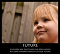
| 05/19/2009 11:24:54 PM | Futureby kashiComment: An interesting image, by its composition you have made it much more than just a picture of a girl, and that is what makes this image a lot more appealing. it ties in well with the phrase, with her seemingly looking off into the future, one that is uncertain, but one that she will create as she grows. A great image and a good submission. | | Photographer found comment helpful. |
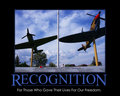
| 05/19/2009 11:23:18 PM | Recognitionby SenayComment: Cropping off the aircraft wings for me in this image makes it seem a little incomplete. The darkness of the underside of the wings also create large, black areas, whereas some fill light would have shown these with some detail which would have made this photo. Some additional foreground with the names on the wall, giving this more prominance, would have then made the names of the fallen the clear subject of the photo, and therefore made a stronger statement overall.
The title and phrase do tie in really well with the photo, and with the changes mentioned above, this could then have been one of my highest rated photos in the challenge | | Photographer found comment helpful. |
| 05/19/2009 11:20:22 PM | | | Photographer found comment helpful. |
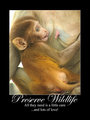
| 05/19/2009 11:16:33 PM | Preserve Wildlife.by kbhatia1967Comment: A good statement made and really good presentation of the overall poster. The entire composition works to expressed your message in a very effective way | | Photographer found comment helpful. |
|
Showing 381 - 390 of ~1024 |
Home -
Challenges -
Community -
League -
Photos -
Cameras -
Lenses -
Learn -
Help -
Terms of Use -
Privacy -
Top ^
DPChallenge, and website content and design, Copyright © 2001-2025 Challenging Technologies, LLC.
All digital photo copyrights belong to the photographers and may not be used without permission.
Current Server Time: 08/13/2025 04:22:52 AM EDT.
|