| Image |
Comment |
| 12/12/2009 05:58:02 PM |
Stowe by nightby ConnorComment: The lights here are illuminating the subject, and you are not shooting 'against the light' which is the main theme of Contre-Jour......I do like the effect you have achieved, and the negative space created, but too many details are too dark and therefore lacks details......... |
 Photographer found comment helpful. Photographer found comment helpful. |
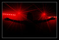
| 12/12/2009 05:53:03 PM |
...and then there was light...by Eagle40Fox2Comment: The lightbursts are great, but the background is not level. I feel this image needed to be symetrical. The right is too low. If these lights were at the same level as the left, being above the arms, and a symmetrical composition, this would have wider appeal. |
| Photographer found comment helpful. |
| 12/12/2009 05:52:56 PM |
dew dropby duartixComment: Love the negative space. It almost looks like an eye looking at me.......great use of the light to make this photo........ |
| Photographer found comment helpful. |
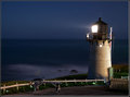
| 12/12/2009 05:52:16 PM |
Looking out to Seaby sranneyComment: A really great photo, really well presented, and something that appeals......but.............
Not really Contre-Jour.......The main light source is really coming from the side, and not really taken 'against the light'...........I do not get the real feel of the effect here.......
In terms of composition, The lighthouse is a little too far to the right. it would work much better if it sat on the line of third instead.......I would have kept the room to the left, and just added space to the right, giving a more paroramic crop........the border does work well here, the lighting is good and the subject interesting.
Will still score this well cause its a great photo, but that it doesn't really meet the challenge IMHO is why this is not the top photo in this challenge. This in a free study (especially with the adjusted crop) for me would score very high....... |
| Photographer found comment helpful. |
| 12/12/2009 02:53:06 PM |
|
| Photographer found comment helpful. |
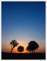
| 12/12/2009 04:42:16 AM |
Desert Sunriseby mqnaufalComment: Great colours through the sky. the centred composition though makes this look a little more plain that it is. A landscape crop, removing the large area of blue sky and therefore showing more colour and ofsetting the trees could have worked here. |
| Photographer found comment helpful. |
| 12/12/2009 04:40:59 AM |
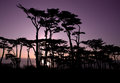
December Duskby DCNUTTERComment: Great coloours through the sky in this image. It is a shame that the dark clloud band at the lower part of the sky means the lower part of the tree starts to blend it. If the lighter colour went all the way down to the hill, this would have gone from really good to brilliant. Could a lower shooting perspective delivered this? However, the rest of the image is very well done and a really good submission for the challenge |
| Photographer found comment helpful. |
| 12/12/2009 04:38:56 AM |
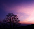
Lavender Nightsby LouisaComment: Grea colour through the sky, and a great Contre-Jour image. Maybe a less centred composition could have worked here, probably with the main trees to the right giving the negative sky space to the left........Apart from that, a really good submission |
| Photographer found comment helpful. |
| 12/12/2009 04:36:39 AM |
Pocketful of Sunshine by MsAmbrosiaComment: A really good photo for the challenge, with great colours through the sky and great retained detail in the foreground which really makes this image work. |
| Photographer found comment helpful. |
| 12/12/2009 04:35:27 AM |
Backstageby keyzComment: A brilliantly composed and executed Contre-Jour photo. The backlight feel is very strong, while the details have been exceptionally well retained without destroying the backlight. While other strong photos have gone for the Landscape, this portrait is exceptionally well done. The border works well with this as well, as does the b&w processing. |
| Photographer found comment helpful. |
Home -
Challenges -
Community -
League -
Photos -
Cameras -
Lenses -
Learn -
Help -
Terms of Use -
Privacy -
Top ^
DPChallenge, and website content and design, Copyright © 2001-2025 Challenging Technologies, LLC.
All digital photo copyrights belong to the photographers and may not be used without permission.
Current Server Time: 08/05/2025 03:04:30 AM EDT.