| Image |
Comment |
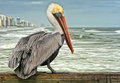
| 01/22/2010 01:38:26 PM |
In the Wildby sarsonukComment: A great capture of an Owl, but the cropped ear is an element that stands out. Great Depth of field to isolate the Owl from the background. |
 Photographer found comment helpful. Photographer found comment helpful. |
| 01/22/2010 01:37:30 PM |
Sea Guardianby AliciaComment: The processing really emphasizes the bird from the surroundings. There appears though to be haloing around the bird and the heavy processing of the background is not to my liking |
| Photographer found comment helpful. |
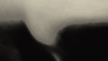
| 01/22/2010 01:35:08 PM |
Surface Waveby zeuszenComment: A different image in the challenge, showing your different style compared to the majority on this site. The wave is interesting and the use of B&W is good. |
| Photographer found comment helpful. |
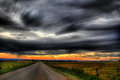
| 01/22/2010 01:33:37 PM |
Montana Skyby LadyKComment: Great colours on the horizon and interesting shades through the clouds which are a major feature of this photo. The offset road works really well also |
| Photographer found comment helpful. |
| 01/22/2010 01:01:12 PM |
Father of the Brideby MartyComment: An interesting and really fun image, and something very different to everything else in this challenge. Love the light and the composition...... |
| Photographer found comment helpful. |
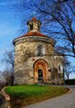
| 01/22/2010 12:59:55 PM |
Rotundaby GeorgeComment: An interesting building, and the use of the curved wall and road leading to it is good composition. However, the tree in front of the building though is a major distraction and does not add to the image...... |
| Photographer found comment helpful. |
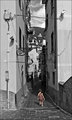
| 01/22/2010 12:52:30 PM |
a l o n eby nivlekComment: An interesting location, but there are a lot of elements and distractions to grab the eye. The black and white contrasting against the slight red of the dress does help draw the attention to the girl in the image, however she does seem a little small in the image.........it does help emphasis her alone status though......The very tall crop though I dont think really was needed, as plenty of dead space and distracting elements could have been removed at the upper part of the image with a more conventional crop ratio |
| Photographer found comment helpful. |
| 01/22/2010 12:46:02 PM |
Old Worldby myceliumComment: The image is centred, but not quite. By this I mean you have taken from the middle of the room, and the end of the room is almost in the middle of the image, as are the middle of the roof elements, but it isn't quite, which makes the image look tilted slightly. A more dramatic angle and using the brialliant elements of the room to lead the eyes through the image would have worked better. |
| Photographer found comment helpful. |
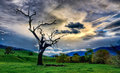
| 01/22/2010 12:43:33 PM |
Burnt Tree Revisitedby vladoComment: A great return to this tree Vlado...........Great composition and a great sky in the image.......The green grass is just a touch overdone on my monitor which might hurt the scores in a very strong field here. other than that, a great image and glad you went with this one.........not voting on it though!! |
| Photographer found comment helpful. |
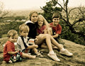
| 01/21/2010 02:12:37 PM |
Visit to Gellibrand Hillby vladoComment: A great image of the family before it expanded again. Use of the yellow tones gives it an old style photo feel. Not sure Stefan is really that happy with you though..........but the kids are getting big...........
|
| Photographer found comment helpful. |
Home -
Challenges -
Community -
League -
Photos -
Cameras -
Lenses -
Learn -
Help -
Terms of Use -
Privacy -
Top ^
DPChallenge, and website content and design, Copyright © 2001-2025 Challenging Technologies, LLC.
All digital photo copyrights belong to the photographers and may not be used without permission.
Current Server Time: 08/04/2025 11:02:12 PM EDT.