| Image |
Comment |
| 10/19/2008 01:13:05 PM |
Bottoms Upby ALAComment: Clever I like the way the model doesn't look like she is upside down (I assume she is and that glass is not filled with Gelo), her posed hand doesn't look as awkward as I might have expected it to.
I think the shot could have benefitted from a different colour backdrop as that's a bit strong for my liking and also seems to give a strange cast over the models face. The green in the glass is neat though.
Comment Only |
 Photographer found comment helpful. Photographer found comment helpful. |
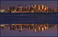
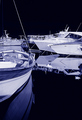
| 10/19/2008 01:09:06 PM |
Financial District - upside downby HeiSchComment: I love the detail in the cityscape and the reflection, I am really not sure though if I like that thick band going through the middle, if that had been half the depth it would have been an awesome image, as it is it's still stunning but sits a little awkward. I would love to see this as a straight shot without the reflection it's the sort of thing I could see sitting on a studio flat wall.
Comment Only |
| Photographer found comment helpful. |
| 10/19/2008 01:05:02 PM |
|
| Photographer found comment helpful. |
| 10/19/2008 01:03:41 PM |
Blue Heron Preeningby hihosilverComment: Unlike the flamingo shots in this challenge the Herons head is not upside down and whilst I gave the other shots a bit of leaway as they could almost be considered fitting for the challenge I don't think this shot can be considered to do so.
Comment Only |
| Photographer found comment helpful. |
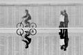
| 10/19/2008 01:02:19 PM |
Mirror, Mirrorby halopesComment: Nice capture, interesting composition and I really like the space left for the cyclist, I might have cropped a little more on the right though as I don't think is a bit of dead space, in one respect it adds balance to the cyclist but in another it kind of makes it too symetrical and looks a bit awkward.
Comment Only |
| Photographer found comment helpful. |
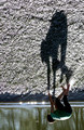
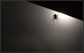
| 10/19/2008 12:59:00 PM |
Shadowplayby jonfrommkComment: Nice shadow which makes a nice change from all of the reflection shots, I think it may be a bit too heavy though and makes the composition a bit awkward, I would also have liked to see some fill light on the backside of the child to add some detail to the legs and underside area.
Comment Only |
| Photographer found comment helpful. |
| 10/19/2008 12:57:10 PM |
Seaworldby Rino63Comment: I see the reflections as upside down but I think like most of the other entries it might have worked a bit better flipped to exagerate the effect. Looks like there might be a blue cast over the image which might affect your score a bit.
Comment Only |
| Photographer found comment helpful. |
| 10/19/2008 12:55:32 PM |
A Hunter's Moonby LonzComment: My main problem with this is the harsh line across the top right, I like the silhoutte and I like the lighting but that triangle is really distracting.
Comment Only |
| Photographer found comment helpful. |
| 10/19/2008 12:54:36 PM |
A Blue Noteby gunsmith6Comment: OOF, blue colour cast and not particularly inspiring :(
Comment Only |
| Photographer found comment helpful. |
| 10/19/2008 12:53:22 PM |
|
| Photographer found comment helpful. |
Home -
Challenges -
Community -
League -
Photos -
Cameras -
Lenses -
Learn -
Help -
Terms of Use -
Privacy -
Top ^
DPChallenge, and website content and design, Copyright © 2001-2025 Challenging Technologies, LLC.
All digital photo copyrights belong to the photographers and may not be used without permission.
Current Server Time: 08/06/2025 12:09:46 AM EDT.