|
|
|
Showing 131 - 140 of ~641 |
| Image |
Comment |
| 06/24/2009 03:05:33 AM | |  Photographer found comment helpful. Photographer found comment helpful. |
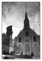
| 06/23/2009 09:54:11 AM | Heaven's Passageby RulerZigzagComment: Greetings from the Critique Club :)
Composition:
I quite liked this in voting although the wide angle distortion works in some areas and detracts from others, for example I love the way the statue leans in to the shot but find the way the church leans is a bit awkward (can't have the best of both worlds though I guess heh). I think compositionally it works overall though, but as mentioned by those that have left comments the shadow (I am assuming you used an NDGrad?) on the building really detracts from the image and that's a shame as I think you had a cracking shot without it.
Technicals:
Other than the grad nothing really jumps out as a problem, it's well focused has a nice DOF.
Post-Processing:
I raelly like the tones in the lower half of the church and I suspect had they been consistent throughout that this would have placed much higher, the only thing I might have changed as it stands is to crop a tad more on the right and lose that tiny bit of tree.
My Opinion:
Nice crisp picture let down a lot by the dark area mentioned (so many times before sorry), nice composition and a rather nice feeling of depth from front to back.
Hope this was of some use, should you wish to discuss any part of the critique further please feel free to PM me.
Good luck in future challenges!
Mark | | Photographer found comment helpful. |
| 06/22/2009 03:37:16 PM | Betty Page's legs?by snafflesComment: Greetings from the Critique Club :)
Hi Susan!
Composition:
I like the composition of this shot, it flows nicely and feels complete, as placement of the legs goes I wouldn't change a thing (although I might be inclined to leave a tad more room either side). Your lights positioning however I would change and I would also change your distance from the background to remove the shadows, I'd have placed the main light high camera right and the fill light also fairly high on axis to the camera or slightly left to soften any visible shadows that remained. My reasoning is that I find the shadows distracting from the overall composition.
Technicals:
Considering you obviously used lights of some form on this shot the settings confuse me somewhat, unless you used constant lighting of the table lamp variety I am not sure why you pushed the ISO and had such a slow shutter. I'd be interested to see the original of this to see what it looked like out the camera.
Post-Processing:
I have a feeling I know the kind of look you might have been going for, I've seen this sort of processing on post cards before (normally cheeky images like this) so I will state the following about the PP from a DPC entry perspective only. I think you intentionally hit the contrast to extreme and also the sharpening for the above reasons.
So from a DPC stand point, I think to the voters this would look like an image that has serious sharpening issues, most would also likely look at the banding in the tights (not the legs! :p sorry couldn't resist) and think of it as a processing error rather than give you the benefit of the doubt that you were perhaps going for this look.
My Opinion:
I actually really like this shot (you have great legs!) if you were further from the backdrop and had lit slightly more evenly (to lose the shadows) I think this would make an awesome retro pinup shot that would look stunning poster sized on a wall - I also think that had these two issues been taken care of then the sharpening and contrasts would have worked so much better as the overall look would be MUCH cleaner. Great legs, great pose lets see a re-dux of it soon with those issues ironed out :)
Hope this was of some use, should you wish to discuss any part of the critique further please feel free to PM me.
Good luck in future challenges!
Mark | | Photographer found comment helpful. |
| 06/22/2009 04:27:55 AM | DUCK !!!by MAKComment: LOL some people really believed the artist thought it was a Duck? Geez I'm sure MAK knows a Chicken when he see's one!
Cool shot mate, especially like the fact that he is "ducking" his head too :) Lovely tone and very nice contrasts.
| | Photographer found comment helpful. |
| 06/21/2009 11:25:26 AM | RedRockby KokkurinnComment: Greetings from the Critique Club :)
Composition:
Tough one to call this as there's quite a lot going on in the scene and many elements are competing for the viewers attention, even though the big Red stone seems to want to draw my eye when it gets there I am immediately pulled to the whiter one to the right and the harsh light on the one to the left. For DPC I think you would have faired much better had you selected 2 or 3 of these stones and shot them on white or black seemless, with some nicely controlled lighting as the stones themselves look quite interesting with their patterning.
As it stands I think the picture above might have worked better by bringing the red stone closer to the front and maybe off center somewhat, and using a very shallow Depth of Field ( f3.5 on your lens might have just isolated the stone enough from the background for it to hold the attention of the viewer.
Technicals:
I am going to assume you had this on a tripod and as you state 2 flashes were used I am inclined to think you maybe shot this indoors, your biggest problem is the very harsh light on the edge of some of the stones, if I were shooting this scene I think I might be tempted to position the flashes behind and use some reflectors to bounce light back in to the stones this would have helped keep the highlights undercontrol.
Post-Processing:
Nice saturation levels and generally good tonal range, I managed to convert the shot to B&W and conceal the blown highlights a bit but some of the charm of the image was lost due to the nice colours that the stones have.
My Opinion:
A reasonable shot, I think the high focus point coupled with a fussy foreground probably cost you a bit in the voting, I think some of the stones are very nice and had they been selected and used in a DPC style clean and simple, but well executed shot you could have had a fairly high scoring image on your hands - it's well worth looking at the challenge history and seeing what sort of shots the voters like here (if scoring highly is your reason for submitting of course).
Hope this was of some use, should you wish to discuss any part of the critique further please feel free to PM me.
Good luck in future challenges!
Mark | | Photographer found comment helpful. |
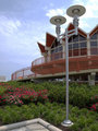
| 06/21/2009 09:19:00 AM | Street Lampby Graves935Comment: Greetings from the Critique Club :)
Composition:
I think Citadels comment is pretty much on the money really although I think I can see what you were going for, the lamp feels like it should sit there nicely as it's on the 3rds line and so should be asthetically pleasing, but unfortunately something doesn't work with it, the pole doesn't bother me that much but I think it's the lamp heads that spoil the shot - they definitely demand a lot of attention.
Maybe a higher position with this same idea would work better, so the top of the building was dominent in the scene this would give more weight to the building and take a lot of it away from the lamp.
Camera Work:
Seems ok, I guess one could argue that the lamp looks totally sharp and the windows of the building are maybe a little soft, I wonder if your intention was actually on the lamp as architecture? If this is the case I think a tiny DOF would have worked better and you know what, I think that may have worked.
Post-Processing:
Nice saturation levels, I would possibly have applied a shadow / highlight on the image to improve some of the detail in the flowers and deepen the sky just a touch.
My Opinion:
Quite a nice idea and congratulations on your first entry I hope to see more of your work as you progress on the site.
Hope this was of some use, should you wish to discuss any part of the critique further please feel free to PM me.
Good luck in future challenges!
Mark | | Photographer found comment helpful. |
| 06/21/2009 09:01:03 AM | In Memory of... (An Unforgiving Mountain)by LeoComment: Greetings from the Critique Club :)
Composition:
I think you hit the nail on the head in your notes really, for me too the memorial is probably more significant in the image than the rocks, I can't put my finger on any specifics but something feels a little awkward, maybe it's the size of the boulders and the beautiful scene behind that we just cant quite see enough of (but that's the rub I suppose, trying to fulfil the challenge enough for DPC voters and still have a good compositional image). I wonder if moving back or using a wider angle (if it was available) to give some room to the right, might have helped in the overall composition, this may also have lessened the memorial enough that it still gives the story but lessened its dominance within the scene.
Camera Work:
Not a lot I can suggest really, you were obviously working in very tough conditions those shadows show just how harsh the sunlight was.
Post-Processing:
Nice saturation levels, pretty good detail in the rocks, I don't think there was much else you could have done within basic editing rules that would have affected the score significantly.
My Opinion:
I think it's a tough call when taking shots like this of how to be respectful to the situation and still get the shot you are after with the challenge in mind, I think you did a good job of retaining respect but the "rock" side of the image suffered a bit for it.
Hope this was of some use, should you wish to discuss any part of the critique further please feel free to PM me.
Good luck in future challenges!
Mark | | Photographer found comment helpful. |
| 06/20/2009 06:58:56 AM | Centerpoint Towerby AndyBComment: Greetings from the Critique Club :)
Composition:
I really liked the ground up almost extreme angle of this shot when I went through voting. I did feel a little straightening would have helped avoid the slight distraction of the tilt though. I love the way the cables lead you wonderfully up to the golden peak and the lighting on that area is gorgeous too.
Camera Work:
Everything looks to be in order, good shutter / ISO and aperture settings for this shot.
Post-Processing:
Not too heavily saturated which is good, I put the image in PS and found a Shadow / Highlights help make the image pop just a tad more, but other than that no real issues I can see.
My Opinion:
I liked this in voting as I mentioned above and was one of your 7 votes, that may have been an 8 without the tilt, I think you have a very interesting capture that met the challenge nicely, I am surprised you didn't get a few more comments but sometimes that's the way it goes.
Good luck in future challenges!
Mark | | Photographer found comment helpful. |
| 06/19/2009 11:57:47 AM | Geodesic Sunsetby thatsanicepictureComment: Greetings from the Critique Club :)
Composition:
For me the sunset area is a little too low in the scene and I think this would have looked really nice had the camera angle been slightly lower, that would have resulted in the darker area at the top being out of the frame too which i think would have added to the image, I think the Hexagon shapes are amazing and with that sunset in the background there was the making of a seriously good challenge entry here (although I think it might be a stretch for Architecture for the voters on this site).
Camera Work:
Everything looks to be in order, nice use of high ISO to get the shot and well retained details in the sunset.
Post-Processing:
Not too heavily saturated which is good as I suspect it would have been very easy to get carried away processing that sky.
My Opinion:
Nice out of the box thinking and I reckon in the right challenge this location has the potential to produce a shot that could finish very high, there's some lovely shapes formed making for a very interesting capture. This one probably fell a bit in score due to the subject matter and the voters expecting to see a building or very specific types of structure (pretty much a given when looking at the results).
Good luck in future challenges!
Mark | | Photographer found comment helpful. |
| 06/18/2009 03:16:27 PM | original.jpgby LutchenkoComment: Sorry about your DQ Will seriously that sucks, I cannot see the point in question so cannot comment on how I feel about the DQ itself, what I can tell you is this original image is 10x better than the edit LOL Sorry but this would have won with practically no editing IMO Message edited by author 2009-06-18 15:16:53. | | Photographer found comment helpful. |
|
Showing 131 - 140 of ~641 |
Home -
Challenges -
Community -
League -
Photos -
Cameras -
Lenses -
Learn -
Help -
Terms of Use -
Privacy -
Top ^
DPChallenge, and website content and design, Copyright © 2001-2025 Challenging Technologies, LLC.
All digital photo copyrights belong to the photographers and may not be used without permission.
Current Server Time: 08/01/2025 09:35:02 PM EDT.
|