| Image |
Comment |
| 10/12/2003 11:15:59 AM |
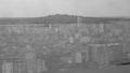
Urban Landscapeby Dim7Comment: I don't see this as urban, but that set aside, this is a nice photograph. 6 |
 Photographer found comment helpful. Photographer found comment helpful. |
| 10/12/2003 11:14:46 AM |
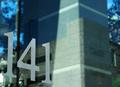
141by elemessComment: Somehow this photo really appeals to me in the challenge. I think the simplicity of it says it all. You don't need much more outside of the nice reflection you have. Very well done! 9 |
| Photographer found comment helpful. |
| 10/12/2003 11:09:58 AM |
The house of Godby oskarComment: I am wondering if you handheld this? There is a blur to this and I don't find it appealing...though I tend to like really crisp photos. |
| Photographer found comment helpful. |
| 10/12/2003 11:07:58 AM |
|
| Photographer found comment helpful. |
| 10/12/2003 11:07:05 AM |
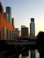
The Bayou Cityby jab119Comment: Very crisp, clear and interesting. I love the framing of this. It's perfect!! Great building colors too and nice reflections. |
| Photographer found comment helpful. |
| 10/12/2003 11:05:35 AM |
|
| Photographer found comment helpful. |
| 10/12/2003 11:04:47 AM |
Old and newby carinaComment: Very Interesting. I wish you would have cropped off the right side though. I am not sure it adds interest... When I hold my hand up and take of the dead white sky, I say WOW! 8 as is... |
| Photographer found comment helpful. |
| 10/12/2003 11:02:06 AM |
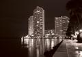
Seafrontby ewebComment: A tripod here would have helped prevent the blur in the lighting. I find it rather distracting. I am also not sure why you chose black and white here. I don't think it helps your photo... |
| Photographer found comment helpful. |
| 10/12/2003 11:01:18 AM |
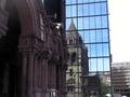
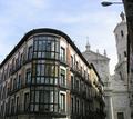
Hidden Cathedralby sersalComment: My personal preference would have been to crop off the right side of this image and a portion of the top to get rid of the street light. The two main buildings of the photo are very interesting and intersect nicely. Where they intersect is very interesting. The rest adds clutter. Still, nice capture: 6 |
| Photographer found comment helpful. |
| 10/12/2003 10:59:37 AM |
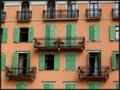
Waiting for guestsby aKiwiComment: Very interesting. I wish you wouldn't have cropped the top arches off. I love the colors, and the architecture in the balconies, shutters and moldings. Lovely overall: 8 |
| Photographer found comment helpful. |
Home -
Challenges -
Community -
League -
Photos -
Cameras -
Lenses -
Learn -
Help -
Terms of Use -
Privacy -
Top ^
DPChallenge, and website content and design, Copyright © 2001-2025 Challenging Technologies, LLC.
All digital photo copyrights belong to the photographers and may not be used without permission.
Current Server Time: 08/20/2025 04:52:59 PM EDT.