| Image |
Comment |
| 01/09/2010 10:17:55 AM |
|
 Photographer found comment helpful. Photographer found comment helpful. |
| 01/09/2010 10:17:34 AM |
|
| Photographer found comment helpful. |
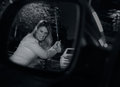
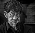
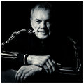
| 01/09/2010 10:15:56 AM |
Song Title: OLD by andrewtComment: I like this a lot better than your portrait entry. Great textures in his face. |
| Photographer found comment helpful. |
| 01/09/2010 08:58:09 AM |
Homeward Boundby ace flymanComment: I love topaz but this is a little over the top. Nice composition and meets the challenge well. |
| Photographer found comment helpful. |
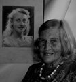
| 01/09/2010 08:37:25 AM |
Youth and ageby LonnieDComment: Nice idea and you got a good expression on her face. Clean up the background and lighten up the highlights. |
| Photographer found comment helpful. |
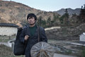
| 01/09/2010 08:34:57 AM |
Towards a New Lifeby wei1108Comment: Some more post-processing to make this pop would help. Love the subject and the framing. |
| Photographer found comment helpful. |
| 01/09/2010 08:33:38 AM |
The Tao Of Boxingby pawdrixComment: Love the lighting & the direct look of the subject. Good use of black & white. For a boxer, I want to see his hands in focus too so larger DOF would help here. |
| Photographer found comment helpful. |
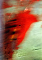
| 01/09/2010 08:22:12 AM |
7 billion minus 1by cutoutComment: I really like abstracts...but this is barely recognizable as a human form. It IS a portrait challenge not a free study or an abstract. I'll give you the benefit of the doubt that it isn't just paint on the wall because frankly that's what it appears but can't give this any kind of score. |
| Photographer found comment helpful. |
| 01/05/2010 11:40:32 AM |
rippled butterfly by LelezComment: Blurring the background by using a lower depth of field would improve your image. The reflection is very cool and you don't want the background clutter to detract from it. Cropping would give you a neat abstract. |
| Photographer found comment helpful. |
| 01/05/2010 11:40:16 AM |
Umbrellas on the pavementby manavgComment: Really cool scene - perfect for this challenge of course. I don't care for your angle. I think a straight-on shot would have been better so you didn't cut off the front umbrella. You could have cropped out the busyness on the right side so we focus on your subject more. |
| Photographer found comment helpful. |
Home -
Challenges -
Community -
League -
Photos -
Cameras -
Lenses -
Learn -
Help -
Terms of Use -
Privacy -
Top ^
DPChallenge, and website content and design, Copyright © 2001-2025 Challenging Technologies, LLC.
All digital photo copyrights belong to the photographers and may not be used without permission.
Current Server Time: 08/22/2025 05:49:05 PM EDT.