|
|
|
Showing 891 - 900 of ~1875 |
| Image |
Comment |
| 02/15/2011 05:36:32 AM | The Sexiest Thing On Earthby LandzEncaComment: Not sure what aperture you were using, but stopping down to get more depth and better sharpness would be appreciated. Also having some lighting on the tuning fork marque, since you generally want to accentuate the product itself. The bit of white at the bottom and the bit of red above the tank could be eliminated, since they seem matter of fact, as well. |  Photographer found comment helpful. Photographer found comment helpful. |
| 02/15/2011 05:34:51 AM | IMG_7877 800by Yo_SpiffComment: The processing works well to add a vintage look to this, but I'm not a fan of the bordering. I can see it working well when presented in another medium, but the rabbeting on the edges and the white just looks silly in this context. If that white were transparent... it would work well.
The cigar is great, and I also like that you've captured him in front of a building which does not indicate the modernity of the shot, it is not an anachronism. | | Photographer found comment helpful. |
| 02/15/2011 05:32:38 AM | Backby PaulComment: Really like the vignette, but the gloves are what define this shot, adding a somewhat forboding (not sure why...) aspect. | | Photographer found comment helpful. |
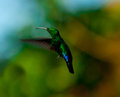
| 02/14/2011 04:00:11 AM | illuminationby BarronessComment: Hello and greetings from the Critique Club-
Since I voted on this challenge, I will provide you with my vote and an explanation as to why I voted how I did.
For your entry, I gave you a vote of 4. While hummingbirds are undoubtedly one of the more difficult objects to capture, the bar has been set very high by other members in this arena and it isn�t unusual for them to take Top 10 placements in the Free Studies. Regarding your photo, the centered composition makes the photo feel very static. This feeling is increased by the lack of other subject matter. Technically speaking, the sharpness for this photo is below what is demanded by wildlife photos, which are expected by the very sharp. I think part of this is due to the aperture of 5.6, assuming you were shooting at the tele end of your lens. Knowing that the 5D is not known for focus speed, I would suggest you stop down significantly, for two reasons. First, it will expand your depth of field and make it more likely for you to catch the bird in focus, and secondly, because it will make your lens sharper in any case. Do not be afraid to crank the ISO of the 5D up- it performs very well in this regard. I would also recommend using a higher shutter speed as 1/250 for a 300mm lens is going to be pushing the limits for a sharp shot anyway. If you have external lighting at your disposal, I suggest you peruse this tutorial as well- ( DPC Tutorial
Be aware, however, that the 5D often does not actually sync at 1/20 and frequently down towards 1/160 instead.
You�ve obviously got the most important thing for wildlife photography- patience- so I suggest you keep with it. There are few people who can muster the patience to sit around trying to focus on such small speedy creatures.
| | Photographer found comment helpful. |
| 02/14/2011 03:42:15 AM | Sunset at Anna Maria Islandby Ja-9Comment: Hello and greetings from the Critique Club-
Since I voted on this challenge, I will provide my vote and an explanation for it.
I gave your entry a 5. While you no doubt stumbled upon a gorgeous scene, it is quite another thing entirely to have a composition with a sunset that strengthens it (it�s quite difficult, in my opinion). It seems as though you wanted to convey the greater scene and context a bit here, but it is somewhat incomplete because the water is so dark and the beach is non-existent. Surely, it�s there, but it is completely obscured. The tree also does not feel particularly relevant to the shot, it not having a conceptual connection to the ocean nor the sky, which is compounded by the fact that it is a very strong element in the scene. It is so strong as to dominate and subvert the sunset, which is what you wanted your subject to be. A focus on the sunset itself as the subject would benefit things, in my opinion. It is also, of course, notoriously difficult to enter sunset photos here at DPC, owing to the laurelled history of the subject matter, so there�s that too. Not a bad shot by any means, but lacking something to set it apart from the others.
| | Photographer found comment helpful. |
| 02/14/2011 03:21:44 AM | Sunburstby chazoeComment: Hello and greetings from the Critique Club,
As I voted on your photo, I�ll tell you what I voted and why-
I gave your entry a 5, and if I were to explain it succinctly, I would say that you did a good job of capturing a lightness and brevity, but that the photo, to me, feels very incomplete and unsure of what it was trying to be. It is somewhat lacking of direction, and while I do like the bright colors and appreciate the blown areas, it does not seem as though it altogether completes the message.
As far as the more high key approach goes, it works well for this subject matter, but the contrast is not quite lowered to a level typical of a high key shot. It also resides in an area that is neither completely blurred nor sharp. While these rules or guidelines need not be followed, it�s useful to know them and know that to a great extent they guide what people expect in photos. I think, in this case, a more solid and concerted effort towards a high key shot would have benefitted things. I think it also would have worked to have an initially somewhat sharper photo and then go for an impressionist approach (which you somewhat have here). What is somewhat awkward though, is that while you�ve gone for the impressionist approach, and the image is not focused, the portions of the flower that define its shape are very sharp because of the contrast that is still present in them. This is particularly true of the edges of the petals, and I think they destroy some of the feeling of a painting that it seems you were going for.
| | Photographer found comment helpful. |
| 02/14/2011 03:08:12 AM | Januaryby smardazComment: Hello and greetings from the Critique Club-
Since I did vote on your image, I�ll give you my vote and my thinking behind it.
I gave you a 6, personally, and if I were to give a summation of my vote, it would be that this is a competently done portrait, but lacks the oomph to push it beyond that.
You�ve got numerous things going well for you in this shot- the lighting is moody, and matches the expression well. The posing does not seem altogether awkward, but also is not terribly natural, either. I hate posing, both myself and other people, so I feel for you here, and can�t suggest much because I think I�m terrible at it. What I do like about the pose is that you�ve kept the joints bent, and because they aren�t uniform in any fashion, you keep a bit of dynamism present. The lighting itself is soft, and interesting, providing a nice texture to the shot through the shadows. One thing I would prefer is to have a bit more light on your right eye. It is slightly illuminated, but maybe a bit more would benefit things. If you turned/tilted your head ever so slightly you would illuminate more under your brow, while still keeping most of your cheek structure obscured. I assume you shot this yourself though, so it�s always hard to do such things.
One thing that I think detracts from things here, though, is what appears to be heavy dodging on the hand. I�m guessing it was much brighter and distracted the viewer, pull them towards it, and while you have muted its presence effectively, once one sees it, it looks very unnatural.
| | Photographer found comment helpful. |
| 02/13/2011 04:55:25 AM | A Jubilant Swingby dahlinComment: I can see why you would have difficulty deciding between these two. They are both great, but so fundamentally different. I love the expression here, but also the reaching in the second one, especially with the glorious sun rimlight. | | Photographer found comment helpful. |
| 02/13/2011 04:51:11 AM | Let Me Explainby dahlinComment: The shadows you noted are there, no doubt, but because the overall exposure of the wall is pretty low, they aren't horribly noticeable. You could always smudge them out in a fan pattern if they really worry you that much, but it's nice as is. A great moment captured, surely one to look back on later and haunt your daughter with. | | Photographer found comment helpful. |
| 02/13/2011 04:47:45 AM | weatheredby aprudhommeComment: The treatment of the shadows define this photo. Very little in their overall abundance, but striking in their strength. It adds a starkness to the scene. | | Photographer found comment helpful. |
|
Showing 891 - 900 of ~1875 |
Home -
Challenges -
Community -
League -
Photos -
Cameras -
Lenses -
Learn -
Help -
Terms of Use -
Privacy -
Top ^
DPChallenge, and website content and design, Copyright © 2001-2025 Challenging Technologies, LLC.
All digital photo copyrights belong to the photographers and may not be used without permission.
Current Server Time: 06/22/2025 10:35:49 PM EDT.
|