| Image |
Comment |
| 02/13/2013 07:18:57 AM |
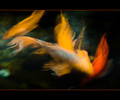
Jewels in the Pondby Ja-9Comment: Well, at the end of it all, we finished rather close, but you got much better comments on your entry, that's for sure! :) Regardless of placement, I still think it's a wonderful photo. |
 Photographer found comment helpful. Photographer found comment helpful. |
| 02/08/2013 02:23:31 PM |
The Best Little Manby colorcarnivalComment: Originally posted by skewsme:
People in the real world must tell you what a fantastic photo this is. They are correct. |
There isn't much more to say about the photo than this. It's a great photo, but it isn't DPC'y (be that good or bad). I love the pose, very lifelike, fun, interesting. I'm terrible at that, so I appreciate those moments acutely. Great capture, guts for using it for Best Of :) |
| Photographer found comment helpful. |
| 02/08/2013 02:19:48 PM |
Mitochondrionby tomeComment: Don't get a fat head, but this is sorta reminiscent of a Gursky, to me. I love how it eschews the normal Eiffel Tower shots. It's even better because it sterilizes what many consider to be a lively and bustling city scene. It is the most flattened and unremarkable depiction of the landmark, and I love that. |
| Photographer found comment helpful. |
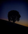
| 02/08/2013 02:17:20 PM |
namasteby FourPointXComment: You know, this is a pretty peculiar shot. You have a silhouetted tree, which doesn't fill the frame, which is centered, and which has an off-kilter horizon (which is separate from being properly vertical). I like the negative black space a lot, I like the muted colors, a lot. I don't like the title, but it's probably because I live close enough to the PRB (that's People's Republic of Boulder, for you not in the know (I'll explain if needed)) that I see those damn stickers on practically everything and it drives me bonkers. |
| Photographer found comment helpful. |
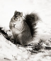
| 02/08/2013 02:13:00 PM |
One Little Nutby colorcarnivalComment: It's like a sweeter more wintry Wendy shot! More humanizing, as well. I just moved to a house with a tame squirrel (according to the previous owner...) so I might have some Wendy shots coming up, as well ;0 ETA: B/W was definitely the right choice here. Message edited by author 2013-02-08 14:13:19. |
| Photographer found comment helpful. |
| 02/08/2013 02:11:09 PM |
Through My Windowby tomeComment: The water spots on the window are peculiarly odd. They almost seem fake, added in PP. Or maybe the source of something mysterious and unknown. A surprisingly unsettling shot, all things considered. |
| Photographer found comment helpful. |
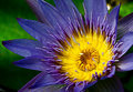
| 01/31/2013 07:17:43 AM |
DSC_0644-Edit1by Ja-9Comment: Great flower photo. It will be pretty hard to separate yourself with a flower photo, but this is probably as close as you can get. I'd clone out that specular highlight, top right. |
| Photographer found comment helpful. |
| 01/31/2013 07:16:12 AM |
DSC_0915-Edit1by Ja-9Comment: Very good, probably my favorite of this batch. I think it's acceptably abstract, in that we all know what we're looking at, yet it's new enough a look to keep our interest. I enjoy the bit of shadows, it emphasizes depth and texture. Small nitpick, and it could be because I'm on a work computer, but there is a bit of weirdness around the edge feathers on the wing. Like a little bit of halos maybe, or overly saturated areas?
Again, could be this monitor... |
| Photographer found comment helpful. |
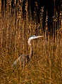
| 01/31/2013 07:07:03 AM |
DSC_1084-Edit1by Ja-9Comment: A well done bird shot, but I think DPC requires a more dynamic scene or a much closer crop. I like the depth afforded by the grasses. |
| Photographer found comment helpful. |
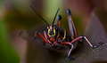
| 01/31/2013 07:05:51 AM |
DSC_3398-Edit1by Ja-9Comment: I'd agree that you might brighten things a bit, but I wouldn't too much. Keeping the shadows heavy emphasizes the bright colors of your subject more. To me, the centered comp is holding things back more than anything, and the slightly odd blur of the leaf on the left is a bit distracting. |
| Photographer found comment helpful. |
Home -
Challenges -
Community -
League -
Photos -
Cameras -
Lenses -
Learn -
Help -
Terms of Use -
Privacy -
Top ^
DPChallenge, and website content and design, Copyright © 2001-2025 Challenging Technologies, LLC.
All digital photo copyrights belong to the photographers and may not be used without permission.
Current Server Time: 06/17/2025 10:23:05 PM EDT.