| Image |
Comment |
| 07/25/2009 10:32:51 AM |
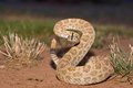
rattler 1.jpgby macawvetComment: Couple things I'd recommend for general impact:
Getting lower (even lower than you already did) tends to make shots look more intimidating. You did do a pretty good job with this to begin with. I second the different crop, either a closer crop or in a perfect world include another balancing subject to the frame. With shots like this it lots of times isn't an option though, so no worries.
I would like to see more depth of field, so stop down the aperture so all the coils of the snake are in focus. This could be a judgment call though, because the background might gain too much detail and get distracting, so it's a careful interplay.
As  trevytrev trevytrev said, you might want to use natural light or try to diffuse your supplied light a bit here. It will take some of the harshness out of the shadows. There are lots of DIY diffuser methods out there.
Check out this guy's setup. Super simple but then look at how great the lighting in his macro shots look. |
 Photographer found comment helpful. Photographer found comment helpful. |
| 07/22/2009 09:27:57 AM |
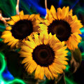
Essenceby purpleflutterby13Comment: ====Critique Club====
Your subject fills the frame almost entirely, and is a centered composition. For this one, I think this is appropriate. Using three flowers instead of one is far more effective in this approach, so good choice. I think it was also a good decision to use three because it adds a bit of dynamism to the capture instead of offering an offset/angled view, which would have been another approach to add visual interest.
The most eye-catching part about your photo, however, is the lighting. Some of the commenters weren�t too pleased with the effect you had by using this approach, but I personally am a fan. I think the blur wasn�t a bad choice, but it would have been improved if you decreased the lighting on the edges of the petals as you neared the edge. This fading would add the ephemeral blur that you used. I�m not sure if you added the blur in PP or not, but one way to increase the blur a bit in capture would be to use a small fan either directly in front of or behind the flowers to slighting rustle the tips of the petals. I enjoy the colors of the lights in the background, but I think they could have been muted a bit more so they weren�t as sharply contrasting and more dreamy. In general, the dreamy-ness feels like the theme here, but you sorta partially utilized it and didn�t go all out. One other thing, which I know is really hard when you have such a great range of color between the center of the flower and the petals, is if you were able to add a bit more light to the centers. The texture of sunflower centers is interesting, and this would have been a nice addition. All in all, I personally would have given you a higher score, somewhere between 6 or 7 depending on how I felt when I was voting. Good effort of setting yourself off a bit from the field.
-Derek
|
| Photographer found comment helpful. |
| 07/20/2009 03:14:52 AM |
Big Brotherby StrikeslipComment: Oh man. Talk about lol'ing. I wish I could remember which thread this came up in.
Power to ya. |
| Photographer found comment helpful. |
| 07/14/2009 07:03:44 AM |
Fallin'by zackdezonComment: What is hurting you the most in this photo is the expression on your face, IMO. I know (personally) how hard it is to do handstands and especially one handed handstands by one's self, but your strained expression surely detracts from the thought. Perhaps a bit of light on your left side would have helped too. Good job going solo on this though, I've tried capturing photos of me dirt jumping and know how much of a headache it can be. |
| Photographer found comment helpful. |
| 07/14/2009 06:52:32 AM |
Chasing a dreamby ZigomarComment: As I said before... I think your lensbaby work is far above and beyond the others here. Again, I commend you for your incredible capture and perfectly placed focus point. For many, the lensbaby is simply another tool that is misunderstood. You, on the other hand, know exactly when to utilize it. Well done, and I hope you will continue to sway me towards the lensbaby!:) |
| Photographer found comment helpful. |
| 07/14/2009 06:45:23 AM |
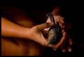
Last Flightby desertsnailComment: Great photo. But the placement of the hands sorta weirds me out... what is that in the background...armpit or other joint? The right hand holding the bird should be a left hand...
I take it you had somebody else holding the bird than the background model. That's my only issue. The muted lighting works perfectly and sets the mood nicely. |
| Photographer found comment helpful. |
| 07/14/2009 06:32:50 AM |
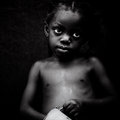
Those Eyes...by gsalComment: I'm ashamed I haven't commented before now! I had you as a favorite for awhile, but neglected to say why. The power of the eyes, and how you faded the skin off into the background is perfect. Combine that with the expression and the cup in the hand and you have one of if not THE most powerful image on DPC I've seen.
Bravo.
A shame you didn't enter this, but the image speaks for itself. |
| Photographer found comment helpful. |
| 07/14/2009 06:19:56 AM |
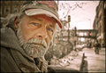
Robert, Vietnam Veteran, Nicollet Mallby choltmeierComment: I agree with choltmeier about how striking this photo is considering the blue of the eyes. What really draws me, however, is how it seemingly looks as though he is in a warzone. I know he isn't, but the nice blur imparted by the aperture choice makes it noticeable. The pedestrians looks as though they are humping packs and the overall lack of color and defintiion remind one of a warzone. Great job. |
| Photographer found comment helpful. |
| 07/08/2009 03:59:37 AM |
|
| Photographer found comment helpful. |
| 07/08/2009 03:54:06 AM |
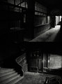
by MephistoComment: I think this is your best use of diptych I've seen so far. The disconnect between the upper hallway and the staircase is nice, the lighting is similar in the scenes; just made to be. |
| Photographer found comment helpful. |
Home -
Challenges -
Community -
League -
Photos -
Cameras -
Lenses -
Learn -
Help -
Terms of Use -
Privacy -
Top ^
DPChallenge, and website content and design, Copyright © 2001-2025 Challenging Technologies, LLC.
All digital photo copyrights belong to the photographers and may not be used without permission.
Current Server Time: 06/18/2025 07:43:46 PM EDT.