| Image |
Comment |
| 11/09/2009 01:30:18 AM |
Blackberry leavesby MelethiaComment: Interesting perspective on the leaves. I like the sawtooth edges and the fine hairs that you have captured. Nice variety of hue and good use of DoF to make things interesting. |
 Photographer found comment helpful. Photographer found comment helpful. |
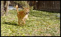
| 11/09/2009 01:28:01 AM |
Running Through the Leavesby jentComment: An overall lack of sharpness and contrast make this photo look a lot flatter than it likely is. The time of day this was shot at and the weather might have influenced this. You might also take some dings from people because your foliage is a largely a secondary subject here. |
| Photographer found comment helpful. |
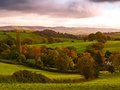
| 11/09/2009 01:24:09 AM |
Nettlecombeby tembaComment: Lost a bit of details in your sky there. I might have considered doing a multi-exposure HDR for this scene to alleviate that blown out portion or possibly underexposed the rest of the scene more and tonemapped. The tones of your foliage and rolling greens, on the other hand, are superb. Very good pastoral feeling. |
| Photographer found comment helpful. |
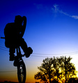
| 11/09/2009 01:21:14 AM |
Sunset "Suicide" at the Skate Parkby kleskiComment: I thought I had commented on this photo when I voted, but alas, I had not. Anyway, coming from the perspective of a rider myself, I think this is taken pretty well. Ideally for this type of shot (magazine spreads) you'd get more of the surrounding area into the shot in order to illustrate the height of the rider (this may or may not have been possible). I like the silhouette though, and the sunset is a great addition. If you're curious, though, this is and yet is not technically a suicide no hander. A traditional suicide no hander has the bike parallel with the ground and the hands are put directly behind the rider, sometimes with a clap behind the back added, and not vertical as it is in this pick. When the bike is vertical, you would traditionally do what is called a tuck no hander, wherein you hold the bars on top of your thighs at your waistline, bending over to pinch them, and extending your hands straight up. Personally, I think a proper tuck no hander would've improved this shot a great deal, because it's a great trick for silhouettes. Anyway, I liked the shot, and was just throwing this out in case you might be interested. Message edited by author 2009-11-09 02:29:23. |
| Photographer found comment helpful. |
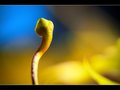
| 11/09/2009 01:01:13 AM |
Snake in the Grassby NeilComment: Very simplistic, but this has nice, pleasing tones to the background. Maybe a little bit more blur on the bottom right elements, but I like this a great deal. Good job. |
| Photographer found comment helpful. |
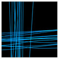
| 11/05/2009 02:11:01 AM |
Crossing Linesby ronaldfwComment: I've done some similar messing around using the same technique, only with the addition of using zoom and camera rotation while doing so. You can get some pretty cool effects if you do all of this with street lights, if you're curious. Some I've gotten don't look anything like photos at all, looking more like graphic design projects. Fun stuff.
Regarding the actual image itself- I'm not liking the choice for the border color, but I like the photo itself. It reminds me of a patchwork, or maybe the term threadbare is more what I'm going for. Message edited by author 2009-11-05 02:12:20. |
| Photographer found comment helpful. |
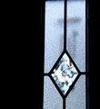
| 11/05/2009 01:52:55 AM |
Chimesby snafflesComment: Hey there;
Here's a belated Critique Club visit!
You took a somewhat different approach to a lot of the entries in this challenge, and I mean that in a good way. Traditionally, when one thinks of windows, they think of a void, something which is defined not by its substance but by its boundary. With this approach, the focus is clearly on what is seen, and is almost a concerted effort to subjugate the window itself to an afterthought at best. Instead of this approach, you have put far more emphasis on the window itself by employing a window with both opaque and translucent properties and relegating the �view� itself to a secondary support role (which is doubled upon by your choice of basing your title on said secondary element). I like the slight tilt and angling of the window relative to the viewer, and the manner in which the chimes themselves are broken up by the diffraction is nice too. Had I been shooting this, there are a couple things I might have tried messing with to see the result. First, I would try to align the round portion of the chime with the center of the star in the window. Secondly, I would decrease my DoF and focus either on the chimes or just slightly past them so they are still acceptably sharp but that the window is lurking at the edge of the focus. This would soften the contrast on the stippled glass a bit but still keep things defined enough that the window itself is still a prominent subject. Nice shot as it is though.
|
| Photographer found comment helpful. |
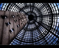
| 11/05/2009 01:26:26 AM |
Windows 2000by hotpastaComment: I really enjoy the angling of the building in this, as well as the texture of the bricks. You really captured some interesting lighting on those bricks, and the whole structure is just interesting to begin with. The cloud and the manner in which it transitions into the blue of the sky is very pleasant. Great shot. |
| Photographer found comment helpful. |
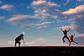
| 11/04/2009 03:05:21 AM |
The Strobist by senor_kasperComment: Originally posted by senor_kasper:
Originally posted by spiritualspatula:
Good shot. I like how you have silhouetted the photographer but not the children. Your sky is nicely exposed and adds some nice color to the scene.
But you titled it Strobist! Get that flash off camera! |
It is. |
The title is "The Strobist" so one might assume you are portraying said strobist in the shot. The strobist's speedlight is not off camera, hence my good humored gibe.
Either way, great shot and congrats on the ribbon. |
| Photographer found comment helpful. |
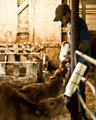
| 11/04/2009 01:37:40 AM |
Feeding Timeby MartyComment: Not too sure about the placement on the focus, but I really like the tones. |
| Photographer found comment helpful. |
Home -
Challenges -
Community -
League -
Photos -
Cameras -
Lenses -
Learn -
Help -
Terms of Use -
Privacy -
Top ^
DPChallenge, and website content and design, Copyright © 2001-2025 Challenging Technologies, LLC.
All digital photo copyrights belong to the photographers and may not be used without permission.
Current Server Time: 06/19/2025 08:03:26 AM EDT.