| Image |
Comment |
| 06/21/2003 01:08:34 AM |
Halfby TiberiusComment: Great lighting and contrast. Only small complaint, is that because of the brightness on the right side, the shoulders lack symmetry as it blends in with the white background. |
 Photographer found comment helpful. Photographer found comment helpful. |
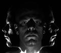
| 06/21/2003 01:06:22 AM |
Rule of Thirdsby robsmithComment: I've seen a couple of attempts at this style of mutli exposured shot and yours is one of the better ones. Two small criticisms thiough. There's more lighting on the left face than the right one, so symmetry doesn'te feel quite right. Also because of the ears in the middle photo, they look a bit odd when you look at the faces on the left and right. They look like they should be part of those faces too, but they don't match. |
| Photographer found comment helpful. |
| 06/21/2003 01:01:30 AM |
Dark Eyesby AnnidaComment: Rivetting. The dark highlights around the eyes work well as does the lighting. The lips feel a little too cut off though |
| Photographer found comment helpful. |
| 06/21/2003 12:59:33 AM |
|
| Photographer found comment helpful. |
| 06/21/2003 12:58:56 AM |
|
| Photographer found comment helpful. |
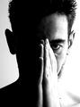
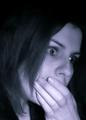
| 06/21/2003 12:54:01 AM |
Sadnessby loz1Comment: Very emtotional shot. There's a bit too much black space at the top of the photo for me and I think I'd like to have seen just a hint of your lips through the fingers to get across even more feeling. But you'ld have to be happy with this shot. It's great - 8 |
| Photographer found comment helpful. |
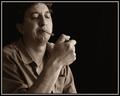
| 06/21/2003 12:46:33 AM |
Smokerby pitsamanComment: Very well lit and composed shot. It also conveys a sense of who you are, so we can relate to the photo better. My only criticism, is the blurred cigarette. For a title of the Smoker, that's the first thing we're drawn to and it detracts from the image |
| Photographer found comment helpful. |
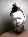
| 06/21/2003 12:41:54 AM |
Unfrozenby 'PongComment: You've obviously gone to a lot of trouble to set this one up and the shot of your face is just fantastic. I just find that the reflections on the painted wall and the shadows to the side of your head too competing though. The hair also for some reason appears to be out of focus compared to the rest of your face. Overall great job though |
| Photographer found comment helpful. |
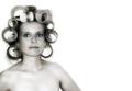
| 06/21/2003 12:39:25 AM |
Swirlyby brentpaughComment: Priceless expression and unique perspective. I hope to god that your hair looks wet because of gel and not because ... well I'm sure you know what I'm thinking. Very memorable shot, so I've rated this highly |
| Photographer found comment helpful. |
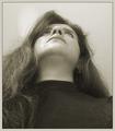
| 06/21/2003 12:33:37 AM |
Is This Really Me?by mcraelComment: An overall very nicely taken classic style of self portrait. The wrinkle in the sheet and the different shadings of greys in it near the bottom, seem to detract from the photo though as they take my attention away from you. |
| Photographer found comment helpful. |
Home -
Challenges -
Community -
League -
Photos -
Cameras -
Lenses -
Learn -
Help -
Terms of Use -
Privacy -
Top ^
DPChallenge, and website content and design, Copyright © 2001-2025 Challenging Technologies, LLC.
All digital photo copyrights belong to the photographers and may not be used without permission.
Current Server Time: 08/16/2025 05:22:15 AM EDT.