| Image |
Comment |
| 08/05/2003 12:28:21 PM |
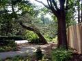
Paine Art Centerby ltflyComment: The wall on the right detracts from the otherwise peaceful feeling of this shot. Perhaps it was intended to cause the viewer to reflect upon the intrusiveness of man upon nature, but in this case, I think I would have liked the photo better without it. |
 Photographer found comment helpful. Photographer found comment helpful. |
| 08/05/2003 12:26:54 PM |
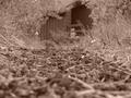
summerhouse backyardby litboltiComment: With both the foreground and background being so soft in the focus, instead of wanting to linger on this photo, my inclination is to quickly move on because it hurts my eyes. I understand that your focal point is the middle of the frame, but it doens't work veyr well. Otherwise, I do like the shot. Had you zeroed in on the obect in the background, or maybe a bug or something in the fore, it would have worked much better, I think. |
| Photographer found comment helpful. |
| 08/05/2003 12:23:13 PM |
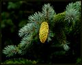
Needleworkby ToddhComment: This is beautiful. The brightness of the acorn against the dark background really brings out the color. One of my favorites! |
| Photographer found comment helpful. |
| 08/03/2003 10:17:16 PM |
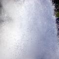
qssssssss....by vignirComment: I have to admit, I almost didn't even view this photo because the thumbnail did little to intrigue me. Seeing it full size, I appreciate more what you were trying to achieve. It is an interesting use of light and water to create an unique concept for the challenge. I like the individual droplets seen in the dark area at the top. In this case, leaving that sliver of unfilled space actually enhanced your shot rather than detracting from the value of keeping within the fill the frame theme. I'm afraid it's still not one of my favorite shots but I'm glad I took the time to inspect it further. |
| Photographer found comment helpful. |
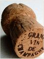
| 08/03/2003 10:13:05 PM |
Evening Of Indulgenceby MitonskiComment: Although this is nicely shot, I don't think it quite fits the theme of the challenge. A close up is not quite the same as fill-the frame and I think in this case, by cutting off just one portion of the focal point while leaving the rest fulling in frame detracts from the overall composition of the photo. I do like how you obtained so much detail in the character of the cork giving it depth and interest. |
| Photographer found comment helpful. |
| 08/03/2003 10:10:24 PM |
Old Soul by sherComment: One of my favorites of the challenge. What I like best is the way you captured the unique tones of his skin. The different shades of orange, grey and brown are fascinating. I also like the symmetry of the shot and the depth your lighting successfully creates. Good luck. I can't vote but I give it a 10. |
| Photographer found comment helpful. |
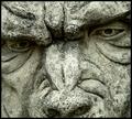
| 08/03/2003 10:06:38 PM |
Gargoyleby MikeOComment: As being a fan and semi-collector of gargoyle statuettes, I appreciate this shot a great deal. You did a fantastic job of filling the frame and capturing the details carved into the stone. The shadow cast by his brow intensifies the forboding look in his eye and I am intrigued by what the rest of the figure might look like. |
| Photographer found comment helpful. |
| 08/03/2003 10:00:58 PM |
Low Tech Undoby GraciousComment: Great colors, really enhanced bu the brightness of your lighting. I love the title too. This is a "fun" photo. Very appropriate for this "back to school" time of year. |
| Photographer found comment helpful. |
| 08/03/2003 09:57:37 PM |
lisaby johnny_justjohnnyComment: For this particular challenge, I would have liked to have seen you pull in a little tighter to lose every bit of the background. Your lighting may be a little harsh. Losing the reflection on her forehead and cheek might soften her skin and complexion. Nice capture of her eyes. |
| Photographer found comment helpful. |
| 08/03/2003 09:52:46 PM |
a root from an old cypress treeby grigrigirlComment: This is a great shot. I love when a piece of nature is captured in such a way that it looks like something other than what it is. Yes, you can tell ther is bark in the photo, but it has more of a feel of a piece of modern art than of a tree root. What I find particularly interesting are the areas of red...almost like blood. |
| Photographer found comment helpful. |
Home -
Challenges -
Community -
League -
Photos -
Cameras -
Lenses -
Learn -
Help -
Terms of Use -
Privacy -
Top ^
DPChallenge, and website content and design, Copyright © 2001-2025 Challenging Technologies, LLC.
All digital photo copyrights belong to the photographers and may not be used without permission.
Current Server Time: 08/05/2025 12:11:06 AM EDT.