| Image |
Comment |
| 06/27/2003 11:47:22 AM |
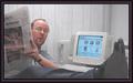
Uh-Oh Busted Again!by Firstrich1Comment: Cute shot :) Nice expression on model's face. A tad staged, but good overall. Lighting seems a little bright |
 Photographer found comment helpful. Photographer found comment helpful. |
| 06/27/2003 11:46:10 AM |
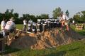
All Systems Go For Launchby EddyGComment: When I first saw this earlier in the week, I could not figure out what they were doing and then I saw the tshirt that said "Fireworks" This is a nice shot of something that you don't see every day (or at least I don't!) The shadow in the foreground takes away from your shot. |
| Photographer found comment helpful. |
| 06/27/2003 11:44:45 AM |
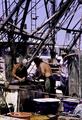
Fishermenby photogooComment: I llike all of the rigging in this shot and the guy leaning watching the others clean the fish is nice. At first glance, it seems too busy, but on a closer study, I like the lines the rigging makes. |
| Photographer found comment helpful. |
| 06/27/2003 11:43:13 AM |
|
| Photographer found comment helpful. |
| 06/24/2003 05:09:31 PM |
Hand on my heartby KaveyComment: Thank you for having the courage to submit this image. I know it's not an easy thing to do when you are not a size 8. I love the lighting and the graininess of the shot. The perspective and curves of your body are gorgeous. Well done to you :) |
| Photographer found comment helpful. |
| 06/19/2003 01:18:37 PM |
|
| Photographer found comment helpful. |
| 06/19/2003 01:04:40 PM |
|
| Photographer found comment helpful. |
| 06/19/2003 12:58:45 PM |
Magic candleby Crafty SueComment: This shot looks like you laid some green construction paper on the carpet/floor and then took a picture of your subject. I think it would be better if you put the construction paper against the wall. Yes, your subject is off center which fits the challenge. I do like some of the reflections in the base of the glass but the red against the green just reminds me of Christmas and that seeems out of context of your shot. |
| Photographer found comment helpful. |
| 06/19/2003 12:53:24 PM |
Retro Glowby eloiseComment: I think there is too much negative space in this shot that does little to emphasize your subject which is bright enough without all the contrast. |
| Photographer found comment helpful. |
| 06/19/2003 12:50:43 PM |
Kissed by a Roseby StevePaxComment: I don't really see how the smoke/dry ice fits in with this image. It is obscuring most of your subject and the background that is visible isn't very appealing. |
| Photographer found comment helpful. |
Home -
Challenges -
Community -
League -
Photos -
Cameras -
Lenses -
Learn -
Help -
Terms of Use -
Privacy -
Top ^
DPChallenge, and website content and design, Copyright © 2001-2025 Challenging Technologies, LLC.
All digital photo copyrights belong to the photographers and may not be used without permission.
Current Server Time: 08/18/2025 07:41:54 AM EDT.