| Image |
Comment |
| 10/28/2009 07:57:56 AM |
Commuting Artby korpenComment: Ouch, look at all those 1,2, and 3s. People really need to save those votes for poorly done photos rather than a great photo which use a technique which is not to their taste. Take solace with the unusual distribution of votes and know that a lot of people "got it" and appeciated it. |
 Photographer found comment helpful. Photographer found comment helpful. |
| 10/26/2009 05:44:09 PM |
Dark Paradise Chasm by hazeComment: Very nice job with those gritty textures. Nice use of the wide angle here
Since Jeb said it, I'll add Go Nor'easters! |
| Photographer found comment helpful. |
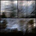
| 10/24/2009 11:02:43 PM |
123by tvsometimeComment: Kind of a nice idea, but each photo ends up a little too simple and thus the triptch is not as powerful as it could be. |
| Photographer found comment helpful. |
| 10/24/2009 11:01:39 PM |
|
| Photographer found comment helpful. |
| 10/24/2009 11:00:09 PM |
GoGirlGo!by gsalComment: Love the photos as standalone images, but not so much as a triptych, especially the right hand photo, where her face is oddly not visable. Maybe if you swapped the left and right ones it would have had a split screen type effect. |
| Photographer found comment helpful. |
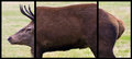
| 10/24/2009 10:58:04 PM |
Crop Factor Explainedby bialas88Comment: Well, I give you a "A" for humor. As a photo though it is a bit too outside the box to really appeal to me. Perhaps if more of the neck were visable on the left photo the connection would have worked better. |
| Photographer found comment helpful. |
| 10/24/2009 10:56:14 PM |
Eleganceby HaneckComment: I like the toning and the overlapping frames. May not be a powerful triptych, since the two bottom photos are two similar and do not add anything else. |
| Photographer found comment helpful. |
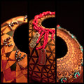
| 10/24/2009 10:54:57 PM |
Gourd Artby dahvedComment: Each photo is kind of neat and would stand alone. Somehow in a triptch they seem to clash more than compliment each other. |
| Photographer found comment helpful. |
| 10/24/2009 10:53:53 PM |
Stop 'n Goby danculwellComment: Cool idea. Having the covered portion be dead black would be better. I can still make out the circle as a different shade than the black background. |
| Photographer found comment helpful. |
| 10/24/2009 10:52:19 PM |
|
| Photographer found comment helpful. |
Home -
Challenges -
Community -
League -
Photos -
Cameras -
Lenses -
Learn -
Help -
Terms of Use -
Privacy -
Top ^
DPChallenge, and website content and design, Copyright © 2001-2025 Challenging Technologies, LLC.
All digital photo copyrights belong to the photographers and may not be used without permission.
Current Server Time: 06/23/2025 03:46:12 PM EDT.