|
|
|
Showing 681 - 690 of ~922 |
| Image |
Comment |
| 11/12/2003 01:40:26 AM | Queen's Gambitby Adrian TungComment: Adrian,
As a chess player, I know the risk in 2.c4. As a photographer who has taken lots of shots of chess pieces, I'm also aware of the problems of transposing chess (intellectual) tension into photography (visual) terms. We must rate each photograph purely on visual terms, unless we are sure of our audience completely.
Visually, (and I find this very difficult because I'm looking at the position from a chess player's perspective) the shot is okay. The dof produces a very blurred foreground, a sharp centre, but not the necessary blurred background required to balance.
The main lines are difficult to make out visually, and there seems to be an arbitary cropping. Lighting is good and it allows pawn d5 to pop. Unfortunately, d5is blocked somewhat, reducing its effect. Maybe a wider lighting would have produced more clarity on the squares.
I got hammered with my last chess shot, too. I don't think that people noticed the heart in the centre. Don't worry about your score. You made a good shot which most people found worthy. |  Photographer found comment helpful. Photographer found comment helpful. |
| 11/12/2003 01:10:29 AM | Where Have All the Flowers Gone?by WildflowerJoyComment: I was very surprised to see that this shot came in at 4.4ish. It could use a bit more sharpness and, perhaps, a bit more colour saturation. But it is a fine shot and an interesting idea. | | Photographer found comment helpful. |
| 11/05/2003 03:55:25 AM | The Shadow Fairyby WILDBLUEComment: *critique club*
Hi, Renee,
Certainly, you've met the challenge head on. Just the slight intrusion of the vase (?) base on the right impedes a completely shadow-based photograph.
Compositionally, you've presented a strong line running from the lower right to the upper left. The close cropping works well. Indeed, photographically, this shot shows a great deal of control.
The shadow, unfortunately, isn't stable throughout its range. The upper left area is noticably weaker than the bottom right. There is a strange brightness halfway up the right-hand side, too. Besides these flaws, there is an imperfection, a cut in the paper?, a tear in the wallpaper? in the upper right quarter.
These problems are not that important. I feel that the main reason your score didn't get much above 5 was that it wasn't that special. You've got a good base idea. Perhaps you could use a different lighting setup to intensify the drama? Or juxtapose the queen with another object?
Best wishes,
Jim
| | Photographer found comment helpful. |
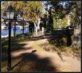
| 11/05/2003 03:46:17 AM | Walk In Shadowsby MonaComment: *critique club*
Hi, Mona,
You've got a nice, welcoming scene here. The colours are clear. I like the blues, especially. The greens and the browns could have a little more saturation to make them more vivid, although the colours you post here are probably very accurate.
The composition is pleasant, too. The path provides a nice leading line through the photo. The tree on the right and the lamp on the left provide a nice, natural border for the path.
In terms of this challenge, I don't think that you used shadows well enough to be the main feature of the photo. Certainly, there are shadows present, but they don't add or subtract from the shot. I think that this is the main reason why your shot scored so lowly at the end. It just didn't meet the challenge in most voters minds, I suppose.
Also, although it is lovely, it is rather dull. There's nothing of special interest here. You need to focus on just one aspect of the scene (for the challenge, I would have recommended the shadow) and find a composition and lighting combination that would have produced a more dramatic effect.
Best wishes,
Jim
| | Photographer found comment helpful. |
| 11/05/2003 02:54:49 AM | | | Photographer found comment helpful. |
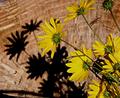
| 11/05/2003 01:15:35 AM | wildflowers & shadowsby katlynComment: *critique club*
I think that the earlier commentors have picked up on the main problems in this shot - the lack of clear focus on the flowers and the overall lack of sharpness.
I've looked at your profile and I really like your butterfly photos. You have brought out the colour there very well indeed. That fascination with colour is missing here. Also, the composition in your butterfly shots is interesting, with a nice placing of the main subjects. The composition here needs similar consideration, I feel.
Best wishes,
Jim
| | Photographer found comment helpful. |
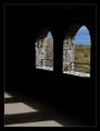
| 11/05/2003 12:59:26 AM | Autumn Castleby dg02Comment: *critique club*
You've certainly met the challenge - shadows do play an important part in creating the atmosphere here.
The overall darkness is nicely balanced by the bright blues and the outside scene. The bright floor area to the left and the bright outside area to the right maintain this comfortable balance.
Comfort is a key term. Apart from the single leaf (an oversight?), this is a traditional shot. You haven't taken any risks. Even the border smacks of conformity. This is not a bad thing - it places your intention squarely within a given convention.
The textures on the walls have been brought out nicely, as have the clouds and trees.
Overall, a nice shot, but not very awe-inspiring.
Best wishes,
Jim
| | Photographer found comment helpful. |
| 11/05/2003 12:50:18 AM | Naturally Beautifulby OneSweetSinComment: *critique club*
We meet again.
I like this shot, and I feel that if it were in a different challenge, it would have done much better. There is grace in the natural world, of course, but voters here tend to be much more literal than we suspect before entering a shot. To me, symetry is naturally graceful, and here you have 2 strong lines; the trees and their reflections.
I wonder about the composition, though. The main interest seems to be in the trees and in the water. The amount of sky seems to be too great. Either extend or contract the sky content to create more drama.
The colours are probably natural. 'Probably' because they don't appear washed out and look as they would in real life. It's very easy to increase saturation to give the impression of a better autumn colour, and indeed, many voters would have appreciated that more. Your maintainence of the natural order is understood.
The building is a contentious point, too. On the whole, I feel that it would have been better left out, but a part of me feels that it does add a sense of moderity to the shot. At the weekend, I took an almost exact version of this scene taking pains to include a building. My wife didn't like the building. Win some, lose some.
Of the shots I've critiqued, I think that this is the most effective one so far. Keep up the good work.
Best wishes,
Jim
| | Photographer found comment helpful. |
| 10/28/2003 12:06:04 AM | Shades of Autumn by moodvilleComment: I didn't vote in this challenge. If I had this one would have been up among my top scorers. It's a great shot. Lovely textures on the vase, and the colour range is warm and inviting - very Autumnesque. Congratulations on the well-deserved ribbon. | | Photographer found comment helpful. |
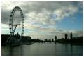
| 10/17/2003 10:27:24 PM | High Tide on the Thamesby e301Comment: =critique club=
Before starting, I'd just like to say that after quite a long break from doing this, I read a forum thread a few minutes back re-urging folks to continue producing critics - started by you! Then this photo comes up! Talk about co-incidence.
You seem to be contrasting the openness of the sky with that of the water as your two key elements. These work with the cityscape silhouettes and the challenge is met well. I don't know if you intended this, but I like the idea of the city/ man controlling the water but being dominated by the much greater force of the sky. Man has always tried to conquer the sky by building bigger, taller, wider building, by creating machines that challenge the dominance of the sky. In this photo, you've shown a new ferris wheel (?) extending right into the clouds, as if saying that this is man's latest attempt. This is a nice idea. A further irony is present in that the buildings on the right were, at one time, serious challengers in the contest 400 years ago.
In terms of colour, there's an overall feeling of darkness. Maybe you meant to protray London's bleakness, but, for me, the resulting image is not entirely pleasing. Possibly that's because the ferris wheel is backed by the darkest cloud mass (detracting from its presence somewhat), whereas the parlimentary buildings have a little more open space. Certainly the bright areas don't add to the composition in terms of placing, although they do in terms of shape.
A question about the silhouette: there are shades of grey and light discernable in them. I'm not sure whether or not you aimed for a true silhouette or simply underexposed the buildings. I feel that doing either 100% would have resulted in a stronger entry.
So, on the whole, I think that this is a good idea which could be usefully reworked. It scored over 6 in the challenge, but I would give only a 5. Sorry.
| | Photographer found comment helpful. |
|
Showing 681 - 690 of ~922 |
Home -
Challenges -
Community -
League -
Photos -
Cameras -
Lenses -
Learn -
Help -
Terms of Use -
Privacy -
Top ^
DPChallenge, and website content and design, Copyright © 2001-2025 Challenging Technologies, LLC.
All digital photo copyrights belong to the photographers and may not be used without permission.
Current Server Time: 08/06/2025 12:03:29 AM EDT.
|