| Image |
Comment |
| 01/25/2004 11:45:08 PM |
|
 Photographer found comment helpful. Photographer found comment helpful. |
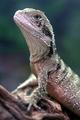
| 01/25/2004 11:41:50 PM |
Australian Water Dragaonby C-FoxComment: Lovely shot. (An outtake for the NG challenge?) Lovely bokeh. Sharp details. Spotless. Not my taste, but the sheer excellence of the capture is making me give a high score. 9 |
| Photographer found comment helpful. |
| 01/25/2004 11:39:16 PM |
Year of the Pigby NeuferlandComment: Cute. The centring makes for a bland shot here. If this chubby chappie were further to the right, the overall balance would be better, imho. The colours look a little off, too. Sorry. 4 |
| Photographer found comment helpful. |
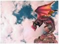
| 01/25/2004 11:27:27 PM |
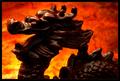
2000: The Year of the Dragonby RoosterComment: I like the wb, tinting the clouds with the red of the fire breath. A nice touch. I wonder, though, if a deep dof wouldn't have helped, as I feel that the clouds needed to be a touch more in focus, less bokeh. 6 |
| Photographer found comment helpful. |
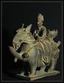
| 01/25/2004 11:20:52 PM |
The Horseby Harz_JoergComment: Nicely crafted piece. I like that you've given more room on the left and top. Just a bit bland, though. 6 |
| Photographer found comment helpful. |
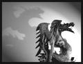
| 01/25/2004 11:19:13 PM |
The Tenacious Dragonby brett2004Comment: Lovely idea and a very effective composition. 2 negative points - the blowout on the bottom right and the head is underexposed. Also, the shadow would have been more effective if it had been darker. 6 |
| Photographer found comment helpful. |
| 01/25/2004 11:17:04 PM |
The Oxby jjbeguinComment: Although this shot has been very nicely orchestrated, I find the effect a bit dull. Sorry. The texture, composition, subject and camera angle are all good. Just not my taste. 5 |
| Photographer found comment helpful. |
| 01/25/2004 11:14:59 PM |
Fire Breathing Dragonby mariomelComment: The detail has been created by highlights rather than from the colour of the object. This makes it difficult to look at, for me. Nice idea, though. 5 |
| Photographer found comment helpful. |
| 01/25/2004 11:12:49 PM |
The Rabbitby neenee1999Comment: I really like the obviously 'designed' aspect of this shot. The colour choice is effective and helps make the shot very elegant. However, I just wish that the font you used wasn't so pixelated. Kudos on making the rabbit look at his character. 6 |
| Photographer found comment helpful. |
| 01/25/2004 11:06:54 PM |
Year of the Rabbitby MWittComment: This has a nice touch. Very subtle. I'm not happy with the border, though. I'm a border fan, but here its heaviness detracts from the gentle tracks of the rabbit. 6 |
| Photographer found comment helpful. |
Home -
Challenges -
Community -
League -
Photos -
Cameras -
Lenses -
Learn -
Help -
Terms of Use -
Privacy -
Top ^
DPChallenge, and website content and design, Copyright © 2001-2025 Challenging Technologies, LLC.
All digital photo copyrights belong to the photographers and may not be used without permission.
Current Server Time: 08/06/2025 10:25:08 AM EDT.