| Image |
Comment |
| 01/26/2004 12:58:09 AM |
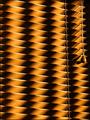
Nature's Lightby justineComment: The challenge states that the primary light source should be non-stationary. I know that we could argue about the movement of the sun, but, for now, I have to conclude that this shot doesn't fit the topic. Nice lines, though. 2 |
 Photographer found comment helpful. Photographer found comment helpful. |
| 01/26/2004 12:54:58 AM |
Painting with firelightby ccraftComment: Correct me if I'm wrong, but I feel that this 'firelight' cannot fit this challenge as it's stationary. A nice shot, otherwise. Lovely golden hues. 2 |
| Photographer found comment helpful. |
| 01/26/2004 12:50:09 AM |
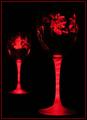
Berriesby Spork99Comment: Nice idea, based on a classical design. Be very careful of unwanted items in the frame. To the middle left and right, you've left some things that shouldn't be there. Under the 'advanced editing' rules, you're allowed to clone them out, and to correct unwanted highlights. 4 |
| Photographer found comment helpful. |
| 01/26/2004 12:43:09 AM |
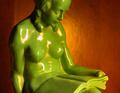
viridisby MJENNIComment: One of the difficulties in this challenge was to avoid unwanted highlights. I don't think that this shot succeeds that well. Sorry. Still, a lovely pose and an interesting combination of colours. 5 |
| Photographer found comment helpful. |
| 01/26/2004 12:26:53 AM |
|
| Photographer found comment helpful. |
| 01/26/2004 12:17:43 AM |
|
| Photographer found comment helpful. |
| 01/26/2004 12:16:36 AM |
Winter Nightsby sherComment: This is a nice, soothing photo. Nice composition, lovely tones and fits the challenge well. 7 Message edited by author 2004-01-30 21:13:47. |
| Photographer found comment helpful. |
| 01/26/2004 12:06:48 AM |
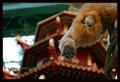
Chinese New Year 2004 :: Year of the Monkeyby JasonComment: This would have worked a lot better had there been a bigger colour/ brightness difference between the monkey and the temple, and the very bright left-hand section had been cropped out. Nice idea. Very cute. 6 |
| Photographer found comment helpful. |
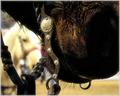
| 01/25/2004 11:57:49 PM |
Bit by Bitby SonifoComment: Nice, effective composition here. I'd like the front horse to be a bit lighter, though. 7 |
| Photographer found comment helpful. |
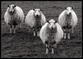
| 01/25/2004 11:48:17 PM |
Four of a Kind by KonadorComment: Hehe. I like this one. Cute, well-taken, appropriate for the challenge. The grass, however, creates an overall dark tone. I think that the feeling here should be lighter, to match the mood. 7 |
| Photographer found comment helpful. |
Home -
Challenges -
Community -
League -
Photos -
Cameras -
Lenses -
Learn -
Help -
Terms of Use -
Privacy -
Top ^
DPChallenge, and website content and design, Copyright © 2001-2025 Challenging Technologies, LLC.
All digital photo copyrights belong to the photographers and may not be used without permission.
Current Server Time: 08/06/2025 10:25:08 AM EDT.